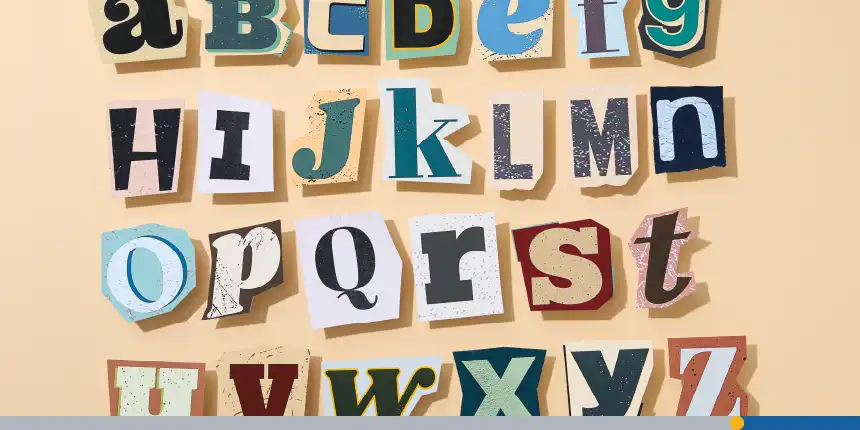
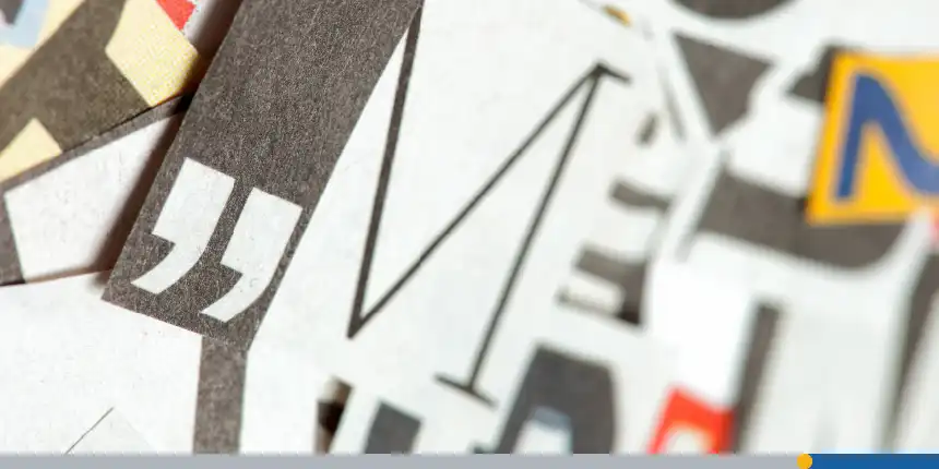
We take fonts for granted in our everyday lives. Thanks to modern technology, we have access to thousands, if not millions, of different fonts that we can use to create Word documents, signage, posters, and even logos. This was not always the case.
Johannes Gutenberg created the first font in 1439 for his revolutionary new invention, the printing press. He used this typeface to print the first book, the Bible, which was recreated as a digital font named Gutenberg. Gutenberg’s invention kickstarted a printing revolution that shaped modern society.
The WordPress Gutenberg Editor is named after him, honoring his groundbreaking inventions that revolutionized printing—the foundation we still rely on today.
Choosing the right font to convey your message is just as important today as it was in 1439, especially when it comes to logo design. An eye-catching logo font can elevate a business or project, making it stand out in digital and print media. However, with so many options, finding the perfect font for your project can be overwhelming.
In this article, we’ll explore the different types of logo fonts, how to choose a font that fits your unique brand identity, and give you some amazing examples to spark your imagination.
- What Are Logo Fonts?
- How Fonts Are Incorporated Into Logo Design
- Types of Fonts for Logos
- Choosing the Right Font for Your Logo
- Top 10 Best Logo Fonts
What Are Logo Fonts?
As the name suggests, logo fonts are used in logo design. They are an incredibly important element and can help create a professional and memorable brand image. A well-designed logo font can make your logo look professional, while a poorly designed one can make it appear amateurish and difficult to read. Logo fonts express your brand identity, adding character to rather bland text or an icon.
Importance of Logo Fonts
Logo fonts convey different emotions and moods, making selecting the wrong logo font alter the message your brand communicates. Let’s use Yves Saint Laurent as an example of how a logo font can impact a brand’s identity.
A. M. Cassandre designed Yves Saint Laurent’s logos in 1963. The iconic wordmark features a unique font and typography that emphasize the brand’s dedication to innovation and elegance. The typeface employed for the Yves Saint Laurent visual identity is reminiscent of the New Yorker but with a contemporary twist. The proximity of the three distinct name segments offers a sense of cohesion, underscored by an intentional absence of separators.
This is a perfect example of how font and typography can work together to articulate a brand’s story. Your font should embody the spirit of your business. Some fonts are more appropriate for certain industries than others. We’ll dive deeper into that later on in the article.
How Fonts Are Incorporated Into Logo Design
While not a necessity, almost all logos have some text, usually the brand name or a tagline. In this section, we’ll discuss the different types of logos and how fonts are incorporated into each one.
Pictorial Marks
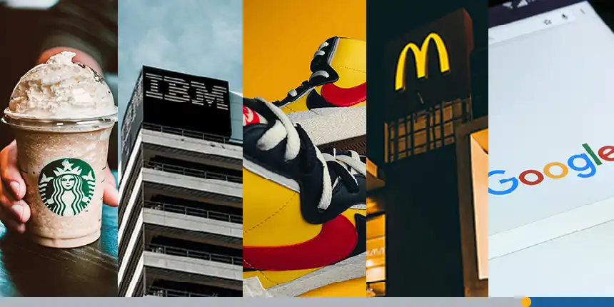
A pictorial mark (also known as a brand mark or logo symbol) is an icon or graphic-based logo. It’s probably the image that comes to mind when you think of the logo. These icons don’t include any text and are based on a single image. Some of the most famous pictorial marks are the Apple logo, the Nike swoosh, and the McDonald’s golden arches.
There are a few variations of the pictorial mark:
- Abstract logo marks: A type of pictorial mark that uses abstract geometric shapes rather than recognizable images. Examples include Adidas, Pepsi, and Reebok.
- Mascot logos: This form of pictorial mark includes an illustrated character as the logo to represent your company. Examples include KFC, Wendy’s, and Starbucks.
Wordmark Logos
A wordmark logo is a font-based logo that focuses on the business name alone. Often, a pictorial mark logo features a wordmark so that the business name is visible along with the icon. However, there are many instances where a wordmark logo stands alone without any images, such as Google, Coca-Cola, or Visa.
With wordmarks, all of the focus will be on your company’s name, so you’ll need to pick a font that captures the essence of what your business does. For example, fashion labels tend to use clean, elegant fonts that feel high-end, while automotive brands almost always stick to a more industrial text that feels solid and secure.
Monogram Logos
Monogram logos or lettermarks are logos that consist of letters, usually brand initials. The vast majority of monogram logos use just two or three letters, like IBM, HBO, CNN, ABC, and HP.
Because the focus is on initials, the font you choose for your logo is very important, so make sure your design is not only on-theme with what your company does but also legible when you print on business cards.
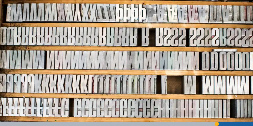
Types of Fonts for Logos
Steve Jobs is largely responsible for the wide variety of fonts available today. Before starting Apple, Jobs took a calligraphy class to explore his fascination with hand-drawn letters. He carried his love of typeface and typography into his technology career.
When the first Macintosh computer was released in 1984, Jobs ensured that users had an assortment of digital fonts to choose from.
Companies like Microsoft followed Steve Jobs’ lead and included a range of fonts with their personal computers, even creating a few of their own. While font selection has grown exponentially in the last 40 years, a few font families are the basis for most of the popular fonts used today.
Sans Serif Fonts: Modern & Versatile
Sans serif fonts are clean, modern, and highly readable. Unlike serif typefaces, they lack the small decorative strokes at the ends of letters, making them great for a contemporary typeface. Brands that want a sleek, minimalistic, or tech-forward aesthetic often use sans-serif fonts. They are also highly adaptable across digital and print media.
Popular sans serif typefaces include:
- Helvetica: A timeless font that works well in multiple fonts combinations.
- Futura: A geometric sans serif font with a modern appearance.
- Montserrat: A trendy font with great versatility.
- Gotham: A bold font choice often used for business logo fonts.
Serif Fonts: Classic & Elegant
Serif logo fonts are traditional, trustworthy, and elegant. They feature small decorative strokes (serifs) at the ends of letters, giving them a sophisticated look. Brands that want to evoke heritage, luxury, or professionalism tend to use serif fonts.
Great serif typefaces for logos include:
- Times New Roman: A classic font that’s easy to recognize.
- Garamond: An elegant serif font with a timeless feel.
- Baskerville: A serif typeface known for its sharp serifs and readability.
- Playfair Display: A display typeface with thick and thin strokes for a high-end feel.
Display Fonts: Unique & Eye-Catching
Display fonts are decorative and designed to make a bold statement. These fonts are not ideal for body text but work well for wordmark logos where the brand name is the centrepiece.
Popular display fonts include:
- Lobster: A playful font with script elements.
- Bebas Neue: A modern font with uppercase letters only.
- Impact: A bold font known for making a strong impression.
Script Fonts: Elegant and Handwritten
Script fonts mimic cursive handwriting and add a touch of personalization and elegance to a logo. These fonts work well for businesses in the creative, fashion, or luxury industries.
Notable script fonts include:
- Pacifico: A rounded typeface with a casual, friendly look.
- Brush Script: A vintage-inspired font with thick and thin strokes.
- Great Vibes: An elegant script font with a luxurious feel.
Slab Serif Fonts: Bold and Rugged
Thick, blocky serifs characterize slab serif fonts. These fonts convey strength, reliability, and confidence, making them great for brands in the construction, sports, and automotive industries.
Some excellent slab serif options include:
- Rockwell: A geometric typeface with a solid look.
- Museo Slab: A contemporary typeface with smooth edges.
- Roboto Slab: A modern slab serif with digital appeal.
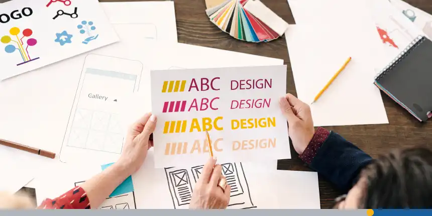
Choosing the Right Font for Your Logo
Selecting the perfect font for your logo requires balancing aesthetics and function. Here are a few things to consider to ensure your logo font’s typography is a good fit for your brand.
1. Brand Identity & Personality
Your logo font should reflect your brand’s personality. A sans serif typeface might be best for a tech startup, while an elegant serif font works well for a luxury brand. Consider whether the logo font aligns with your brand’s personality traits, values, and overall image.
2. Versatility Across Platforms
Make sure your font works well across different media, from mobile apps to web design and print materials. Certain intricate fonts look great when they are presented on a large screen but become difficult to read when printed on a business card or pamphlet.
3. Readability
Studies show that modern audiences have an attention span of about 8 seconds. That’s all the time consumers have to look at your content. And in a market with dozens of brands vying for attention, that might even be shorter.
So, make every second count by using a legible logo font. Avoid overly decorative fonts if readability is a priority. A business logo font should be clear and legible in all sizes.
4. Avoid Too Many Fonts
Using too many fonts in a single logo can make it look cluttered. Stick to one or two fonts for a clean and professional appearance. This will also help create a sense of brand continuity. If you use one font for your logo and across all marketing materials, your audience will start to associate that font with your brand.
5. Align Your Font with Your Target Audience
Do your logo fonts resonate with your audience? Choose a logo font that resonates with your audience and establishes a sense of familiarity and connection with your brand.
6. Uppercase vs. Lowercase Letters
Decide whether your logo should be in uppercase letters, lowercase letters, or a mix of both. Uppercase logos convey strength, while lowercase logos feel more friendly and approachable.
7. Analyze Your Competitors and Their Fonts
Having a forgettable logo or a logo similar to your competitors can make you lose or confuse your audience.
One way to minimize such risks is by running a competitor analysis before kickstarting your logo design. Analyze logos of successful brands in your industry to draw inspiration from their design choices.
8. Use FreeLogoServices To Create Your Logo
FreeLogoServices’ Logo Maker tool has thousands of professional templates that are fully customizable, so you can experiment with different fonts and typefaces to make sure you make the right decision. Choose the perfect logo font and craft a breathtaking logo in just minutes!
Top 10 Best Logo Fonts
We’ve put together a list of the best logo fonts to help you decide which logo works best for your brand.
1. Helvetica
Helvetica is a versatile and widely recognized sans serif font that has stood the test of time. It is known for its clean and modern appearance, making it a popular choice for logos that need to be easily recognizable across various marketing materials.
Brands that use Helvetica include Jeep, American Apparel, and Panasonic.
2. Futura
Futura is a geometric sans-serif font that embodies a futuristic and forward-thinking spirit. It has a clean and sleek design, making it suitable for both logos and body text.
Brands that use Futura include Nike, Paypal, and Supreme.
3. Garamond
Garamond is an elegant and timeless serif font named after the renowned 16th-century French engraver Claude Garamond.
Like many serif logo fonts, its old-style charm and delicate letterforms make it a popular choice for brands that want to convey a sense of sophistication and refinement.
Brands that use Garamond include Apple, American Eagle, and Abercrombie & Fitch.
4. Montserrat
Montserrat is a clean and modern sans-serif font designed by Argentine graphic designer Julieta Ulanovsky. It is highly legible and versatile, making it a practical choice for a wide range of design applications.
Brands that use Montserrat include T.G.I. Friday’s, Denner, and Chipotle.
5. Bodoni
Bodoni is a high-contrast serif font with sharp, distinct lines and contrasting thick and thin strokes. It exudes elegance and sophistication, making it a popular choice for luxury brands, high-end fashion houses, and creative industries.
Brands that use Bodoni include Zara, Calvin Klein, and Chapters.
6. Lato
Lato is a versatile and modern sans-serif font with a friendly and approachable appearance. Its balanced and legible letterforms make it suitable for a wide range of design applications.
Lato is the official typeface of the Polish Government.
7. Proxima Nova
Proxima Nova is a modern and exciting sans-serif font designed by Mark Simonson. It is highly legible and has an extensive character set, making it suitable for various applications.
Brands that use Proxima Nova include BuzzFeed, Mashable, and NBC News.
8. Didot
Didot is an elegant and high-contrast serif font named after the Didot family, a group of prominent French printers, publishers, and typefounders. It is characterized by its thin, delicate serifs, tall letterforms, and strong vertical stress.
Brands that use Didot include Hilton, Dior, and Yves Saint-Laurent
9. Avenir
Avenir is a simple yet rich font with a geometric sans serif design.
Brands that use Avenir include Bloomberg, LG Electronics, and Japan Airlines.
10. Raksana
Raksana is a bold and retro script font that turns heads. A display font meant to grab people’s attention, choose this logo font to inject a 60s pinup feel that makes your logo design stand out.
Additional Logo Fonts for Businesses and Projects
If you’re looking for the best fonts for logos, here are some great honorable mentions that just missed the top ten.
- Raleway – A modern sans serif with an elegant touch.
- Bebas Neue – A bold, all-caps display typeface great for headlines.
- Lora – A serif typeface with a balance of classic and modern elements.
- Oswald – A great logo font for brands that want a bold presence.
- Lobster – A playful script font that adds personality.
Conclusion
The best logo fonts help establish a strong and long-lasting brand identity. Whether you opt for a geometric sans serif, an elegant serif font, or a bold display typeface, make sure it aligns with your business and resonates with your audience. Keep it simple, legible, and versatile, and you’ll create a memorable logo that stands the test of time.
If you are looking for an amazing font for your business logo, FreeLogoServices‘ Logo Maker has thousands of fully customizable font options, ensuring your logo design is perfect!
FREQUENTLY ASKED QUESTIONS
How many fonts should a logo design have?
Ideally, a logo design should have one or two fonts. Using multiple fonts can make the logo design look cluttered and unprofessional.
What is the most versatile sans serif font?
Montserrat and Helvetica are two of the most versatile sans serif fonts, working well across industries and platforms.
Are serif fonts outdated?
Not at all. Serif fonts are timeless and still widely used for brands that want to convey tradition, elegance, or trustworthiness.
Should I use uppercase or lowercase letters in my logo?
It depends on your brand personality. Uppercase letters convey authority and strength, while lowercase letters feel more casual and friendly.
Can I use free fonts for my logo?
Yes! Many free fonts are high-quality and suitable for logos. However, make sure to check the license to ensure it allows commercial use.
What’s the best modern sans-serif font for a logo?
Futura, Gotham, and Montserrat are among the best modern sans-serif fonts for logos, offering clean lines and a sleek appearance.
How do I choose the right font for my logo?
Consider your brand identity, readability, versatility, and industry trends. Choose a font that aligns with your brand’s message and looks great in various formats.
