You know a great logo when you see it. It’s clear, simple, memorable, and stands out from the clutter across the internet.
Your logo is the public face of your brand, so it needs to pack a lot of punch. But designing an effective logo isn’t easy; it requires some strategy. Good news: if you do the background work, you’ll have the insight you need to develop a logo that makes a lasting impression. Here’s what should be in a logo.
1. A design that conveys the essence of your brand
A logo should deliver an immediate and honest impression of your business philosophy, conveying why your brand is special. A logo that’s based on an authentic brand philosophy will be meaningful and instill confidence in its audience.
So, before you jump into the logo design pool, really get to know your brand. If you haven’t given much thought to brand characteristics or values, now is the time. Building a brand identity your audience can relate to will give you a major advantage as you work your way through the logo design process.
Designing to convey the essence of your brand goes beyond just your brand personality. Develop your logo with your ideal customers in mind. Your understanding of your target audience should heavily influence your approach to logo design.
Author of Designing Brand Identity, Alina Wheeler, has this to say about the Amazon logo, “The arrow doubles as a smile that conveys friendly customer service and it connects the ‘a’ to the ‘z’ because Amazon offers everything A to Z. It’s all there.”

The logo is an excellent representation of the value Amazon provides its customers.
2. An appropriate style choice
Style choice is one of the first logo design decisions to consider. Here’s a quick run-down on the five types of logo styles to help you find your way.

Wordmarks
A wordmark is a logo made up exclusively of text – typically the business name. Wordmarks can be a perfect choice for businesses just getting started. Since name recognition and awareness are critical for a new business, the entire focus of the wordmark IS the business name with no additional distractions. Choose a fitting font and colors to match the personality of your brand.

Brandmarks
If you can visually depict your brand without words, through the use of an image or symbol, a brandmark may be the right choice for you. Brandmarks are more commonly associated with universally-known organizations that are easily identified through a symbol alone. Many of today’s famous brandmarks started out as combination marks and “earned” their ability to drop the name/text.

Combination marks
A combination mark offers the flexibility to spell out the company name while also incorporating an image or symbol, giving you an opportunity to further explain your story and set your brand apart. 56% of the top 100 companies globally use combination marks.

Emblems
Like a combination mark, emblems incorporate both text and an icon or symbol, but usually by designing text inside the symbol. They often simulate a badge or a seal.
Emblem-style logos tend to be more inflexible since they are more detailed and the text must fit within the image. If you decide to work with an emblem-style logo make sure that it is versatile enough to be clear and visible when sized down for smaller uses like promotional products or profile pics.

Lettermarks
Also referred to as initial or monogram-style logos, lettermarks are a popular choice for brands that need to simplify a long company name by using some form of abbreviation. Since most of the focus is on the letters or initials, lettermarks often use a more stylized font.
Finding logo style choice a challenge? Learn more.
3. Your business name
A powerful logo will tell the complete story with one image. While some MAJOR brands may be able to pull off a brandmark-style logo, it’s not recommended for businesses that are not yet a household name.
Unless your brand is widely-known (or you have an endless marketing budget), your business name is a key brand identifier and should be included in your logo design to begin building connections with your audience.
Though we advocate for including your business name in your logo, we strongly recommend against including any additional text that can make your logo difficult to read when resized.
Taglines and company addresses or contact information are some of the features that do not make our list of things a logo should have. There may be some instances where this information is appropriate as a separate element, but a logo design should be clear, simple, and stand apart from unnecessary text.
4. A relevant color scheme
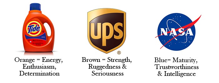
Color says a lot about your brand. In fact, studies show that color increases brand recognition by 80%. The human mind is programmed to respond to color. Because of color’s ability to impact behavior and emotions, color choice should be strongly influenced by the preferences of your target audience. By understanding a bit about color psychology and how to choose the right logo colors, you can highlight some of your brand’s key characteristics and connect with consumers.

An effective logo should have a design that conveys your brand personality, a style choice consistent with your identity, your business name, and a relevant color choice. Putting the necessary time and strategy into these decisions will pay off in the long run, get your brand noticed by the right people, and make a lasting impression.
Need some more ideas? Take a look through our logo maker to see hundreds of different designs.


