Color is the first thing you see in every logo, even when it isn’t the star element in a design. Our brains respond to the sensory language of color before we even process words or context. Yet, color is just one part of the story.
Think of a logo color scheme as a frame for interpreting your brand personality. Would the McDonald’s arches still excite joy and hunger if they were blue? Would the Target bullseye capture the thrill and energy of shopping if it were purple? A strong combination evokes the right emotions from your audience, while a weak one is confusing.
Armed with a clear brand story, you can choose colors that capture the feelings behind your brand. Need inspiration to get started? Keep these key factors in mind to choose the best logo color schemes for your business.
Industry design standards
Logo design presents a tricky dilemma. You want a logo to be unique and stand out from the crowd. On the other hand, people expect you to stick to design principles that define your industry. Have you ever noticed that red is the most commonly used color in the restaurant industry? That’s because red is a bold color that evokes excitement, energy, and hunger.
Since blue symbolizes trust and security, it’s the most common color for tech, financial, and communications companies. Eco-conscious brands tend to go with green, while purple is a popular choice for products that are indulgent or creative. Black reigns among luxury brands, and yellow is ideal for products linked to confidence and optimism.
Use industry standards as a starting point for your ideas. Being different is fine, but it should never be an accident. If you decide to stray from the norm, make intentional branding choices that add to your story.
Brand personality and values
Normally, you wouldn’t judge a book by its cover. But with logos, it’s smart to think on a basic level first. When you choose colors with strong associations, you can influence a viewer’s visceral reaction. Try coming up with a list of traits, emotions, and action words to describe your brand personality. Is your business authoritative? Traditional? Upbeat? Playful? Trendy? Edgy? Innovative? Sophisticated? Quirky?
What colors come to mind when you think about your brand values? Are you imagining more than one color? Colors that interact well from a visual and branding standpoint make the perfect foundation for a logo color scheme.
Take a look at the Dunkin Donuts logo for inspiration. It pairs the warmth and friendliness of orange with the sweet, happy feel of pink. Both colors are derived from red; and as a result, the entire design is cheerful and energetic. The final touches of brown tie back to the earthiness and comfort of enjoying baked goods and freshly ground coffee.
Brand positioning
Color choices make a statement about your position in the industry relative to other brands. After all, two businesses can sell similar products and have little in common.
Picture the differences between the sandwich restaurants Subway and Panera Bread. Both logos use green to represent fresh food you can trust. Yet, the yellow in the Subway logo brings out the brand’s fast service and playful marketing. When you look at the complete picture, it accurately portrays Subway as a fun, fresh, and affordable restaurant.
The green and beige palette of the Panera Bread logo goes in a different direction. The earthy color pairing mirrors a friendly, wholesome restaurant with housemade bread and natural ingredients.

Color fundamentals
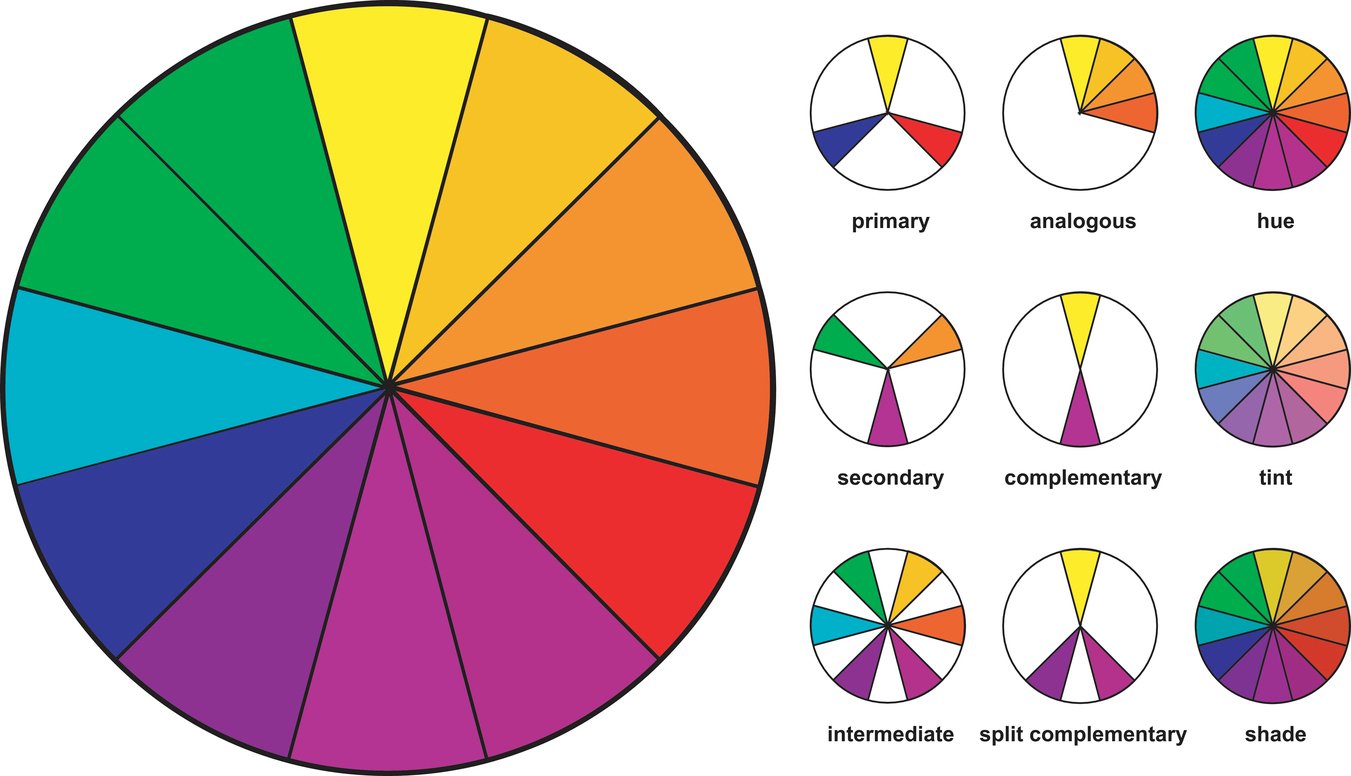
Trends change, but color fundamentals stay the same. No matter what look you want to achieve, look to these classic color relationships for ideas.
Monochromatic color schemes
A monochromatic color scheme uses color variations that come from the same base hue. You can use three techniques to change a hue. Adding white creates a tint, while adding black creates a shade. Blending different variations of gray with a hue creates a tone. Monochromatic schemes often use a lot of negative space to balance the subtle color shifts.
Examples: Animal Planet, Oreo, Willy Wonka Candy Co.

Primary color schemes
Red, yellow, and blue are the basis of all colors. Try breaking up these bright saturated hues with white or limiting one color to a small area. You can also ditch the full trio and scale down to two colors.
Examples: Burger King, Ikea, McDonald’s, Pepsi

Secondary and tertiary color schemes
Secondary colors are the product of blending primary colors. Tertiary colors are the result of mixing a primary color with an adjacent secondary color. For example, red and orange create red-orange, while yellow and orange create yellow-orange. Much like primary colors, secondary and tertiary colors are evenly distributed around the color wheel. As a result, they offer visual balance.
Examples: Phoenix Suns, FedEx, Slack

Complementary color schemes
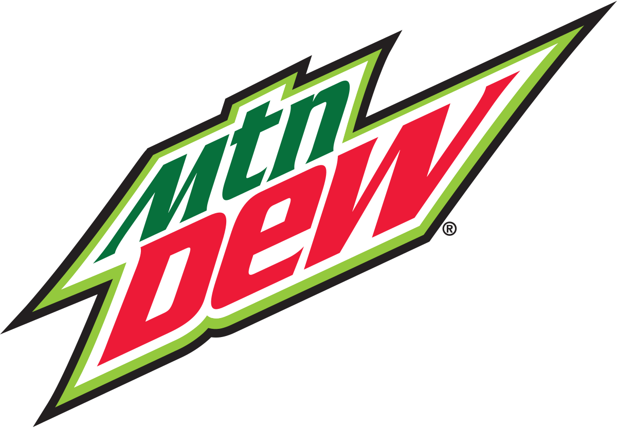
Ever wonder why red and green make the perfect Christmas colors? They’re complementary. Complements are directly opposite each other on the color wheel. For instance, blue and orange are complements, and so are yellow and purple. Complements all pair a warm and cool color, satisfying our natural desire for contrast.
Examples: Mountain Dew, Taco Bell, Mozilla Firefox
Analogous color schemes
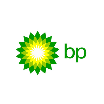
Looking for less contrast? An analogous scheme combines a color with the two (or four) adjacents hues. Let’s say you started with yellow-green. The two adjacent colors are yellow and green, as in the BP logo. Analogous color schemes are a popular choice for gradient logos.
Examples: BP, Instagram, Mastercard
Changing the tone and saturation of a color can help you tailor a palette to fit your brand. Want to be bold? Use more contrast and saturation. Prefer a more conservative look? Use fewer colors or lower their intensity.
Logo style and composition
Let the style of your logo dictate how much or how little color you use. A single color can have a big impact in a minimal logo, while mascots and shields are often detailed. Focus on maintaining the readability of the design. Not many people want to try to decipher a hand-drawn font written in blinding yellow.
Be thoughtful about how you break up color. Brands like NBC and Google prove that you can put multiple colors side by side. However, they work better when evenly distributed and contained in clear sections. Otherwise, use tones, tints, and shades to temper parts of a design.
Color variations are endless. It’s up to you to develop a color scheme that sends a compelling message about your brand.
Want to test out different logo colors? Use our logo maker to edit colors in your design.


