Times change, trends go out of style, and some logo designs start looking ripe for an update. Even the best logos have an eventual expiration date. By keeping up with trends, you can figure when it’s right to stand behind a classic logo or reinvent your brand mark.
A retro logo design can stand out in a good way and embody the personality of a classic brand. Throwback styles have the power to make people sentimental by celebrating bygone eras. On the other hand, bad retro designs are overloaded with outdated style elements that no one wants to see anymore.
Check out these good and bad retro logos to find out what works and what doesn’t.
Hermès
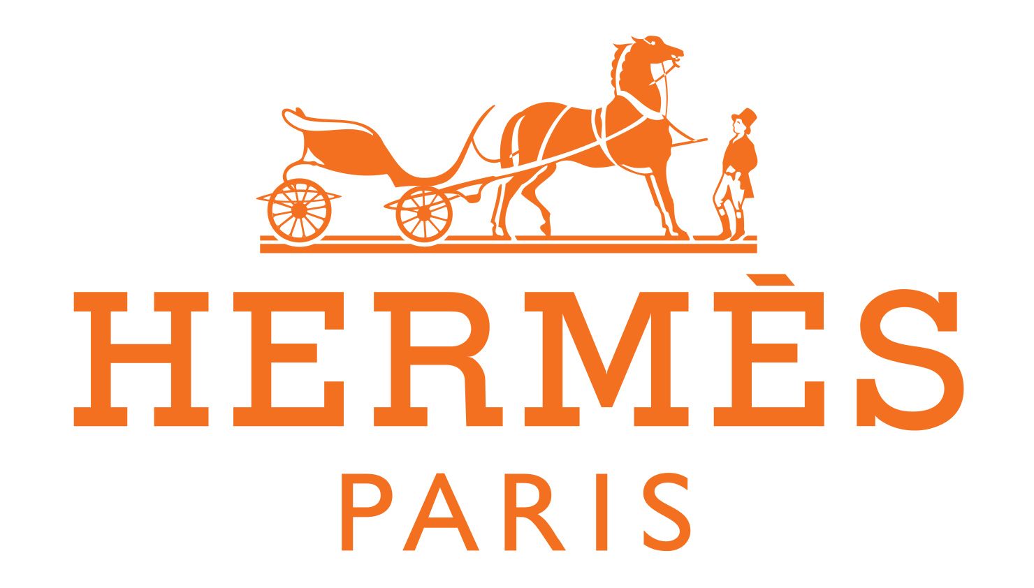
A logo of a horse-drawn carriage probably makes little sense if you’re unfamiliar with the origins of Hermès. The world-renowned French fashion house started out making equestrian accessories in 1837. Instead of lining up for coveted Birkin bags, patrons came for custom harnesses, saddles, helmets, and blankets.
At first glance, this retro logo might seem like a relic of days past. After all, innovation is key in fashion. But for a brand that’s been around for 181 years, it’s just as important to project a long history of luxury and success. The warm orange color scheme exudes joy, youth, and creativity, even while the quaint illustration makes you think of heritage.
Capri Sun

The Capri Sun wordmark hasn’t changed much since the brand’s US debut in 1981, and you can tell. Capitalized block letters with 3D shadowing is a common staple of 1980s and 90s design. The bold outline and faded color scheme also result in a washed-out look that is heavily dated.
Although the Capri Sun logo has been redesigned a few times over the last four decades, the subtle updates are barely noticeable. A brighter color scheme, modern typeface, and refreshed layout could work wonders to revitalize this tired logo design.
Morton Salt

Who can imagine a canister of Morton Salt without the legendary girl holding an umbrella? Since the Morton Salt Girl debuted in 1914, the logo has become one of the most recognized brand marks in the country.
Morton Salt has restyled the girl’s appearance and clothing several times over the last century, but the story and message haven’t faded at all. The company cooked up the famous slogan “When it rains, it pours,” to promote a new free-flowing table salt that wouldn’t clump even in the rain.
Most recently, Morton Salt released a scaled-down illustration to keep up with modern trends while maintaining a vintage spirit that’s true to the brand.
WestJet
![]()
Judging by this abstract logomark for WestJet Airlines, the company’s branding may be a bit stuck in the past. The Canadian airline obviously tried to create a symbol with ties to the national symbol and the idea of air travel.
Unfortunately, the end product looks like old-school clipart thrown together by an amateur. The new logo was only introduced in 2016, with the leaf portion added to the original triangle symbol. But somehow, the design already feels outdated.
Clumsy spacing plagues the wordmark, and nothing about the logo offers a fresh perspective or a window into the brand story. Scrapping the whole design and starting from scratch is the best way to make this stale logo feel new again.
New York Times
![]()
Writing and storytelling are among the oldest professions in the world, so it’s no surprise that the New York Times chose a retro logo design. Since the mid-19th century, the newspaper has used a custom calligraphic typeface similar to the Olde English font.
Despite its highly decorative flourishes, the wordmark is easy to read and memorable to people around the country. The antique lettering is formal and dignified — writing you expect to see among scholars, royals, and clergy.
Instead of looking outdated, the tone of the design portrays news reporting as a time-honored institution.
Sonic
Old-fashioned fast food joints have a way of winning people over and sticking around for decades. Restaurants like Sonic Drive-In and In-N-Out Burger are great examples of brands that use nostalgia as a selling point.
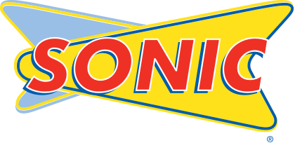
The Sonic logo is a playful tribute to 1950s and 60s restaurant signs. A bright palette of primary colors appeals to hungry diners, and the bold contrasting borders harken back to a time when neon signs lit up the night.
University of Kansas Jayhawks
Colleges and sports teams have a bad habit of keeping outmoded logos around too long. Since these energetic logos are often packed with color, simpler designs look more crisp and readable.
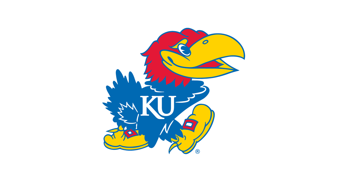
The University of Kansas Jayhawk logo is a prime candidate for a redesign. The feathered mascot is clearly doing something, but it’s hard to tell exactly what. The bird’s strangely contorted stance is hard to make out, and the body details are so murky that it’s a challenge to tell if you’re looking at the bird’s wings or rear end.
When a logo design is confusing or just plain uninspired, it’s definitely time for an update.
King Arthur Flour
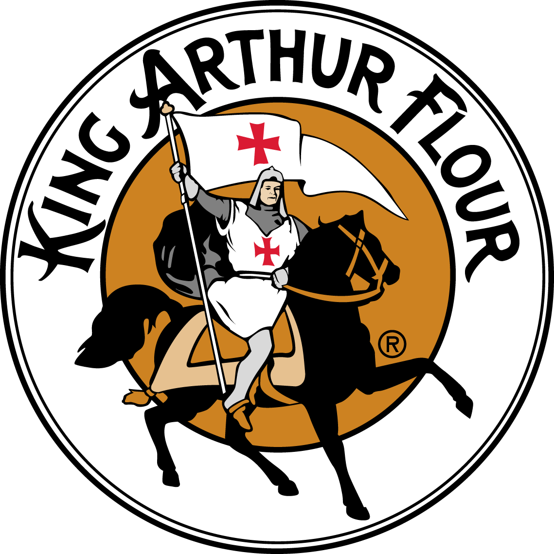
Black and brown coloring doesn’t make the most cheerful color scheme, but it works for King Arthur Flour. The colors tie in with the pure, earthy appearance of homegrown grains — the star ingredient behind the brand. The logo features an armor-clad bannerman sitting upon a horse while waving a flag.
As the first flour company in America, the 230-year-old brand is steeped in history and national pride. The company started out importing flour from Britain less than a decade after the American Revolution ended, and its distinct logo is a tribute to the eternal ties between these countries.
Co-owner George Wood adopted the King Arthur name in the late 1800s after seeing a musical performance. Whatever his reasons for choosing it, the legendary warrior fit the concept of a premium product that could create baked goods worthy of the most respected figures in American society.
A&W Restaurants

A&W is another food brand that isn’t afraid to use a brown logo. The restaurant and beverage brand has used variations of this oval design for 50 years, so it’s rightfully earned a spot on our list of retro logos.
The problem is brown is a tricky color to use in food logos. While it’s a warm, neutral color, brown can come across as too dull or muddy in the wrong context. Fortunately, A&W is most well known for its root beer, which helps this logo steer clear of the unappetizing connotations of brown. Retro color scheme aside, the logo isn’t exceptional or terrible — just average.
As you design your own logo, focus on the personality and tone you want to convey. Capturing the right values is more important than sticking closely to trends.
Since you can’t predict the future of design, it’s better to develop a versatile logo that can evolve with your brand. A retro logo can make an impact for years to come as long as it stays relevant to the brand image you’re trying to portray.
Ready to create a logo for your business? Get started now!


