Millennials — born roughly between 1980 and 2000 — are now the largest generation with a collective buying power of $200 billion. And if you listen to all the media buzz about Gen Y, you might be worried about how to connect with this growing audience. As a small business owner, you’re in the best position to offer the fresh, authentic perspective millennials look for in a brand.
It’s true. Millennials are a tech-savvy tribe of digital natives that crave engaging experiences online. Gen Y expects speed, convenience, and a customer-first attitude, but they repay you tenfold through word-of-mouth promotion. When millennials see you as a trustworthy, civic-minded business, they become loyal advocates for your brand.
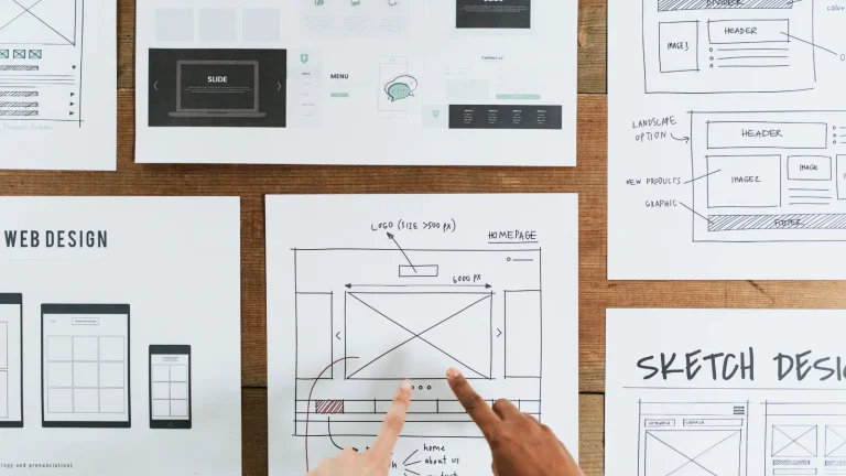
What’s the best way to tap into this energetic customer base? Build a dynamic brand that gets people excited to do business with you. Start by crafting a visual narrative that radiates personality to your audience. Follow these design tips to create a logo that appeals to millennials.
How To Design a Logo Millennials Will Love
Have a Well-Defined Vision
Today’s young adults have grown up in a digitally connected world where opinions are like currency. Not to mention, web users routinely call out the worst logo designs they can find. If you unveil a confusing (or downright terrible) logo, millennials will have something to say about it.
Make sure your logo has a clear message and projects a positive, refreshing image of your brand. Keep these elements in mind as you develop a design concept.
- Target audience: Who are you speaking to? Don’t get up caught in millennial stereotypes. Go deeper to understand the specific interests of core customer segments. How do your brand goals relate to your niche?
- Brand identity: Design a logo that fits the tone of your business. Otherwise, you’ll set up expectations you can’t fulfill. Millennials are naturally skeptical of businesses that have an inconsistent image.
- Originality: If you can look around and spot 10 logo designs that are similar to your concept, start over. A good logo should make your brand easy to distinguish from competitors.
Go for the Nostalgia Factor
Gen Y is used to having a myriad of technology and entertainment at their fingertips. But newer, bigger, faster, shinier things do get boring from time to time. Millennials came of age in a time of rapid, relentless advancement. The downside? Consumer fatigue. You can make a lasting impression on millennial audiences by inspiring them to think, “Remember when…?”
Set yourself apart from competitors by using retro aesthetics, especially from the 1980s and 1990s. In 2017, the Syfy Channel rebranded with a new wordmark for the network’s 25th anniversary. Instead of an ultra-modern look, Syfy revealed an analog-inspired logo that perfectly fits the genre.
Studies have shown that millennials are more nostalgic than previous generations. Young adults are excited by the opportunities created by change, but equally long for the simpler pleasures of the past. Use this youthful nostalgia to your advantage. A thoughtful throwback instantly makes your audience feel something.
Do More With Less
Millennials are primarily responsible for renewed interest in minimalism. The desire for clean, simplistic shapes is an instinctive reaction to design overload. Social media is also a factor. With so much brand engagement happening online, it’s essential to create responsive logo designs that stand out on small screens.
From McDonald’s to Google, brands in every industry have stripped their logos down to the bare essentials. Follow their lead, and look for ways to declutter your logo throughout the design process Some common elements to focus on include:
- Shape/detail: Are there unnecessary lines or shapes in your rough draft? Can you remove extraneous elements and still get the same message across?
Design inspiration: Picture how PayPal made subtle changes to its familiar monogram for a more streamlined look. The brand removed the cutout from the letter “P” and used transparency to add an exciting feature to the design.
- Color: Bold, unexpected hues go hand in hand with minimalist design. After all, a winning color scheme can come to define a brand. Don’t be afraid to try vivid colors. However, aim for versatile palettes that you can quickly shuffle around. Use smart layouts to break up color, so it doesn’t overwhelm the eyes.
Design inspiration: Look to brands like Slack, Kijiji, and LG for guidance. Color is the most striking aspect of each logo design, which makes them easy to remember.
- Focal points: Do you like to go crazy with embellishment? Make a statement, but limit the logo to one or two standout features. Too many competing elements will make your design jumbled and hard to recall. If you’re using a vibrant color scheme and a decorative font, keep the logomark as uncomplicated as possible.
Design inspiration: Think flat. Social media icons provide plentiful examples of brand logos with the perfect balance of simplicity and artistic flair.
Invent Unique Typography
Worried that a standalone wordmark won’t make an impact? Great typography can command attention all on its own, especially if it’s unique to your business. Consider designing your typography to create a one-of-a-kind aesthetic for your brand.
A hand-drawn font is one way to capture the homegrown spirit that millennials love. Hand-drawn typography is charming and down-to-earth. This sense of authenticity differentiates a smaller business from cold corporate identities and provides instant recognition for your brand. You can sketch out your ideas and vectorize the final draft for digital media.
Prefer a simpler approach? Hire a typography designer or customize an existing font. Free fonts are readily available online, and you can use a logo maker or font editor to test different variations. Play around with elements such as height, width, spacing, and orientation. Try exaggerating the stems of different letters or simplifying the lines.
If you’re planning a DIY project as a total novice, it’s helpful to stick with a focal letter or section. You can add a wow factor by merely using a contrasting color, flipping the orientation, or manipulating the white space.
Examples: Vespa, Mozilla, BOA Fit System
Think About Movement and Versatility
Stop thinking of logos as a static entity. Much like the TV ads of yesteryear, digital media has expanded the role of a brandmark. As you design, think about how your logo will look when in motion. Can your logo interact with other visual elements?
Animating a logo and incorporating it into broader brand narratives are smart methods of storytelling. Giving your logo a story within itself brings added value and personality to your brand — qualities which resonate with Gen Y.
Millennials express personal values through the brands they love. If you want to reach this engaged audience, your logo design has to tell a compelling story about your business. Keep it simple, but not generic. Gen Y is drawn to brands that make a statement and offer a distinct point of view. Focus on being honest and highlighting the core qualities that make your products and services special.
Ready to develop a unique brand aesthetic? Get started by creating a free logo design that embodies your brand promises.


