Creating a logo is equal parts design expertise and understanding human psychology. A logo makes a powerful first impression and creates a bond with your customers from the first time they see it. Some people even go so far as to tattoo their favorite logos on their body!
To get that kind of loyalty, your company needs to focus on a few elements, not the least of which is the best color combinations. In fact, the color combination you choose could mean the difference between inviting brand new customers and telling them they should stay away from you.
Sound complicated? Don’t worry. We’re here to explain it all and help you pick the best color combinations when making your logo based on the industry you’re in.
Why Consider the Best Color Combinations?
While each design element in a logo plays an important role in making it the strongest possible design, the color combination a designer chooses is essential. Color, unlike typeface, evokes emotions immediately. While some symbols or type choices might stir emotions, every single color you show a person will be associated with an emotion of some kind.
The boldest color combinations in logos inspire emotions like love, nostalgia, trust, and excitement. While other color schemes might be more subtle, they still serve the mission of the company. The best color combinations get the customer to feel exactly what that company wants them to feel.
Before you decide on the best color combination for your company, consider the psychology behind each color and how they relate to your industry.
Entertainment Industry Color Combinations
Broadly speaking, businesses in the entertainment industry want their customers to feel lively, excited and important. Of course, different companies will want more specific feelings. A hip hop record label, for example, might be looking for a color combination that exudes strength, while a streaming service for kids probably wants to seem approachable and mild. Both companies, however, want people to know that they are fun and something people are drawn to.
The best foundational colors for the entertainment industry are purple, red and yellow. Purple evokes a feeling of royalty for people, which makes total sense. When you think of the most important people in Western culture, most of them are celebrities and entertainers. Red gives people a sense of passion. When you think about the dedication it takes to become an entertainer, passion is one of the first things that comes to mind. And yellow is lively and fun — exactly the emotions a person would want to feel at a red carpet event or a concert.
For example, look at the different iterations of the E! Entertainment logo. E! is the best example of an entertainment company, and their logo’s most prominent colors in the last few decades have been red or purple.
While purple and yellow do go together as an excellent color combination (the iconic Los Angeles Lakers come to mind), red and purple are not the best color combination. Try choosing a base color based on your company’s mission and building around that.
Best Color Combinations in the Food Industry
If there’s one thing people are particular about, it’s their food. Of all the other industries, the food industry is one that has to be particularly careful when choosing the best color combinations for their logos.
No matter what way your company is involved in the food industry, it’s important to portray freshness and trust to your consumers. The first color that perhaps comes to mind when you read fresh was green. For many, green signifies renewal and life. If you sell packaged foods sold in the grocery store, a green logo on the product will stand out on the shelves and signify to customers that the item is nutritious. When you create a green and white color combination, you’re inspiring a feeling of fresh, pure products.
That’s less important for a restaurant. Instead, you want to simultaneously inspire hunger and prove you’re a fun place to visit. The combination of red’s bold emotions (like hunger) and yellow’s association with a bright, lively atmosphere create the best color combination for restaurants. For proof, just think of the most iconic food logo in America — the red and gold of McDonald’s.
A color combination to avoid in the food industry is anything where brown is the prominent color. Where green is associated with life, brown is associated with destitution and loneliness — definitely not what will bring people into your restaurant.
Health Care Industry Color Combinations to Consider
Health care companies want to be seen as a reliable, calming place to be. When patients have health concerns, they want to know that they can immediately trust that they are in good hands and everyone knows what they’re doing.
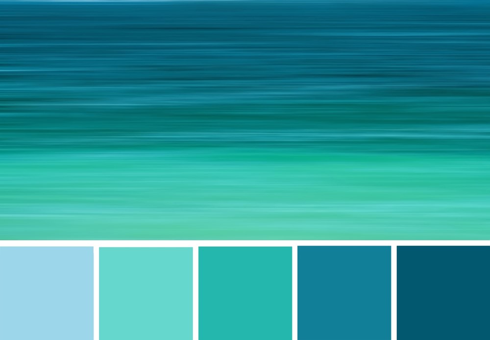
Blue is the right color to build your logo around. In fact, blue and white is the best color combination for your health care company. Blue signifies serenity and trust, while white tends to make people think about pureness. Together, they tell your patients you are a clean, competent facility full of trustworthy professionals (the Blue Cross logo comes to mind).
Color combinations to avoid if you’re in the health care industry are reds and yellows. Red is closely associated with an emergency and often creates subtle panic in someone. Similarly, yellow is the sign for caution. When you’re trying to help people, you don’t want your logo to create any kind of unnecessary worry.
Best Color Combinations for the Construction Industry
In the construction industry, you want your customers to feel you’re dependable, competent and sometimes a little rugged. Traditionally, construction companies skew masculine, so feminine colors like pink probably won’t evoke the right feelings towards your business. Browns and grays, however, are the perfect base to build your color combinations around.
Since gray is an easy middle ground, it often serves as a great combination with other, more bold colors. The best color combination for your logo might be a grey that is a bit serious and signifies classic sophistication plus a blue that proves you’re competent and trustworthy.
Create Vibrant Color Combinations for the Retail Industry
In the retail industry, the best logo color schemes tell the customer that they will be their best selves as soon as they purchase products from this brand. Different demographics will require different color combinations to speak to their best selves, sure. But everyone wants to feel like they’re one product away from being who they want to be.
Take The Home Depot, for example. They chose a bold orange and white combination that signifies energy, fun and a little mischief. They’re letting their customers know that taking the harder DIY path is celebrated in their stores. On the opposite side of the spectrum, a place like Forever 21 chose a yellow and black combination to tell their customers that they have youthful, trendy pieces (yellow), that still have a layer of sophistication (black).
To understand what the best color combination is for your retail company, think about what your customers feel like they’re missing. For example, if you think your customers are looking to feel important, you might want to create a combination of some purples and dark blues for your logo. But if they are looking to be playful and approachable, the best color combinations for you include pinks, yellows, and greens.
Choosing the Best Color Combinations for Your Logo
The final secret to identifying the best color combination for your company is to recognize that there are no hard rules. You know your customer and your company’s mission best. You can use any color combination you want (as long as it looks good). To get help creating the best logo that says exactly what you want it to say, check out our logo design services. We’ll show you the best options available to you based on your preferences and needs.
