Colors have a unique way of attracting everyone’s attention.
In the offset of the 20th century when computers had started controlling how a man works, the web designers of this time used to expand their color scheme by adding unique elements into their website.
In the 21st century, web designers now use gradients to create bold statements. Gradients channel viewer emotions. They also help visitors to connect with a product or the idea.
Currently, the use of gradients in logo design is gaining grounds in the market. Many people adore an excellent gradient logo. The best gradients will let designers create something that feels new through blending colors.
In this article, we have the pleasure to discuss how you can make a gradient logo design that looks unique, modern, and refreshing.
How to Make a Gradient Logo Design
Many times when we see logos, and they have a gradient to them. You will notice how nice they are in different colors. This is because they are all made up of gradients. But how can one make a fantastic color gradient logo? Well, we got you covered. Let’s start with the basics.
Where Can You Begin?
We all know how confusing it might be for you to start designing a gradient logo. For starters, you will need to know that a beautiful gradient is created by two or more shades to bring one constituent with a moderately fading color shift into them.
Here are more schemes and ideas that we have picked up to help you learn how to create a gradient logo.
Choice of Colors
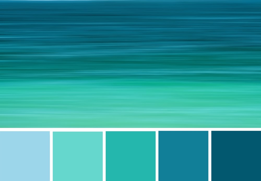
So, how does one choose colors? Well, you can draw inspiration from nature. When running out of ideas, get out and look at what the environment has to offer.
You have the choice of using a gradient to air different ideas. You can choose a brilliant color for your clients to see. You can select a dark gradient to create a sense of shape. Also, a dull color can reduce its visual weight.
Choose Colors That Are Close
We would advise you to choose hues that are adjacent to each other. This is because they will deliver a flashy revamping in a gradient as contrasted to colors which are not close. This is because they cancel out each other’s brightness.

Add a Third Stop Gradient
When doing a gradient design, you can add a third stop in the gradient, which is halfway between the original two colors. You can replace the dull color along with the gradient transition with a more pleasing color.
When generating a gradient from a solid color to clear color, alias the color fade effect, the two stops must have duplicate colors. Use of many colors means at the midpoint means you have to transition phase color at a 50% opacity rather than the visually smooth effect.
Now, here is the real deal. You can as well create as many stops in the gradient logo to get more control over the transition.
What Next?
Ensure that the gradients are creatively used in the logo. Also, the gradient logo should be relevant to the brand. To enhance your design, you can make use of subtle gradients.
Start designing your gradient logo today with our logo maker.


