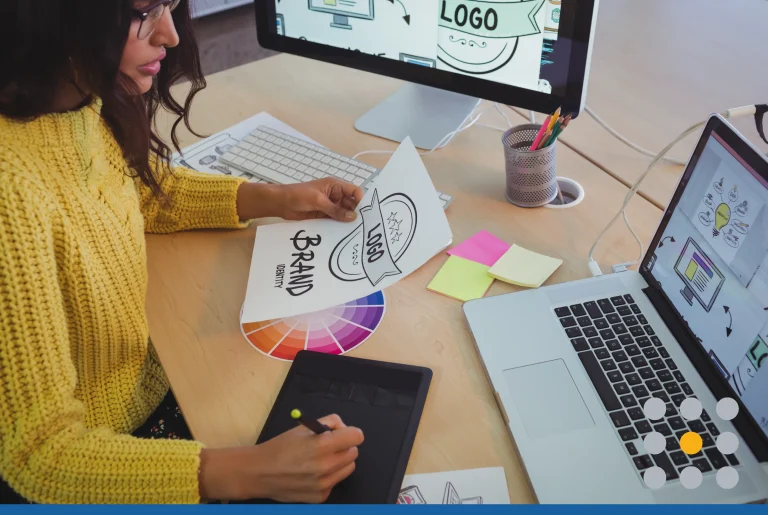
Great logos are deceptively simple; so to the untrained eye, they seem easy to create. The perfectly balanced logo designs you see every day are the product of obsessive tweaking. Expert designers are so skilled at unifying shapes, colors, and layouts that their work looks effortless.
Yet, hiring a designer to handle the entire process isn’t always an option. Maybe you’re working with a tight budget or already have a strong concept in mind. Whatever the case, check out these design basics before you make your own logo.
1. Gather design inspiration
Visuals draw your eyes to simple details that make a great logo jump off the page. Learning to spot attractive design elements can help you narrow down your style choices.
Look to logos from successful brands and designers for inspiration. You can print out images, save them on a computer or create a web album on websites such as Pinterest. Try to visually dissect your favorite picks, taking note of the form and placement of each shape. Here are sample elements to keep in mind:
- Are the lines sharp, round, or a combination of both?
- Is the design symmetrical? If not, what other elements create balance?
- How does the design use centered or off-center elements?
- How do the shapes interact? Are they adjacent? Stacked? Overlapping? Concentric?
- Are the colors complementary? Contrasting? Monochromatic? Neutral?
- Does the design include white space? Broken lines or shapes?
Pay attention to patterns and trends that stand out, especially in your industry. Consumer perception is a big part of branding. Imagine visiting a bank with a wacky mascot logo and fun, youthful brand colors. A bank has to inspire trust, so it needs an authoritative logo that matches its brand identity.
2. Decide on a custom or stock design
Does the mere thought of an art project make you cringe? A logo maker is a do-it-yourself option to get a ready-made design or mock-up without any art skills. Logo makers provide design templates with images and font pairings to help you try out a variety of looks. They are tailored to beginners, and you can customize a design with just a few simple tweaks.
On the other hand, an original custom logo can set your business apart, giving you more distinction and brand recognition. The custom route takes more time, effort and patience, but you can simplify a design to fit your skill level.
Using a stock design can work in some situations if you don’t want to make your own logo from scratch. For example:
- You have an established business with a loyal customer base.
- You operate locally and have few direct competitors.
- Your operate locally and have strong branding through other channels.
- Your overall branding goes against industry norms.
A custom logo is typically a good option if your business is new or online. Growing businesses are under more pressure to build an audience, and it’s easier to stand out with a custom logo.
3. Plan to transform a template
When you’re going with a logo maker, look for programs with a big library of editable templates. The more power you have to customize the design, the better it will be. Customization reduces the chance of running into another business with a similar logo.
Choose a template with a symbol you like, and then change the fonts and colors to make the design your own. When it makes sense, go with a symbol that has strong ties to your business name, but not your industry.

Consider how Fruit of the Loom uses food on an underwear brand, an uncommon association. Yet, it perfectly conveys the message behind the brand name.
You should also play around with word placement. Deviating from the standard look — a logomark above a business name — can immediately add visual impact. Here are common ways to transform a template:
- Framing: Arrange the words around the logomark in a box or circle (Starbucks, NBC )
- Two-tone: Use a different color on adjacent words for contrast (Beats Audio)
- Stacking: Stack multiple words with right, left or off-center alignment (Land Rover)
- Orientation change: Alter the direction of the words or use a nonlinear layout (Home Depot, Ocean Spray)
If you aren’t planning to use a logomark at all, it’s even more important to be unique with the lettering.
4. Choose the right logo design software
Steer clear of software that isn’t designed for making hiqh-quality images. It’s tempting to go straight to programs you’re familiar with, but you’ll hit a brick wall before you know it. With programs such as Microsoft Paint or Powerpoint, you lose clarity the more you resize and edit a logo.
For the best results, you need to work with vector files, which are scalable. Common files types include .ai, .eps and .svg. These file types also allow you to create transparent backgrounds, so you can display a clean logo on any medium. Choose a pro software, such as Adobe Illustrator and CorelDraw, or free options, such as GIMP.
If you’re not comfortable designing in a vector format, you can convert another file type to a vector. Just make sure the original design is large and clear to retain as much quality as possible.
5. Brainstorm ideas on paper
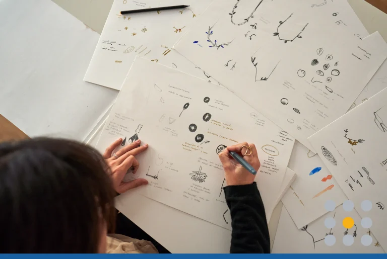
Creating a completely new logo design? Use hand-drawn drafts in pen or pencil to work out your design. Try not to worry too much about your art skills. The goal is to be less restrictive with your initial ideas. Doodling is like setting your brain free to release all your creative power on paper. If you start with a beginner design software, you’re more likely to limit yourself to available shapes and symbols.
Don’t throw out your failed sketches. Put several doodles on the same page to compare the changes. Why not test out a few hand-drawn fonts as well? Watch the logo process evolve to hone in on what works and what doesn’t. Then, you can try out new combos pairing the features you like.
6. Build upon simple shapes
Think like the pros, and let shapes be your guide. Designers use basic shapes to perfect the form of a logo and create more complex shapes. This technique is an easy way to preserve symmetry and proportion and avoid misshapen lines. Consider these smart ways to build from shapes:
Layering: Overlapping simple shapes can help you create the outline of a bigger shape. Whether you realize it or not, you probably learned this skill in grade school. Imagine drawing a rabbit logo. Try looking for familiar shapes in the rabbit’s form. Upon closer look, you’ll notice the body is mostly made up of circles and ovals.
Reduction: Use basic shapes and layering, and then erase portions to reveal negative space. Picture logos from major brands, such as Pepsi, Adidas, and Mitsubishi.
Substitution: Shapes can also serve as placeholders when you want a balanced, beautiful logo form. Think about the famous “byte” in the Apple logo. A designer would use a circle to create the perfect cutout. Even though the circle isn’t part of the design, it helps to achieve a balanced and proportionate curve in the apple.
7. Choose your color palette
After building out your logo shape and design, start to think about what colors you want represented in your brand. According to Adobe Create, there are 3 simple things to consider when choosing the right logo color palette:
- Start your logo in black and white. The logo is more memorable than the color.
- Use colors to standout. Choose a color story that separates you from the competition in your industry.
- Consider the context of your color palette. Make sure the colors you choose translate well from print on your marketing materials to your website and social media. Also consider color meanings in different industries and geographical locations.
Logo design is a challenge, and you’ll probably come up with more bad ideas than good ones. But don’t get discouraged. Removing all the elements that don’t fit is how you create a winning design. Get feedback as you bring your design to life. Stepping outside your creative perspective once in a while helps you spot flaws and edit like a professional.
If you don’t have the time or patience to make your own logo, consider trying our logo maker. Choose from thousands of different designs to find the perfect business logo.


