Color is what brings a design to life. Imagine looking up at the Sistine Chapel and seeing that it’s in black and white. It would still be a remarkable work of art, but it would be missing a fundamental aspect that makes it special. The same can be said for a logo.
Choosing the right logo color scheme is one of the most important steps in logo design. Colors create feelings, set the tone for your brand, and make a lasting impression. The human eye can distinguish over one million different colors. With so many color combinations available, it can be daunting to choose one to represent your company.
In this article, we’ll discuss the ins and outs of color theory, explain why certain colors go together while others don’t, and provide you with some amazing color combinations that you can use for your logo design.
- Understanding Color Theory for Logo Design
- Color Psychology in Logo Design
- Best Practices for Choosing Logo Color Combinations
- 30 Stunning Logo Color Combinations

Understanding Color Theory for Logo Design
Before exploring specific color combinations, let’s review the basics of color theory and how colors work together.
First things first: What is color? Simply put, color is how your eyes and brain perceive light reflected in your environment. Light is a type of electromagnetic radiation transmitted in waves of energy all around you. All objects give off light, and different wavelengths create a spectrum of colors.
Your brain processes color before form, words, or motion, so when it comes to logo design, color is the very first thing that your audience will interact with. People are far more likely to remember your brand’s color scheme than any particular design details.
What Is Color Theory?
Now that we know what color is, let’s dive into the theory to understand it a bit better. Color theory describes the behavior of colors, including color mixing, color contrast effects, color harmony, color schemes, and color symbolism.
Color theory (also known as color science) dates back thousands of years to Aristotle. While color theory has all sorts of useful scientific applications, we’ll use it to better understand how colors interact and which colors create the most appealing combinations.
The Color Wheel
If you’ve ever taken an art class in school, you’ve likely come across a color wheel before. A color wheel is an illustrative tool used to help us define colors and their relationships to one another. There are two main types of color wheel, subtractive and additive, based on the two ways you can produce color.
- Subtractive: The subtractive color wheel starts with white, and then colorants are used to make the surface reflect a different color to our eyes. The primary colors for this wheel are red, yellow, and blue.
- Additive: The additive color wheel starts with black and mixes different amounts of colored light to create all the colors in the visible light spectrum. The primary colors on this color wheel are red, green, and blue.
When it comes to design work, you’ll mainly be working with the subtractive color wheel. However, most digital screens create color using the additive color method, so it is good to be familiar with both.
The Different Types of Color
One of the main uses of the color wheel is to help us recognize the visual relationships between colors. By looking at the placement of colors on the color wheel, we can come up with groupings of different colors that work well with one another for a variety of purposes.
Certain colors combine well, while others clash. Here are the different types of colors:
- Primary colors: The three primary colors are the foundation of the color wheel. They are called primary because they cannot be created by mixing any other color combinations and all other colors are derived from these three hues.
- Secondary colors: Secondary colors are created by mixing equal parts of two primary colors together.
- Tertiary colors: Tertiary colors are created by mixing equal parts of a primary and secondary color together.
- Complementary colors: Colors that are opposite each other on the color wheel (e.g., dark blue & bright orange). These create high-contrast and vibrant designs.
- Analogous colors: Colors next to each other on the color wheel (e.g., blue-violet & deep purple). They offer harmony and balance through subtle color variation.
- Triadic colors: Three evenly spaced colors on the color wheel (e.g., red, blue, and yellow). They create dynamic and colorful logos.
- Tetradic colors: Two pairs of complementary colors that form a rectangle on the color wheel (e.g., deep red, bright green, royal blue, and orange).
- Monochromatic Colors: Different shades and tones of a single color (e.g., light blue & royal blue). This approach provides sophistication and consistency. Monochromatic logos have become increasingly popular in recent years.
Now that you have a good grasp of color theory, you can use FreeLogoServices’ Logo Maker tool to try out thousands of different color combinations to find which one works best for you.

Color Psychology in Logo Design
Don’t underestimate the psychological effect that color can have on your audience. A well-chosen color combination can have a profound impact, evoking certain emotions and establishing a long-lasting connection.
In this section, we’ll go over some of the most commonly used logo colors and what they represent.
- Red: Red is used to describe bold and intense experiences. It represents indulgent emotions and actions, such as fire, love, passion, hunger, anger, energy, violence, and danger.
- Blue: Blue is linked to trust, stability, and professionalism, making it one of the most popular logo colors for technology brands that want to convey a sense of reliability.
- Green: Green often symbolizes nature, growth, and health. Environmentally conscious brands use the color green to evoke a sense of fertility, abundance, and renewal.
- Yellow: Yellow is a very optimistic color that is often associated with warmth and happiness. Companies use yellow to radiate positivity.
- Orange: Like red and yellow, orange is fun, bold, and energetic. It is synonymous with fire and autumn, linking it to warmth and a bountiful harvest.
- Purple: Purple is linked to power, wealth, and royalty. Some of the top luxury brands in the world use a deep purple color to indicate exclusivity and premium quality.
- White: White is universally linked to a sense of purity and cleanliness. Many minimalist logos use white to create a feeling of order and organization.
- Black: Black embodies power, elegance, and sophistication. Sleek and simple logo designs often benefit from the stack contrast that black provides.
Importance of Logo Color Combinations in Branding
Logo color combinations play a pivotal role in branding, influencing our perception and making us feel a certain way. When you see the bright red Coca-Cola logo, you are instantly transported to drinking an ice-cold Coke on a hot summer day.
Studies show that certain colors evoke certain emotions. For example, the color blue is linked to trustworthiness. Choosing the right logo color scheme can unlock hundreds of culturally loaded interpretations in the human brain. You can leverage these connections to elevate your own brand and reach your target audience.
The Best Logo Color Combinations for Different Industries
Just because a color scheme looks visually appealing doesn’t mean that it will work for your particular company. A bright and vibrant logo with pinks and purples might be the right fit for a daycare but would not be a great fit for a financial institution. We’ll go over some color scheme suggestions that would be appropriate for different industries.
- Technology and innovation: Blues and whites are commonly used in the technology industry. These colors can create a sense of professionalism and sophistication. Examples of technology and innovation companies that use blues and whites include LinkedIn and Facebook.
- Food and beverage: Warm and earthy tones are commonly used in the food and beverage industry. These colors can create a sense of warmth and approachability. Examples of companies that use these tones include Starbucks and Coca-Cola.
- Finance and banking: The finance and banking industry commonly uses professional and conservative color combinations. For example, institutions like Chase and BNP Paribas often use navy blue, pale yellow, and forest green to create a sense of trust and reliability.

Best Practices for Choosing Logo Color Combinations
There is no one-size-fits-all approach to choosing a logo color combination. Each company has unique elements that need to be represented within your color scheme. That being said, we’ve put together a few tips and tricks to help you along the process.
1. Know Your Brand Identity
Understanding your brand’s values and personality is paramount when choosing a logo color scheme. You want to use colors that are visually appealing and stand out among your competitors, but you also want those colors to align with your core principles. Studying your target audience and your brand’s unique selling points will help you stay on the right track.
2. Research Your Competitors
Research your competitors’ logo designs to understand what works and what doesn’t. Looking at other companies in your industry can help spark inspiration. But be careful not to copy your competitor’s designs, or there could be legal ramifications.
3. Keep It Simple
Use a simple and consistent color palette. While you can use as many colors as you’d like, we recommend choosing between one and three colors in your logo design. Using too many logo color combinations can make your design seem cluttered and unfocused. Choose a dominant color to appear across all your branding assets, including a brand style guide.
If you need help designing your company logo, FreeLogoServices has thousands of professional templates that are fully customizable so you can hone your logo color combinations to your liking.
30 Stunning Logo Color Combinations
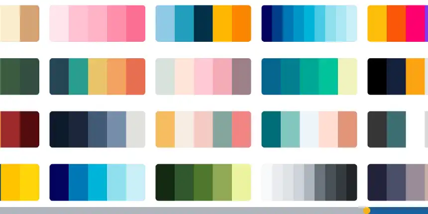
Here are some of our favorite logo color combinations to give you some inspiration for your own logo design.
1. Dark Blue & Bright Orange
A striking contrast that balances professionalism with energy. Dark blue conveys trust, while bright orange adds a punch of enthusiasm. Perfect for corporate branding or sports teams.
Examples: The New York Knicks, The Edmonton Oilers, Fanta, Mozilla Firefox
2. Light Blue & Royal Blue
A blue color scheme exudes stability and sophistication. This monochromatic color combination is great for businesses that want to appear reliable and forward-thinking.
Examples: Windows, Ford, Cinnabon, Geico, Paypal
3. Blue Violet & Deep Purple
A regal, mysterious pairing. These colors work well for luxury brands or companies that want a touch of exclusivity.
Examples: Wimbledon, NYU, Cadbury, Hallmark
4. Forest Green & Soft Gray
A natural and calming logo color palette, ideal for brands that focus on sustainability, wellness, or organic products.
Examples: Land Rover, Starbucks, Lacoste, Whole Foods
5. Canary Yellow & Dark Gray
A perfectly balanced mix of bold and neutral tones. This duo is eye-catching yet sophisticated, ideal for tech startups or creative agencies.
Examples: Bic, Post-It, UPS, DeWalt, Nikon
6. Aqua Blue & White
A crisp, clean look that’s popular in healthcare and tech industries. The white logo pops against an aqua background.
Examples: Pfizer, Cisco, Skype
7. Blue Gray & Soft Gray
This gray tones combination is sleek and modern. Great for brands that want a professional and minimalist look.
Examples: GM, GAP, Lowe’s, Intel
8. Bright Primary Colors (Red, Blue, Yellow)
A bold and fun three-color logo combination that captures energy and excitement. Perfect for kids’ brands or anything playful.
Examples: Burger King, Slack, eBay, Dairy Queen
9. Hot Pink & Neon Green
A rebellious, high-energy pairing that screams fun. Ideal for fashion, entertainment, or nightlife brands.
Examples: Sweet Frog, Wicked, Poppi
10. Coral Pink & Yellow Orange
A warm, summery palette that feels welcoming and cheerful. These colors are often melded together using a gradient to create an exciting and inviting logo design.
Examples: Dunken Donuts, Tinder, Instagram
11. Soft Brown & Mustard Yellow
Earthy and rich, this combination works well for natural or vintage brands. It appears subtle and understated, giving a sense of continuity and stability.
Examples: A&W, Reese’ Cracker Barrel, The Washington Commanders

12. Seafoam Green & Baby Blue
The gentle, soothing duo makes people feel at ease. This logo color combination is perfect for wellness or skincare brands.
Examples: The New York Liberty, The Seattle Kraken, Glad Skin
13. Dark Blue & Soft Gray
A sophisticated pairing for financial institutions or corporate branding. Evokes feelings of stability and forward thinking.
Examples: Marshalls, Lenovo, Facebook
14. Light Gray & White
Understated yet elegant, this logo color scheme is minimalistic and timeless. While not the most eye-catching logo color combination, when used correctly, these colors represent class and wealth.
Examples: Apple, Lexus, Mercedes-Benz, Jaguar
15. Green & Yellow Orange
A warm and lively combination that feels energetic yet natural. This logo color combination makes people feel hopeful and energized, a perfect choice for outdoor brands.
Examples: John Deer, Subway, Sesame Street

16. Deep Purple & Dark Gray
A moody and sophisticated color scheme that’s great for high-end brands. This color scheme creates a sense of depth and intrigue.
Examples: Roku, SyFy, Twitch, Taco Bell
17. Aqua Blue & Forest Green
A blend of cool tones inspired by nature. These colors create a sense of refreshment and revitalization.
Examples: Doublemint, Sprite, Android
18. Neon Green & Deep Red
A daring complementary color combination that’s bold and unforgettable. Many companies use green as the primary logo color and incorporate red for a vibrant punch.
Examples: Mountain Dew, Heineken, 7-Up
19. Red, White, & Blue
A classic three-color palette, these colors evoke a sense of responsibility, authority, and pride. Many governing bodies use this color scheme.
Examples: Pepsi, Major League Baseball, The National Basketball Association
20. Black & Orange
The contrasting combination of black and orange brings up feelings of excellence and power, combined with optimism and openness.
Examples: Caterpillar, Amazon, Harley Davidson, McLaren
21. Bright Blue & Mint Green
A fresh, modern pairing that feels youthful and energetic. A subtle logo color combination that works well across a range of different industries.
Examples: Trip Advisor, WhatsApp
22. Dark Purple & Yellow Orange
A strong, commanding combination that feels both bold and reliable. This logo color scheme is exciting and energetic while also representing stability.
Examples: The Phoenix Suns, Nickelodeon, FedEx
23. Royal Purple & Deep Yellow
These contrasting colors can create a sense of energy and vitality. Color schemes that use contrasting colors can add a sense of excitement and playfulness to a logo design.
Examples: The Los Angeles Lakers, The Baltimore Ravens, Disney Channel
24. Royal Blue & Light Blue
Harmonious colors can create a sense of balance, harmony, professionalism, and sophistication in a logo design. This is one of the most frequently used color schemes of all time.
Examples: Nivea, Oral B, Crest, American Express
25. Beige & Brown
Beige and brown is an example of a of neutral logo color combination. Neutral color combinations can create a sense of balance and contrast, along with warmth and approachability.
Examples: M&M’s, Nespresso, Yves Saint Laurent

26. Green, Brown, & Tan
A nature-inspired color combination that can create a sense of calmness and serenity. A green, brown, and tan logo color scheme can add a sense of warmth and approachability to a logo design.
Examples: Garnier, Nvidia, The Body Shop
27. Blue & Yellow
Vibrant and playful complementary color combinations can create a sense of excitement and playfulness. Blue and yellow logo color schemes can add a sense of energy and vitality.
Examples: Ikea, Good Year, Corona, Expedia, Warner Bros.
28. Navy, Gray, & White
Navy, gray, and white are examples of professional and sophisticated color combinations. These color palettes can add a sense of trust and reliability to a brand.
Examples: Jet Blue, Nokia, P&G, United Airlines
29. Red & Orange
A logo color scheme with two intense colors can go wrong, but when done well, these two colors create a great sense of courage, vitality, and prosperity.
Examples: Mastercard, Shell, Tide,
30. Different Shades of Green
Using several different shades of green can create a strong symbol linked to nature. This color palette creates a sense of sustainability and harmony.
Examples: Animal Planet, Spotify, Holiday Inn, Tropicana
Conclusion
Choosing the right logo color palette can transform your brand’s visual identity. Whether you choose complementary colors, monochromatic color combinations, or a bold color scheme, the right choice will make your brand more memorable and impactful.
By following our tips and tricks and considering color theory, you can create a wonderful logo color palette that elevates your brand to new heights.
If you want to create an eye-catching logo for your business, FreeLogoServices’ Logo Maker has an intuitive user interface that can help you craft a professional logo in just minutes.
FREQUENTLY ASKED QUESTIONS
What is the best logo color combination?
The best logo color combination depends on your brand’s message. For trust and professionalism, blue color schemes work well. For energy and excitement, bright primary colors or warm colors like orange and yellow are great.
How do I choose a logo color palette?
Consider your brand’s personality, target audience, and industry. Use the color wheel to explore analogous color combinations, triadic color combinations, and tetradic color combinations.
How do colors influence customer behavior?
Colors trigger emotions and influence how customers perceive your brand. Choosing the right logo color palette can build trust, encourage action, or create a memorable experience.
What colors should I avoid in a logo?
It depends on the industry, but some color choices can be problematic. For example, overly bright neons might be too aggressive for financial brands, and too many muted shades could lack impact for a fun or energetic brand.
Can I use more than three colors in my logo?
While many brands stick to two or three colors for simplicity, some logos successfully use multiple shades. Just ensure they are perfectly balanced and not overwhelming.
Do colors have different meanings in different cultures?
Yes, color perception can vary across cultures. For example, red symbolizes luck and prosperity in China but can represent danger in Western contexts. Always consider your audience.
Should I use a white logo on a dark background?
A white logo can be highly effective for contrast, especially when used on dark backgrounds. It helps ensure readability and a sleek, modern look.
What is the role of gray tones in logo design?
Gray tones like soft gray, dark gray, and blue gray add neutrality, sophistication, and balance. They are often used in corporate branding or to complement brighter brand colors.
How often should I update my brand’s color scheme?
Brand color updates should be done strategically. If your brand evolves, a subtle refresh can modernize its identity. However, drastic changes may confuse existing customers.

