Have you ever gone for lunch at a restaurant and seen the big fishbowl filled with business cards? Did you add your business card into the mix with the hopes of being chosen for that free meal?
You probably noticed that most of the other cards are plain, with white backgrounds and just a little information. If your business cards do not stand out, not being chosen for the “free meal” will be the least of your problems.
Remember, in this day and age, it is easier than ever to make your business cards unique and professional.
Be Gone with Boring Design
The business card is a time-honored method to share your business’s contact information, but times are changing. With 88% of business cards thrown out within a week, you want to be in that other 12%. Technology and creativity have intersected to make it now easier than ever to brand your business with unique and eye-catching cards that will leave a lasting impression on all who receive it.
Ready to go? Consider these 5 new trends in business card designs:
1. Not Your Standard Card
A sure-fire way to keep your business card out of the trash is to make it useful. Put your brand on something that can be used over and over again.
Magnets are always a fun idea, especially if they incorporate a calendar. These will likely end up on a refrigerator door, where your business information will live for the rest of the year.
Pens are another great option. Simply wrap a simple design around a pen to create a business card that writes!
2. Stellar Brand Consistency
Your business cards, no matter what form they take, will leave a lasting impression when you meet someone for the first time. They are part of the “introduction” phase of any business meeting or deal.
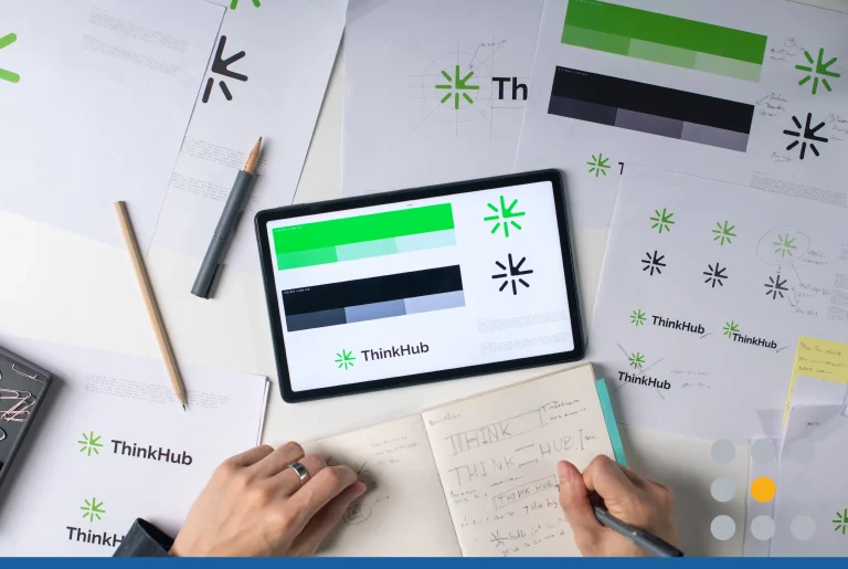
Your business cards should be an extension of your branding message. They should use the same elements as your website and other promotional materials (especially those on-hand during the meeting).
When you choose a design, be mindful of the color schemes and how it will incorporate with your logo and brand colors/aesthetic.
3. Don’t Forget to Use Both Sides
You can draw attention to your business card by using both sides for images and copy. There are unlimited possibilities for how you can structure your double-sided business cards.
One standard layout would be a small logo and contact information on the front. The back in this situation can be used for an appointment reminder, a business photo, another larger logo, or even a punch card.
How you arrange your card will depend on how you intended to use them. If you are unsure, create a few different options: one for a standard meeting, another for customers coming into your store/business, and one that is just for promotion (think “Buy One, Get One on Your Next Purchase).
4. Interactivity
Business cards do not have to be the standard one-piece card that we’re all aware of. You can get creative with how people read it—and engage with it!
Business cards today can be multi-layered so that a person has to unfold it or slide out a part. With designs like these, you can make an eye-popping design using your logo on the front layer and then cleverly reveal your contact info on the inside or flip side.
Inviting the customer to go beyond simply reading your card will increase the chances of them holding onto it and even showing it to others.
5. Simplistic, but Sophisticated
Even with all the colorful and creative designs for business cards, nothing beats simplicity mixed with elegance. Keeping designs simple—but stylishly modern—will help focus customers on your contact information.
Why not set your name and contact details off-center? Use a vertical orientation? You can stay conservative with your design elements and still create a card that draws attention.
Business cards don’t have to be plain anymore. But they still have to look professional, so avoid these common errors when designing your cards:
- Choose a color scheme and font that are clear and legible.
- Use high-resolution images that are not pixelated.
- Pay attention to how the content “sits” on the card so it’s adequately spaced from the edges.
- Double-check all your information for mistakes before the card goes to print.
Follow these trends and you’ll make a business card that has what you want most of all: impact.
Ready to design a business card? Get started at FreeLogoServices.com!


