Logos need a strong visual identity that connects people to your brand. That’s why it’s tempting to look for a magic formula for choosing the right logo colors. Research suggests color can boost brand recognition by as much as 80 percent.
Color psychology in logo design
Colors can certainly speak to consumers on a subconscious level and stir emotion. Yet, getting the desired reaction isn’t as simple as picking a calming blue or earthy green.
Complex interactions in the brain shape how we process visual information. Each person’s experience is further affected by factors such as context, culture, and conditioning. Feelings about color also change with the times.
Unfortunately, logo color psychology tends to get the nutshell treatment. Complicated ideas are boiled down to the simplest generalizations. White is eternal and pure, yellow is happy and confident, and red is fiery and passionate.
Good logos are meant to last. So, don’t sacrifice brand equity by switching up your logo colors too often. Brand colors are hugely important to any business image. How the business is perceived by the public is usually informed by their choice in brand colors. A deeper understanding of color psychology is vital if you want to base decisions on more solid foundations. Let’s take a closer look at how colors convey meaning.
What is color?
For most people, it’s hard to imagine living in a world without color. Color is woven into every moment of life, and we use it to define everything from our appearance to our moods. So, what determines how we see color?
Color is how your eyes and brain perceive light reflected in your environment. Light is a type of electromagnetic radiation transmitted in waves of energy all around you. All objects give off light, and different wavelengths create a spectrum of colors.
When an object reflects all visible wavelengths in the spectrum at once, you see white. When it absorbs all the wavelengths, you see black. Every other color comes from reflecting and absorbing wavelengths in a unique combination.
Since the brain processes different types of visual data separately, you perceive color before form, words, or motion. If people are familiar with your logo, color becomes a shortcut for conveying visual details about your brand.
Common meanings associated with colors
Modern perceptions of color are a loose consolidation of ideas from many eras and cultures. Although you can’t rely on broad symbolism alone, it’s helpful for starting your color search. Here are some well-known meanings associated with major colors.
Red
Red describes bold and intense experiences in Western culture. It represents indulgent emotions and actions, such as fire, love, passion, hunger, anger, energy, violence, and danger.
In the wider world, red has powerful, but less extreme connotations. Red is a symbol of luck and joy in Chinese culture, while Indian brides wear red clothing and henna to signify beauty, fertility, and prosperity in marriage.
Red also holds connections to blood sacrifice in ancient cultures. Sacrifices strengthened favor from the gods, associating red with renewal and wealth.
Yellow
Yellow has a reputation for being bright, cheery, and positive. Since it reminds people of sunshine, flowers, and gold, yellow is often associated with warmth, spring, and good fortune. Yellow is a common symbol for caution in road signs, as the vibrant color is easy to spot from a distance.
But yellow isn’t an auspicious color everywhere. It often implies cowardice and illness, and many Western Europeans associate yellow with envy. Yellow also signifies illicit activity in China.
Blue
Blue is one of the most beloved colors around the world. From the sky to the ocean, blue is prominent in the natural world. Blue is tied to air and water, earning a reputation for calmness, coolness, and tranquility.
That’s why brands often use blue to convey trust and stability. And as the color of the heavens, blue is a symbol of divinity, spirituality, and protection in many religions.
Strangely, blue represents good and bad moods in the Western world. Blue is frequently used to describe feelings of unhappiness and melancholy.
Green
Green is another dominant color of nature found in land, plants, and insects. It commonly symbolizes freshness, spring, and renewal and the inexperience of youth. Green is also a stand-in for messages of peace, environmental consciousness, fertility, and abundance.
As the color of money in Western culture, green represents wealth and greed. Green is lucky in Ireland, where it embodies the lush countryside and leprechaun myths. With so many ties to money and good fortune, it’s no surprise that people become “green with envy.”
Orange
Much like red and yellow, orange is fun, bold, and energetic. Orange is synonymous with fire and autumn, linking it to warmth and bountiful harvest. Sacred fire is a staple of Hindu ceremonies, so orange is tied to sacrifice, spirituality, humility, and feasting in Eastern cultures.
As the national color of the Netherlands, orange is a prominent symbol of royalty. In America, orange is a symbol of Halloween mischief and merriment.
Purple
Purple pigments were among the most difficult to obtain in ancient cultures. That’s how purple became a widespread symbol of power, wealth, and royalty.
Purple gemstones were also considered mystical, linking the color to mystery and magical protection. Not to mention, the purple heart is a medal of courage in the U.S. Armed Forces.
In modern Western cultures, purple is associated with the mind, brain, and creativity. It’s often used for autism or Alzheimer’s organizations. Other cultures, such as Brazil, reserve purple for death and mourning.
White
Almost everywhere, white has some connection to light, purity, or cleanliness. White is tarnished by sickness or stains, so it’s frequently linked to health, virginity, innocence, and brides.
It also symbolizes spirituality and holiness in Western cultures, where it’s associated with angels. On the other hand, white is a color of death and mourning in many Asian countries.
Black
Black is a color of strong opposites. While it embodies power, elegance, and sophistication, black substances such as smoke, soot, and dirt are unclean. In many Asian cultures, black is a neutralizing force that represents balance.
Ancient civilizations saw black as a symbol of the unknown, forging its links to death, emptiness, evil, and bad luck. Black can represent spirits and shadows or mystery and sensuality.
Adding context to color choices
By now, you can see color symbolism isn’t black and white. Most colors have conflicting meanings, and context changes everything. A color scheme can be good or bad, depending on how it relates to your products and brand story.
A study on the interactive effects of logo color measured how consumers judge the appropriateness of color based on product function. Key findings suggest:
- Blue, black, green, and gray are functional colors. Consumers consider them highly appropriate for products that solve problems and offer utilitarian value.
- Red, purple, pink, and yellow are linked to pleasure. These colors are most appropriate for products that provide social status, identity, and entertainment.
- Overall, red and blue work fairly well for functional and sensory-social brands.
Brand visuals that consistently align color and function gain more favorability. This is especially true if your products blur the lines between these categories. For instance, cars are functional, but status and aesthetic are important factors when purchasing one.
Equally important, watch out for damaging associations in logo color psychology. Logos may appear on a wide variety of media or product types. A color that seems perfect in one context could have a negative meaning in another.
A study on color associations in marketing tested the value of context in logo design. Participants identified the color black as modern, elegant, and luxurious, but perceptions changed based on the product type. In a new context — a tube of toothpaste — respondents associated black with dirtiness, sadness, and low quality.
On the other hand, using blue in the right context strengthened favorability. Participants focused more on positive attributes, such as mintiness and freshness, over associations like cold and sad.
Importance of color conventions in your industry
Although branding is about standing out, it makes sense to cater to some expectations. Color psychology in logo design is partly the product of associative learning. The study “Exciting Red and Competent Blue” used fake logos to test common assumptions about color and emotion.
In most instances, participants used the same emotions to describe the logo colors. Their responses also revealed interesting trends. For example:
- Blue is the most competent color, with red a close second.
- White, yellow, and pink are among the most sincere colors.
- Orange and yellow are exciting, but not considered competent or sophisticated.
- Brown has the strongest association with ruggedness.
- Purple, pink, and black lead in sophistication.
The brain develops fast ways to process information based on repetition. People acquire ideas about color through conditioned beliefs and sensory experiences. As a result, consumers use whatever color references they have to make judgments about unfamiliar branding.
Repetitive use of specific logo colors can gradually define an industry. Over time, it gets harder to successfully go against the grain. Take a look at fast food logos. The most prominent colors are sensory-social, such as red and yellow. On the other hand, appliance logos often have functional colors, such as blue and gray.
Adapting the value of a color
Until now, we’ve talked about standalone colors in a one-dimensional sense. The color spectrum is vast and encompasses many versions of a single hue.
In additive color, a hue is a pure color reflected from a particular wavelength. When you mix pigments synthetically, it involves a subtractive process. Adding more pigment subtracts the amount of light reflected.
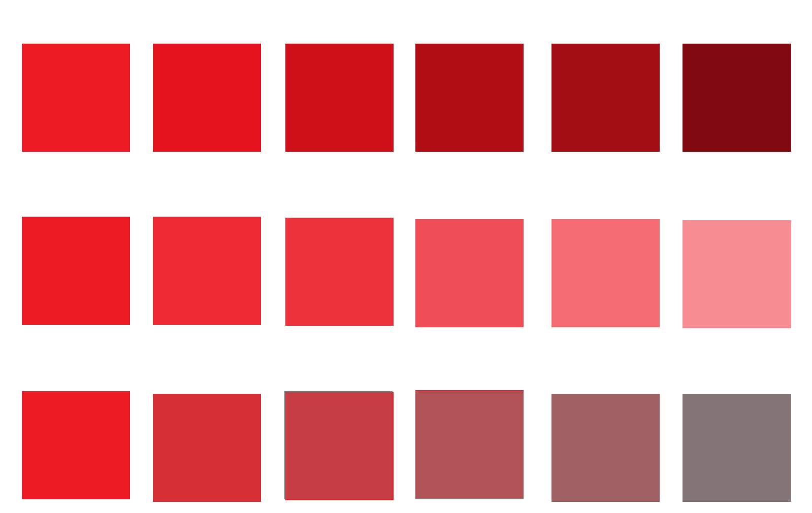
Modifying or combining logo colors can change the story they tell. Let’s say you want a red logo, but your brand is mature and conservative. A vibrant, saturated red may come across too bold and youthful. Yet, you can change the value of red to find a softer color that works.
Values are the amount of lightness, darkness, or grays in a hue. Adding white values lightens the pure color, creating a tint. Values of black darken a color to create shades. Adding values of black and white — or gray — creates tones that are lighter and mildly shaded.
In a study of value comparisons, researchers reported that higher values of white had positive associations with sophistication and sincerity. Does your brand aim for pleasure and excitement? The study found positive associations between bright saturated colors and exciting or rugged brands.
Combining colors and creating color schemes
Subtractive color lets you create more hues by mixing the primary colors red, yellow, and blue. (In digital color, cyan, magenta, and yellow are the primary hues). From those colors, you get the secondary colors orange, purple, and green. Then, you can mix primary and secondary colors to get tertiary colors, such as red-violet and blue-green.
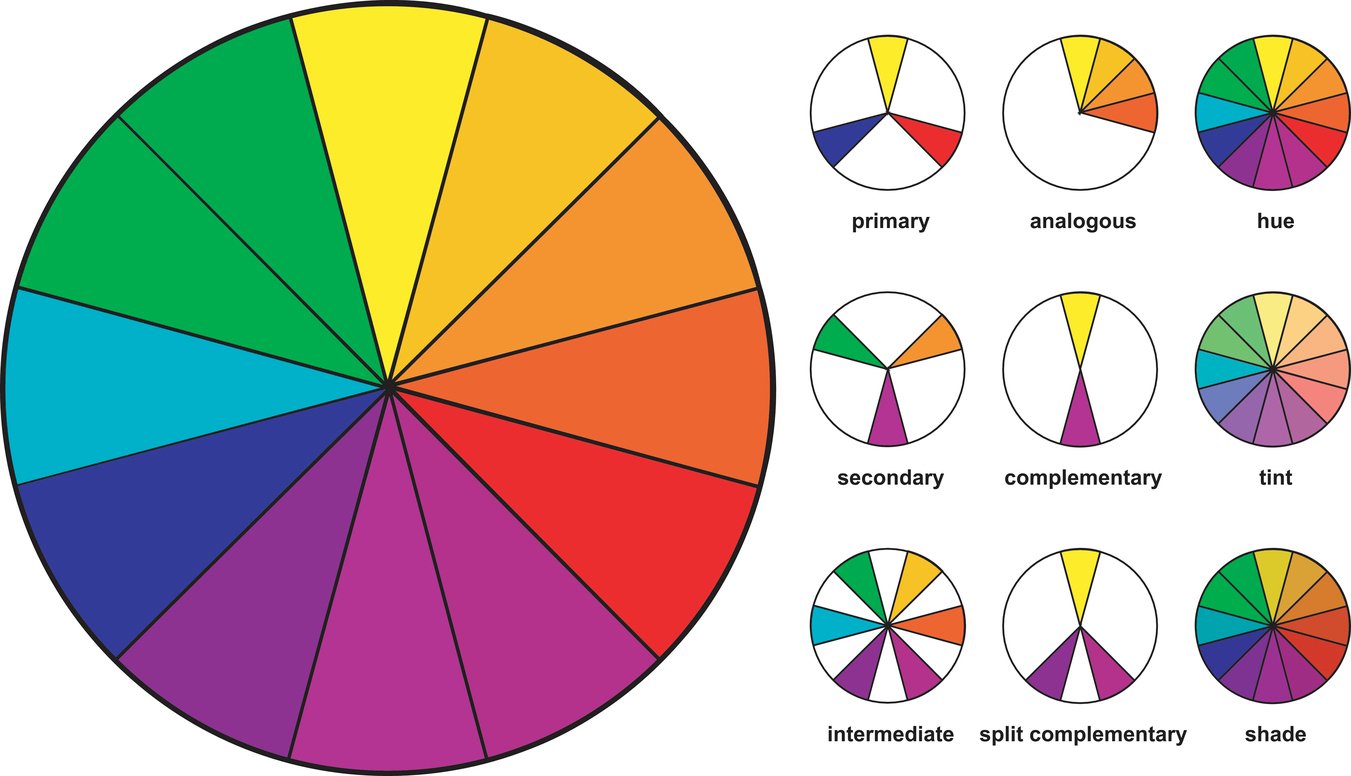
When you arrange these color tiers on a wheel, they help to visualize balanced color schemes. One half of the wheel features warm colors, and the other half contains cooler colors. Consider these common ways to pair color.
Monochromatic
![]()
Monochromatic color schemes pair values of the same hue. Since the values have the same “temperature,” they look balanced. Saturated values grab attention, while tints, shades, and tones provide softer accents. Similar to monochromatic schemes, grayscale uses only values of white, black, and gray.
Analogous
Analogous schemes use adjacent colors, such as blue, blue-green, and green. You can adjust the values of supporting colors to make one hue more dominant.
Triadic
Triadic schemes have three colors equally spaced around the wheel, such as red, yellow, and blue. Triadic schemes are high in intensity, since they have it all — contrast, warm colors, and cool colors.
Complementary
Complementary colors are direct opposites, such as purple and yellow or red and green. Complements are also high in vibrance and contrast, creating visual balance with opposites. This scheme is versatile, and it can work with a dominant color or an even color distribution.
Split Complementary
A split scheme pairs one color with the two colors adjacent to its complement. For example, blue and orange are complements. In a split scheme, blue pairs with red-orange and yellow-orange.
Creating balanced logo color schemes
Color schemes help control the amount of saturation and contrast in your logo. You can make them unique by playing with values or balancing designs with white, black, or neutrals. These colors create space between contrasting hues, and they often make logos cleaner and more attractive.
As you move forward with logo design, remember that function matters as much as aesthetic. Logo colors should match the experience you’re trying to sell.
Make sure your color choices and values also match the mood of your brand and audience. Don’t go fiery if your brand is laidback and soothing.
Want to experiment with different logo colors? Edit your logo colors with our free logo maker.


