Logos are more than just symbols. They are a crucial part of a brand’s identity, encapsulating its essence, values, and story in a simple design.
Over the years, many iconic brands have evolved their logos to stay relevant, appeal to changing demographics, or reflect a shift in brand strategy.
But what can we learn from the logo evolutions of these famous brands? And how can these lessons be applied when creating a logo for your own brand? Let’s dive in and explore.
- The Importance of Logo Evolution in Branding
- Key Lessons from Famous Logo Evolutions
- How to Use Logo Evolution Insights for Your Own Brand
- Practical Tips for Creating a Modern Logo with FreeLogoServices’ Online Logo Maker
The Importance of Logo Evolution in Branding
Brands are like living entities; they grow, adapt, and evolve over time. This evolution often necessitates changes in visual identity, especially logos. The current logo of a brand reflects important facets of its identity, such as a commitment to innovation, sustainability, and an embrace of contemporary design trends.
Logo redesigns are also beneficial to ‘reset’ the customers’ perspective regarding the company. Usually, these are part of a broader change within the company to facilitate re-targeting strategies.
You might think a logo is just a pretty picture, but, in reality, it’s much more than that. It’s also a powerful tool for communication and recognition. As companies expand into new markets or adjust their strategies, they must consider whether their logo still aligns with their brand’s mission and values.
The prime example of a brand logo evolution is the transformation of the Apple logo.
Originally a complex design featuring Isaac Newton under an apple tree, it has evolved into the simple, iconic apple with a bite taken out.
This shift wasn’t just a design change; it symbolized Apple’s transformation into a brand that values simplicity, innovation, and elegance. That was once Steve Jobs’s vision for a sleek and minimalist line of products.
A lesser-known but equally compelling logo evolution is Airbnb’s redesign, which conveys a sense of belonging. At the same time, MasterCard’s move was more about creating a sense of a digital-friendly platform.
Key Lessons from Famous Logo Evolutions
Studying the evolution of famous logos offers valuable insights into branding and design. Here are some important lessons we can learn from some of today’s most popular logo designs:
Starbucks: Adapt to Changing Times
Brands must adapt to remain relevant, and this often means updating their logos.
Take the Starbucks logo, for instance. The brand has undergone several logo iterations, each reflecting its growth from a local coffee bean retailer to a global coffeehouse chain.
Its current minimalist logo, featuring just the iconic siren without any text, shows confidence in the brand’s global recognition and simplifies its design for the digital age.
Nike: Simplicity is Key
In an era when consumers are bombarded with information, simplicity stands out. The evolution of the Nike logo exemplifies this. Carolyn Davidson created the first Nike logo, the Swoosh corporate trademark, in 1971 while she was a graphic design student at Portland State University.
Starting with a complex design featuring the company name and a swoosh, the Nike Swoosh eventually dropped the text, leaving only the swoosh. This move highlighted the brand’s confidence in its global recognition and demonstrated the power of a simple, memorable design.
Coca-Cola: Reflect Your Brand’s Core Values
A logo, such as the Coca-Cola logo, should represent what a brand stands for. The evolution of Coca-Cola’s logo, for example, has been subtle over the years, maintaining its classic script to reflect the brand’s heritage and timeless appeal.
By staying true to its original logo design, Coca-Cola reinforces its values of tradition, authenticity, and refreshment.
Google: Embrace Modern Design Trends
Logos need to look good not just in print but across digital platforms, which often means embracing modern design trends.
The Google logo has experienced several iterations and updates over the years, highlighting its design changes and the evolution of the company’s branding from its original name, BackRub, to Google. The company transitioned from a three-dimensional serif typeface to a flat, sans-serif typeface, aligning with the recent trend of clean, minimalist design trends and making the logo easier to read on screens of all sizes.
Adidas: Change With the Times
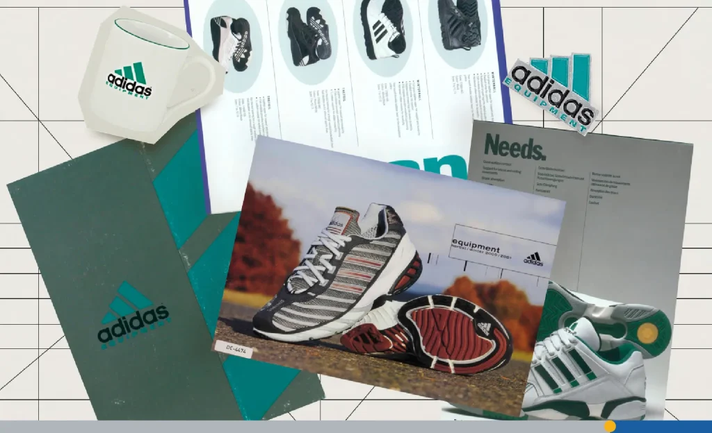
The three-stripe Adidas trademark has been around since the company’s major redesign in 1972. At the time, Adidas was expanding its line of products, offering apparel alongside its iconic shoes for the first time.
It was created by a small, collaborative team of Adidas leaders and a couple of designers from a German creative agency. Inspired by florals, the new logo featured three leaf-shaped foils to stay consistent with Adidas’ reputation as the brand with the three stripes. The three stripes are ever present, running through the leaves.
These examples show us that a well-designed logo is not static but it evolves along with the brand.
From simplifying designs to embracing modern trends, the evolution of these famous logos provides valuable lessons. But how can you apply these insights to your own branding efforts?
How to Use Logo Evolution Insights for Your Own Brand
Understanding the lessons we’ve shared above is crucial when designing or rebranding your own logo. But how do you apply them effectively? The process is straightforward, but you will still need time to integrate some of these suggestions into your brand.
Know Your Audience
Before diving into logo design, understand your target audience. A logo that appeals to one demographic might not resonate with another.
For instance, the playful and colorful logo of Instagram is designed to attract a younger, more vibrant audience, whereas LinkedIn’s simple and professional logo aligns with its business-oriented users.
Keep it Simple and Memorable
A complex logo can be hard to recognize and remember. Aim for simplicity while ensuring that your logo stands out. Remember, the goal is for people to identify your brand at a glance, much like they do with the McDonald’s golden arches or the Twitter bird.
Reflect Your Brand Identity
Your logo should be a visual representation of your brand’s identity. If you’re a tech company that values innovation, like Tesla, opt for a modern, sleek design.
If you’re a vintage clothing store, a retro-inspired logo might be more appropriate.
Be Open to Change
As your brand evolves, be open to updating your logo to stay relevant. However, ensure that any changes remain true to your brand’s core values and don’t alienate your existing customer base. Think of it as a brand refresh rather than a complete overhaul.
A prime example is the Shell logo. The original Shell logo design was first created in 1900 and has undergone multiple transformations over more than a century.
Despite these changes, the fundamental logo—a stylized shell—has remained consistent, allowing Shell to modernize its brand without losing trust and recognition.
Now that you understand the key elements of successful brand logo evolution, it’s important to have the right tools to bring your vision to life. And what better way to do it than with FreeLogoServices, a free Online Logo Maker?
Practical Tips for Creating a Modern Logo with FreeLogoServices’ Online Logo Maker
Now that you’re armed with insights into logo evolution, it’s time to put them into practice. Using an online logo maker like FreeLogoServices can help you create a custom logo that’s both modern and reflective of your brand.
The platform offers numerous free logo templates that facilitate the creative process, allowing you to personalize and enhance your logo with various design elements.
Start with Your Brand Identity
Before you start designing, use the FreeLogoServices platform to brainstorm and clarify your brand’s identity. What do you stand for? Who is your target audience?
These questions will guide your design choices. Logo design on FreeLogoServices is free to experiment with, so take advantage of this opportunity before going forward.
Use the Right Tools and Features
FreeLogoServices offers a variety of tools and features to help you create a professional logo with its Logo Maker. But there’s even more feature-wise, including the Business Card Maker for creating professional-made business cards in no time.
From customizable templates to a vast library of products like pens, t-shirts, and beanies, you have everything you need to design a unique brand identity for your startup or small business.
Experiment with Different Styles
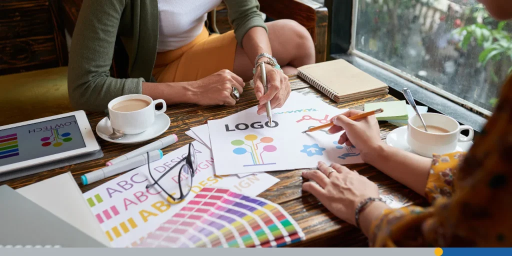
Don’t be afraid to experiment with different styles and colors. The platform lets you easily tweak your designs until you find the perfect look for free. Remember, a good logo is versatile and looks great in black and white as well as color.
Get Feedback
Once you’ve created a logo you’re happy with, get feedback from others. Generating a wide range of logo ideas can help you refine your design and ensure it meets various needs. Use the FreeLogoServices Business Card Maker to print samples and see how your logo looks in real-world applications.
This can provide valuable insights and help you make any necessary adjustments.
Remember, the journey of logo design is ongoing, just like the growth of your business. Let’s recap what we’ve learned and how you can apply these lessons to make your brand’s visual identity future-proof.
Conclusion: What Have We Learned?
Logos are vital to a brand’s identity. They serve as a customer’s first impression and a lasting symbol of a company’s values.
As we’ve seen with iconic brands, the evolution of a logo isn’t just about keeping up with design trends—it’s about adapting to the needs and expectations of your audience. A logo should be a dynamic element that grows with your brand, ensuring that it always reflects your values and mission.
By learning from the past, leveraging modern tools like FreeLogoServices, and staying attuned to market trends, you can create a logo that not only stands the test of time but also propels your brand forward.
Remember, your logo is not just a design; it’s the heart of your brand’s story. Start crafting your story today!

FAQs on Logo Design and Evolution
Why do companies change their logos?
Companies change their logos to reflect a shift in brand strategy, adapt to modern design trends, or appeal to new demographics. Most of the examples in this article happened to better fit their branding into the changing consumer preferences and habits.
How often should a brand update its logo?
There’s no set rule, but brands typically update their logos every 5-10 years to stay relevant and reflect any changes in their mission or target audience.
What are the key elements of a good logo?
A good logo is simple, memorable, versatile, and reflective of the brand’s identity.
Can I create a professional logo without hiring a graphic designer?
Yes! With tools like FreeLogoServices’ online logo maker, anyone can create a professional-looking logo without needing design experience.
What should I consider when choosing colors for my logo?
Consider your brand’s identity and the emotions you want to evoke. Different colors can convey different meanings, so choose colors that align with your brand’s values and message.
What should I do if my logo redesign is not well received?
Make an effort to address people’s concerns regarding your redesign. Maybe the original logo was already very popular and well-received by the community. In the worst-case scenario, you can revert the logo design back to the original. Next time, be sure to gather feedback from people by polling some redesign options before making a final decision.


