Opal mining is the most dangerous and lucrative job in the world. The work begins with the minimal process of digging a 30-meter hole. A miner then climbs down a ladder into the hole with a jackhammer. This process—known as belling out—is the start of excruciatingly hard work. The finish line is finding red on black opal—a complex substance more valuable than gold.
Red opals are extremely rare and can take over 100 years to be created. However, the same can be said about complex logos and even minimalist logos. Just like red opal, the color, rarity, and uniqueness of a logo can make it priceless.
We understand that your brand is precious to you and can be easily damaged. Even red opal is fragile and can shatter while being extracted.
With that in mind, we’re going to carefully take you through the process of choosing a logo for your brand. With our help, your logo should rise to the top and not be stuck at the bottom of the ladder.
- What Is Logo Design?
- What Is Minimalism?
- 3 Minimalist Logo Examples
- What Is the Difference between a Typeface & a Font?
- Using Typefaces & Fonts That Create an Evergreen Logo
- Color & Good Logo Design
- The Shape of Your Own Logo
- Logo Design Tips
- 7 Tips on How to Make a Good Logo
- A Free Logo Design?
Blog Highlights
- What is logo design: To begin our entertaining ramble on all things logo, we want to start by saying we will not be speaking to you as if you’re a professional designer. We’ll use plain English to discuss logo design and how a good logo can work wonders for your brand. We’ll also talk about design elements such as colors and negative space. But we’ll do all of that in a positive tone, we promise.
- What is the difference between a typeface and a font: With all this talk of negative space, we want to touch on topics avoided by other blogs. Have you ever wondered what typefaces and fonts are? We certainly have. And we’ll tell you all about how they can help your brand and logo by combining to make your logo stand out.
- 7 tips on how to make a good logo: We’ve compiled a list of golden rules to help your brand acquire a professional logo. In 7 logo design tips, we talk about:
- Studying other brands but not copying them.
- The importance of doing thorough research on your target audience.
- Considering your brand’s personality.
- The effect of simple lines.
- Thinking outside the box when making a logo.
- How will your logo look good on various platforms?
- Do you really need a complex logo?
All of this information will help you to practice good logo design for your brand, and you’ll even learn about white space, too!
What Is Logo Design?
The word logogram means to have a symbol representing a word or phrase. As an example, on a calculator you will have used + to mean addition. Company logos fulfill the same need, but they use some of the most essential elements of graphic design to make a logo that creates an impression.
Factors such as typeface, colors, and shapes are used to create both complex logos and minimalist logos.
A successful brand must use logos to highlight its values, differences, and quality above other similar products and services. A good logo will provoke a strong reaction—making an audience want to purchase the product.
Brand logos are often worked on for many years—Coca-Cola has been altering their logo for over a century! Over the years, logos can become very complex.
As the art movement has changed and become more sophisticated, so have logos. The use of negative space, hidden symbols and messages, plus the removal of text, has made logos both successful and adaptable. These simple logo design tips have been copied by one brand after another. As time moves on so does the humble logo.
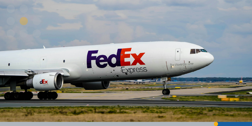
What is negative space? Put simply, negative space is the area around and between the subject of an image. This technique can cause other shapes and patterns to be seen by the viewer.
For example, on the airplane below, can you see the arrow hidden in the negative space of the FedEx logo? Please don’t use the internet to cheat, because we’ll know!
“I do not regard advertising as entertainment or an art form, but as a medium of information. When I write an advertisement, I don’t want you to tell me that you find it ‘creative.’ I want you to find it so interesting that you buy the product.”
― David Ogilvy
What Is Minimalism?
In recent years, minimalism has become of interest as a topic about the idea of living well with less. This idea is where an individual reduces the number of items they own until they have decluttered and feel more comfortable.
In regard to logos, minimalism is best explained as the minimalist art movement that emerged in the late 1950s. Artists such as Frank Stella had begun to move away from heavy brushstrokes to conjure up simpler, eye-catching images.
The techniques of minimalist art eventually made their way to marketing departments looking to improve their brand’s personality. Minimalist logo design has flourished in recent years. It’s used to make a good impression on viewers while promoting a brand at the same time.

“Make things as simple as possible but no simpler.”
― Albert Einstein
3 Minimalist Logo Examples
There are certain golden rules to follow when designing a minimalist logo, such as:
- Try to make sure your logo looks good, not only in color but also black and white.
- Think negative space. You’re going to need lots of negative space.
- Can you add a handwritten font to your logo to add emotion and a personal touch?
- Does a minimalist logo design suit your brand, or will you need 2 different logos?
An industry known for favoring minimalist logos is the technology industry. Over the years, tech companies have moved away from complex logos. Our first example is the most famous example of this design theory.
Minimalist Example 1
Apple began to use a multicolored logo way back in 1977. However, by 2001, Apple began to use their simple chrome logo, and its computer badge continued to become ever simpler.
Most coffee shop patrons will immediately recognize the Apple logo if it’s laser etched onto the aluminum lid of your laptop.
Minimalist Example 2
You’d be hard-pressed to find a more recognizable logo than that of Starbucks. All over the world, Starbucks’s bustling coffee shops are sought out and easily found because of their minimalist logo.
In 2011, Starbucks made its simple logo even simpler by removing the text from it.
The coffee chain’s name Starbucks was inspired by Herman Melville’s 1851 masterpiece Moby Dick. Continuing to expand on the maritime theme, Starbucks chose a siren (a close relative of the mermaid) to be the face of their logo. And more importantly, they surrounded their siren with plenty of empty space.
This minimalist logo is a great example of avoiding too many elements in graphic design. The logo’s brand effectiveness was brilliantly increased by reducing its logo’s elements.
Minimalist Example 3
Okay, we’ve talked about using your Apple laptop in a Starbucks, sipping a hot cappuccino while munching on dark chocolate peanut butter cups. Surely, you must have known it couldn’t have been long before we talked about McDonald’s. Yes, the perfect purveyor of chocolate milkshakes, apple pies, fries, and… sorry, we know we have a problem.
The Glorious Golden Arches
Anyway, our point is that minimalist logos don’t get much better than the golden arches of McDonald’s. In 1952, Architect Stanley Clark Meston created an initial design for the McDonald brothers that would be easily seen from afar. By 1961, a creative director known as Jim Schindler took inspiration from the architecture feature to create a minimalist logo.
How Does the McDonald’s Yellow Arches Logo Fit In with Other Minimalist Logos?
The logo achieves this easily by:
- Looking good in yellow—a color that symbolizes happiness and energy—but also in other single colors such as black, white, and even opal red.
- There is a lot of negative space in the McDonald’s logo. However, we haven’t found any hidden images or secret messages. If you find one that involves free food, please email us about that.
- McDonald’s came up with their own font for the sign, which has a touch of handwriting about it.
- The McDonald’s logo is minimal enough that it can be easily merged with text when needed. It also sits comfortably in any design, be it a holiday celebration like Christmas or an event such as Halloween.
What Is the Difference between a Typeface & a Font?
We could go on all day about the history of typefaces and fonts, then spend twenty minutes overloading you with technical information. Nah, let’s not do that. Let’s tell you the simplest way we can.
Children are often given a set of colorful blocks to play with. Very often, there are 26 of those little blocks. And each one of those blocks has a different letter of the alphabet on them. Why? Because we like to help children learn the alphabet as soon as possible. So, we could say this collection of 26 little blocks with letters on—spanning from letters A to Z—is a typeface.
Now, suppose you give a set of little blocks or a typeface to an extremely clever child called Danny. He might decide to alter that typeface by making some of the letters bold. So far so good? Okay, so now we make this even easier. Imagine Danny is so clever he knows what a serif is. A serif is simply a small line added to the end of a larger stroke in a letter.
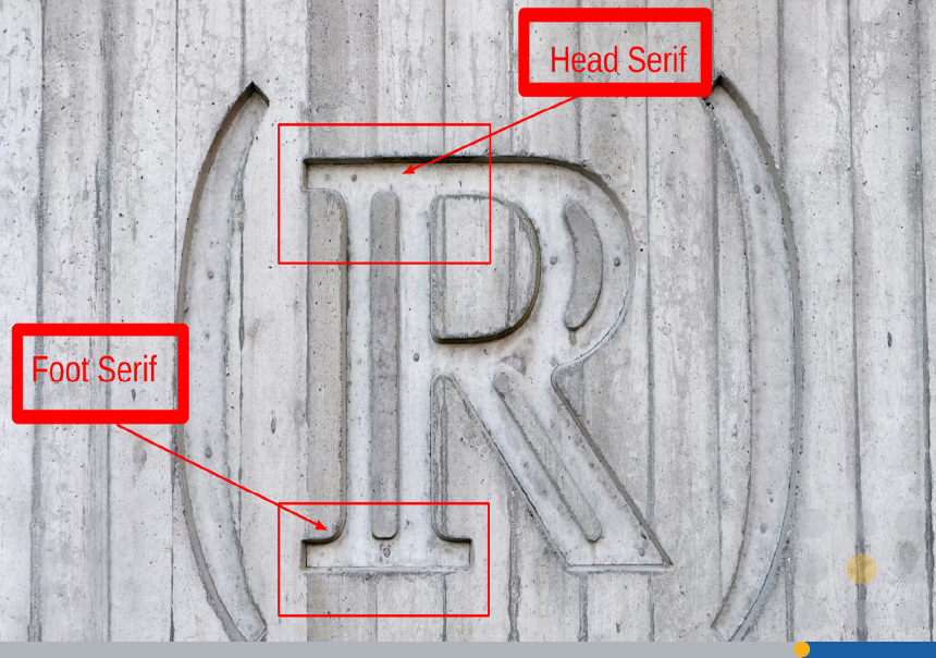
A typeface with serifs is called, wait for it… a serif typeface. You see, we are clever. And a typeface without a serif is called a sans-serif typeface. We don’t want to show off, but the word sans is a French word which means without. So, to cut a long story short, by bolding letters and adding serifs, clever little Danny has created fonts which he can play with forever and ever.
Fonts can be endlessly adjusted to make your brand, whether on print materials or your logo, look good. Large businesses have been experimenting for years with serif fonts to help their brand and logo stand out. Interesting colors, negative space, plus typefaces and fonts that are sharper than an axe, will all work together to give you a great-looking logo.
Using Typefaces & Fonts That Create an Evergreen Logo
What do we mean by an evergreen logo? Well, an evergreen tree—found in North America, Asia, and Europe—has green leaves all year round. Just like the evergreen tree, the perfect logo will look fresh and eye-catching today and 100 years from now.
The road to an evergreen logo is an experimental one. We start by suggesting that you avoid complicated designs—plus typefaces that are heavily detailed. Whether you experiment with paper and pen or invest in Adobe Illustrator, you first need to consider the core values of your brand. What is your brand’s message? Once you know that, make a list of the following:
- What colors symbolize your brand’s intent? You remember we mentioned McDonald’s uses yellow which symbolizes happiness and energy. Look for a color that symbolizes the core essence and uniqueness of your brand.
- For your logo design, think of something that might be relevant today and a hundred years in the future. This will be an easy task if you sell coffee, but other products and services will require more thought.
- Experiment with different typefaces and fonts but take your time in doing so. Try to create multiple versions of the lettering for your logo design. Research different typefaces and discover what they symbolize. Also, consider if standard serif fonts or handwritten fonts will suit your logo design and brand.
- Think about how you can enjoy the process. Try not to make the design of a logo hard work. Allow yourself to experiment and create a fantasyland if you want to.

“I don’t know why people expect art to make sense. They accept the fact that life doesn’t make sense.”
― David Lynch
Color & Good Logo Design
With your new knowledge, you now understand what makes a good logo and its business stand out. If you look at popular apps and websites, you may have noticed that many use no more than 3 colors.
Also, there are appropriate colors in the design, and it will be successful when used in different sizes. Remember that you’ll want your logo to look good on business cards and marketing materials.
If you want to really polish your logo, invest time in the study of color therapy. Consider a relaxing walk in the park and how it can reduce someone’s stress levels. This powerful sensation is down to the color palette of nature: relaxing light shades of green.
Consider the simplicity of nature by keeping the colors of your logo simple. Too many colors will make your logo look garish and affect its scalability when it’s seen on a smaller screen like a mobile phone rather than a desktop computer.
Also, don’t forget to get out in nature and life while making time to enjoy yourself. Your best ideas will come to you when you are at your most relaxed.

“I’m from the generation that climbed trees, fell out of trees, broke my arm, my foot, my fingers, fell in the sea, nearly drowned. To design a catapult was high-tech.”
― Sir Ridley Scott
The Shape of Your Own Logo
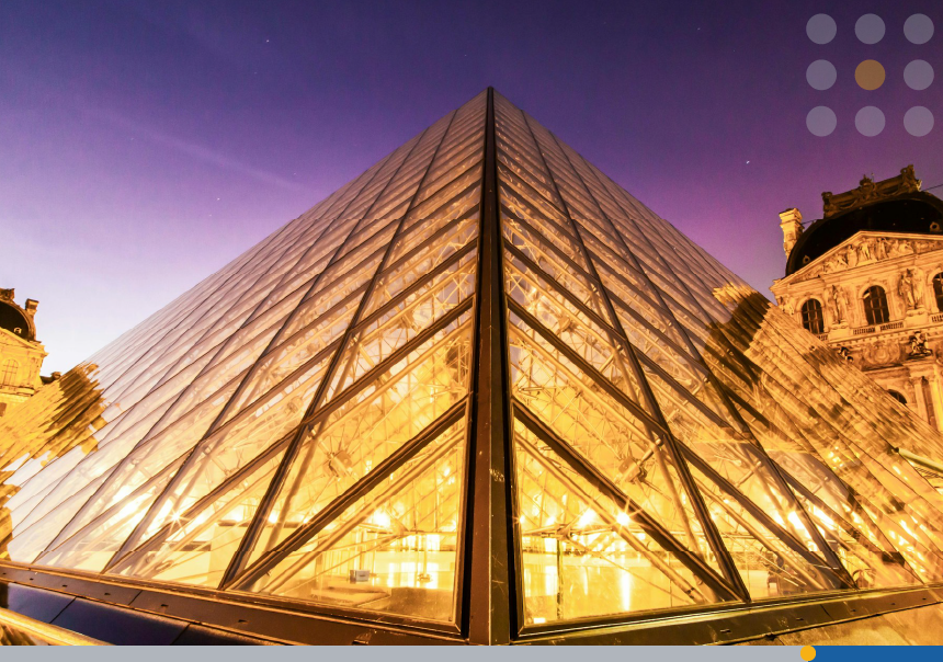
Over three thousand years ago, the Egyptians were building pyramids one after another. The shape of the pyramids—the triangle—has been seen as a symbol of science and power ever since. If you like movies you will have seen triangles and pyramids used in The Black Hole, Blade Runner, Dune, and many other popular forms of entertainment.
When choosing the shape of your logo, think of what shape would be most appropriate. Also, consider the meaning of the shape. Here are a few for you to think about:
- The circle represents life, the universe, unity, and perfection.
- The square represents familiarity, comfort, order, and dependability.
- The rectangle represents professionalism, guidance, and order.
“A logo derives meaning from the quality of the thing it symbolizes, not the other way around.”
— Paul Rand
Logo Design Tips
You can now see how good logo design can leave a lasting impression, whether it’s a minimalist logo or something more complex. To attract potential customers you can go for a versatile logo or invest time in creating something mysterious that will leave your target audience with a timeless logo in which there is something interesting to discover.
Overall, we hope we’re giving you the impression that a graphic designer has a lot of work to do. Whether designing a company logo or marketing materials, it can be said that there really is no such thing as a simple logo.
However, suppose you want to design logos yourself?
In that case, you need to take your time and not be overwhelmed with endless design elements that will quickly exhaust you.

“It’s one thing having, for instance, nice images on your studio wall that influence you when you’re just beginning as an artist or filmmaker, but when you go about getting into a situation where you begin to make work yourself, it’s a different kettle of fish altogether. It’s all about doing it—the physicality of making films. What you see at the end is never the same as the situation of how it was done, yet that process is very important. It’s all about making a lot of mistakes and being brave.”
― Steve McQueen
7 Tips on How to Make a Good Logo
We don’t want you to tire yourself out when you craft a professional logo for your brand. For that reason, we’ve compiled a short list of 7 logo design tips that you can print off and use during the design process.
1. Study Brands but Don’t Copy Them
The first of our golden rules involves bringing yourself up to speed on the competition. Please don’t copy anyone else’s work but study their approach. Take a walk to your local library and look at the work of David Ogilvy and peruse the library’s art section. Get inspired and do it quickly.
2. Research Your Target Audience
Take the time to ask yourself who exactly is your target audience. Think about your brand’s personality and if it will appeal to new customers. Also, do some thorough research before diving into the design process for your logo.
3. Consider Your Brand’s Personality
Illustrations that children find attractive are often simple line drawings. Companies that create animated content for children keep their art simple in a way that also reflects their brand’s personality. Imagine your brand as a person. Is it fun or serious? To be on the same page as your customers, create a good logo design for your brand that is appropriate.
4. Study Simple Lines
As an example, take a little time to look at the coastal town known as Morecambe, which is located in the North West of England. The architecture in Morecambe is known for the clean lines of its Art Deco buildings, such as the Midland Hotel. Ask yourself if you can create a logo that is as simple and productive.
5. Think outside the Box
The logo design process can really benefit when you think outside the box about your brand and logo. We’ve talked about white space and other design elements, such as FedEx’s hidden arrow. And when it comes time to create a logo, don’t just study graphic design—look at the sciences, nature, and your environment.
6. Create Logos That Look Good on All Platforms
Rather than going for complex logos, we’d advise you to go for a minimalist logo design. Our reason is that more and more people will now see your company for the first time on a mobile phone screen. Try to ensure your logo looks good on various platforms, and don’t forget to use white space.
Your final design should be simple enough to create a great logo for your company name.
7. Is a Complex Logo Right for Your Business?
We’re going to be honest and vote against complex logos for the moment. As a beginner, you might find it far easier to sketch out a logo that is closer to the kind of minimalist logo we saw Apple, Starbucks, and McDonald’s use. Minimalist logos can be easily replicated on business cards and are far more powerful than using cheap alternatives like clip art.
Still, please create a logo for a brand that will never be forgotten. Could you do that for free?

A Free Logo Design?
The right logo cannot be created with just clip art and stock images. It’s also an expensive process, but not if there is a free alternative online.
Avoid Keywords: complex logos
It’s also not enough to sit at your computer and do a Google search for keywords such as complex logos. For a professional logo that offers you brand identity with other design elements that look good on business cards or websites, you need an intuitive Logo Maker.
You’ve enjoyed our logo design tips—now get ready for the real thing! To make a minimalistic logo a memorable logo, please let us tell you about FreeLogoServices. With a simple interface and customizable templates, FreeLogoServices can help you create a logo that will match your brand values and showcase a timeless design on merchandise such as pens and t-shirts.
FreeLogoServices also offers a Business Card Maker which can create professional-looking business cards so you can show your brand values to prospective customers.
Suppose you need help finding the time to create a logo? In that case, FreeLogoServices can also put you in touch with their professional logo designers. This option makes it easy for your business to get a new logo quickly. FreeLogoServices will listen carefully as you tell us the brand values you want to see in a good logo created just for you.
Conclusion
We hope we’ve helped you understand how to make your logo stand out and attract your target audience. With patience and the basic elements of a minimalist logo, you now know that:
- A good color palette will symbolize your brand identity.
- The use of a great typeface makes people want to be acquainted with your brand.
- A logo shape can make customers feel the same way—as you do—about your brand.
FREQUENTLY ASKED QUESTIONS
How can a logo for my brand attract potential customers?
The idea of your logo should be to attract attention in seconds while communicating your brand identity. Always ask yourself how you can create a visual representation of your product with your logo.
What makes a memorable logo?
Simplicity. If you’re new to the idea of creating a logo, try to avoid extensive detail and a large patchwork of colors. Aim for 3 colors plus lines and curves that tell the story of your brand.
How do other logos project their brand identity so simply?
They are not new to the game of logo creation. A logo used for a famous product, whether it’s apple pie or a television show, is a logo that will have been tinkered with over and over again.
Why do you always mention apple pies and McDonald’s, do you have a problem?
Yes, we do. But we are having treatment for that. Besides, we hope we’ve redeemed ourselves by telling you all about logos and how they can help your brand.
What is a complex logo?
The name complex says it all, to be honest. The term refers to logos that use many colors, fonts, shapes, and textures.
Why are all logos minimalist now?
The simplicity of minimalist logos makes them attractive. Another factor is that many customers purchase goods and services on their mobile devices. With smaller screens, complex logos can become garish and overwhelming. Ensure your logo can scale without losing quality.
Why is there no color in modern designs?
It may seem like everything now has only 3 colors, but the truth is smaller screens are meaning a smaller amount of colors. You might have noticed many apps and cloud-based software are using a combination of black, blue, and red. This simplicity is the norm, but the future—not to mention technology—doesn’t mean a lack of colors will last forever.
Can a brand be successful without a logo?
Interesting question. A brand can only be successful if people know it exists. If you think about movies, marketing departments spend a fortune on advertising to make sure everyone knows a movie is about to be released. However, a brand does thrive on good word of mouth. So, to make your brand successful, you need to have both a good product or service and a good logo.
“A logo is not a brand—it’s only a symbol for a brand. A brand is much more than a logo.”
— Marty Neumeier
