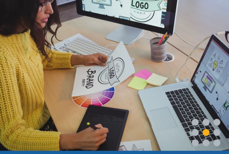
Different Surfaces, Different Uses, Different Devices, Same Logo
Fax Machines.
People have been predicting the end of the fax machine for years. But, it just doesn’t seem to be going away. Most older fax machines (and most fax machines around are older; who buys a new fax machine these days?) only print in black & white. This could cause problems for a logo. Logos have to be effective and look spectacular in all color schemes–a CMYK printer with low ink, an RGB cell phone display, or a black & white fax machine.
Banners.
Logos need to stay clear no matter what. Many logos are made with a pixel-based bitmap and will get blurry when blown up even just a little bit. Logos made with vector graphics, however, do not get blurry when expanded. These vector-based logos are created using geometric figures–like lines, shapes, and points–that can be expanded without losing any sharpness.
Business Cards.
Business cards present the opposite problem that banners do. In addition to a logo looking sharp when blown up, it also has to look great when shrunk down. Designs can’t be too complex or crowded because they’d be completely unreadable in such a small spot. The best and most memorable logos of all time are simple. One image, maybe a couple words, and that’s it. Simplicity leads to recognizability in terms of scaleable logo designs.
Embroidered Polos.
This is not always a problem, but has caused enough headaches to warrant a mention. Many printing companies have a stitch count for embroidering custom logos on polos. If you request more stitches than they offer, your request is either denied or you are charged a lot more to add the extra stitches. This simply means, once again, that good logo designs aren’t complex. Simplicity.
Webpages and Mobile Phones.
It’s getting harder to stand out on the internet. There’s videos, sounds, and hey, maybe even smells one day. In order for a logo to stand out, color schemes are becoming more and more complex. Companies are experimenting with complimentary and contrasting colors, as well as combinations of light and dark tones. Logos need to pop on the high-resolution screens of smartphones and computers.
For more tips on designing your logo, check out “5 Things to Avoid in Logo Design“.


