A logo is an essential part of a good business. Do you know the most valuable asset of major corporations? It’s not the buildings they own or the products they sell.
It’s the logo and the brand. That’s what creates the feel of the company. You can do something similar to your organization.
The good thing about creating a logo is that it doesn’t have to be complicated. You can create a simple, text-based logo that people can immediately identify with.
How can you create a text-based logo? Keep reading to find out.
Get to Know Your Brand
Do you know what your brand is? Many people confuse the logo with the brand or think they’re the same thing. That’s actually not the case.
A logo is the visual illustration of your brand. Your brand may be hard to define because it’s not tangible. It’s a connection that people have with your organization.
You want your brand to reflect the mission and vision of your organization in a way that people can relate to. Many top brands can be summed up in just a few words. Coca Cola’s brand is based on happiness.
Look at Classic Text Only Examples
One of the best things you can do to find inspiration is to look at other wordmark logos. FedEx offers a great example of what a text-only logo can be.
Oracle, Verizon, IBM, Intel, and Disney are all examples of text logos. Take a look at them and see what kind of connections and emotions come up for you when you look at them.

Colors Create an Emotion
The one thing to understand about creating text-only logos is that people process and interpret colors and images faster than they read the text.
That doesn’t mean that you shouldn’t have a text-only logo. A descriptive logo is actually what consumers are responding to today. They prefer to have a text logo rather than an abstract symbol.
You do need to rely on colors and typography to tell the story of your brand. People will make that connection before they read the text of your logo.
How can you choose the right colors? Knowing a little color psychology always helps.
Typography Tells a Story
The type you use also tells a story. Some fonts are associated with different time periods and other fonts are considered to be timeless.
If your company is an 80s-style arcade, you can go with a rounded, retro font. On the other hand, you can use a font that is more like a typewriter if you want to have a reliable and classic feel.
Develop Ideas
With the basic design principles of color and type and how they can create a lasting impression on people, it’s time to get to work.
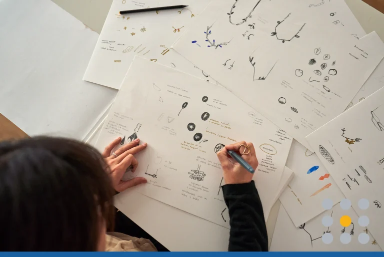
You can sketch ideas out on a napkin, but the best way to develop creative ideas is to use a text only logo maker. You can take your text, apply different fonts and change the colors accordingly.
This gives you the ability to contrast and compare different looks. When you have 2-3 ideas narrowed down, save them and print them out for further testing.
How Will the Logo Be Applied?
Your logo is going to be applied to all of your marketing efforts. A couple of the keys to creating a great logo include versatility and scalability.
It’s likely to be featured on your website, t-shirts, and promotional products. You may have it on business cards and letterhead, too.
Since your logo will have so many applications, you want to test your logo to make sure it will look consistent and sharp across each application.
Sometimes people will create a logo that will look great on a website, but the message fails to get across when the logo appears on a banner or t-shirt.
Think about the main places where the logo will appear, and test the logo to make sure it’s scalable.
Get Other Opinions
Your logo has to resonate with a few audiences. Your logo will be used to connect with existing and potential customers. You may also have vendors and suppliers that work with you. This is an important relationship that you don’t want to overlook.
Finally, you want to have your logo connect with your staff and colleagues. Everyone in your organization is a potential brand ambassador. A strong brand that employees can connect with is necessary to have them become more engaged in the office and telling people about your business.
Take the drafts of the logos that you have and show them to each audience. You don’t only want to know what they like the best, you want to know why they chose what they chose.
This information will be valuable as it may give you additional insights as to what people expect from your brand and you can adjust your logo accordingly.
Once you get your feedback, make any adjustments. For example, your feedback might be that one type is better with a certain color scheme. Make those adjustments, test the logo again, and then finalize your logo.
Launching the Logo
Launching a brand is a very exciting time for a business. It doesn’t matter if it’s a brand new logo or if it’s a rebrand for the business. You want to be sure to celebrate and launch the logo with pride.
You can create a campaign that gets people excited about the logo and launch it internally first. You can continue to build on that excitement and publicly unveil the logo at an event where you host your clients, partners, and employees.
Of course, you want to have a digital marketing campaign where you have the logo on your social media accounts, too.
Create a Text-Based Logo
There’s a lot that goes into a good logo design. With a wordmark logo, you have to make sure that you utilize colors and typography to get the point across quickly, so people can just glance at the logo and know exactly what it’s about.
Are you ready to start designing your next logo? Try out our text-only logo maker today.


