Before you know it, the 65 million U.S. teens and young adults who make up Generation Z will have the biggest voice in consumer culture. Are you ready to bring your small business brand to this emerging audience?
Post-millennials — loosely defined as the group born between 1995 and 2010 — have grown up in an age of digital immersion. The live in a world of DIY entrepreneurship and flock to brands that aren’t afraid to take risks in marketing. They demand more content, perks, and transparency, but have fickle attention spans that are always on the prowl for something better.
At the same time, Gen Z appreciates the bootstrapping ingenuity of small businesses. Celebrating realness and imperfection is a strength, while fake, faultless brand images are called out as a sham.
By creating an authentic brand story, you can stay on the good side of these young influencers. Start with the visuals you use to express your company values. Follow these tips to design a logo that gets people interested in your point of view as a business owner.
Logo Designs That Attract Generation Z Customers
Be Original
Nowadays, graphic design tools are so accessible that the internet is spilling over with artists and concept ideas. Popular design elements get recycled to the max, which means your audience has already seen too much of the same thing.
If you find yourself thinking, “I want a logo just like this,” throw out your references and start over. Some symbols are used excessively in a short period of time, and people lose their initial connection with the visual. One example is the GPS marker pin, which started out fresh and rapidly turned into a bad logo cliche.
Businesses alienate Gen Z when they make products and campaigns based on stereotypical ideas of what’s fun and youthful. So, don’t create a logo that’s just a hodge-podge of design fads. Your audience will see right through it.
Project a Down-to-Earth Image
It’s easy to toss around marketing buzzwords like “authenticity” and “brand likability.” But how do you actually convey genuineness and trustworthiness in a business logo? One option is to choose artistic styles that feel charming, friendly, and informal.
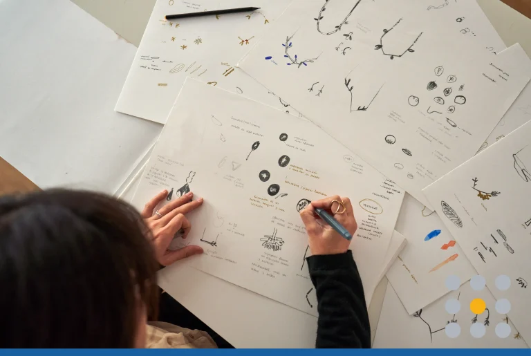
Think about the bright, mellow designs and mixed patterns of folk art. The flowy, carefree lines of script fonts. The unique details and unpretentious character of hand-drawn illustrations. Make your brand more endearing by highlighting the imperfections in your artwork.
If you’re working with a logo maker, test out fonts with letters that vary in size, width, style, or capitalization. Or try folksy fonts that are casual and eccentric, instead of clean and rigid. Look for images inspired by sketches, painting, or stenciling.

Go for Quirky Over Trendy
Gen Z isn’t impressed by brands that are clearly trying too hard to be trendy. While it’s okay to use familiar symbols, they only add value to your logo if you personalize them in a way that feels memorable. Embrace whatever is strange, exciting, or unique about your brand. Then make those special qualities the cornerstone of your logo design.
Do you run an old school hardware store that shows home-improvement newbies how to tackle DIY projects? Do locals love to dream up zany toppings at your bagel shop? Does your flagship product have a distinctive appearance?
Try to pinpoint a few qualities that sum up the customer experience you deliver. Use those definitive features to make sure your business logo is different from competitors.

Build Flexibility Into Your Designs
In the past, branding was about creating a fixed identity that could last indefinitely. Today, consumers expect businesses to evolve at a much faster pace. Stay the same for too long, and post-millennials will see you as a brand that doesn’t try to innovate.
Continuity and consistency are more important than longevity. Don’t think of your brand symbol as a single, unchangeable image. Aim to design a logo with swappable elements you can add, remove, or rearrange to express your brand in different ways.
The most influential companies invest in a brand family of logos to represent the business in a variety of media contexts. Picture the colorful logo variations used by FedEx or the varied layouts used by social media companies, such as Pinterest. Not only does this aid in responsive logo design, but it allows you to subtly refresh your logo over time.
Having a flexible aesthetic also pushes you to hone in on the most recognizable aspects of your brand visuals. You can swap out the colors, use standalone text or graphics, change the layout — whatever works. You gain opportunities to update or expand your company image, as long as your core branding remains identifiable.

Be Adventurous With Color
The days of getting by with a quiet, forgettable brand are quickly fading. Gen Zers are the most agile web users. They mastered the internet before they could say the alphabet, and they know how to navigate around clutter to find exactly the content they want. If you want to reach this audience online, your logo design has to shout, “Check out this interesting thing we’re doing over here!”
A bold or unexpected color scheme is one of the easiest ways to grab attention. How many logos can you instantly identify based on shape and color alone? With minimalism still going strong, rich, saturated hues are the perfect tool to boost brand recognition. Color can transform a simple logo design into a vibrant, memorable brandmark.
Don’t shy away from ultra-bright color schemes. For examples, neons and gradients are past trends making the rounds again. Use subtle techniques, such as shading, transparency, and color blocking, to bring dimension to flat logos. Gen Z is used to looking at logomarks on small screens, so they’re instantly attracted to vivid designs that pull focus.

Explore 80s and 90s Retro Influences
Like all generations, post-millennials are falling in love with retro design aesthetics from recent decades. Gen Z is coming of age in a millennial-guided culture, which is steeped in nostalgia for 1980s and 90s fashion, art, and entertainment.
Analog-inspired typography. Retro color schemes. Synthwaves. Grunge-style illustration. Chrome effects. Bubble letters. Look to the past for striking design elements you can reinvent and feature in your logo designs.
Post-millennial sensibilities are only just beginning to form, which gives you a chance to refresh your image for a new audience. Get ahead of your competitors by reflecting on how you can go beyond current trends.

Moving forward, you have to be comfortable doing the bulk of your brand-building online. If you’re ready to ramp up your internet presence, create a free logo design today using our online logo maker tool.
