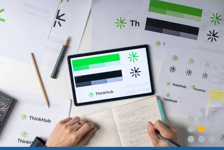
Today’s business owners need to be aware that their brand needs a personality to stand out against competitors. Companies that are unable to tell a story about their business, product, or services may experience having difficulties retaining customers.
The most successful brands in the world have developed their voice through the use of a logo. A business logo should function as a beacon, guiding your customers to your product and services. If you market your logo successfully both online and offline, your customers will become familiar with your brand and will start to associate certain products or services with your company. For example, if someone says “grocery store,” you may think WholeFoods, Stop’n’Shop, or Trader Joe’s — all of which have recognizable logos.
But before you settle on a logo for your business, it’s essential to first learn what different logo styles are available. To design a logo that works best for your business, you need to do a bit of research. Below are different types of logo styles and which ones work best for specific industries.
Popular Business Logo Design Styles
- Mascot Logo. A mascot logo uses an image of an animal, person, or imaginary thing as the focal point of their brand logo. Michelin Tire, for example, uses their iconic Michelin Man mascot that is recognizable by nearly everyone around the world. You may have realized that most mascot logos are used for professional sports teams because they are easy to identify with and are easier to personify to an audience of all ages. Companies and brands with mascots will often enlist real-life actors to interact with customers to promote the business. While this type of logo is easily recognizable and great for online marketing, it may be difficult to print this logo on promotional materials due to the complexity of the design.
- Abstract Mark. Increasingly popular in today’s tech-forward economy, the abstract mark logo consists of an abstract shape. While the logo may be abstract upon first glance, this logo style still strives to send a message to the audience regarding what the service or product is about. For example, DropBox (the global cloud file sharing company) uses a simple blue colored abstract logo that is shaped like an open box. This simple logo tells the audience that all of their files placed within this box are stored safely, they are organized, and they can be moved or shared. The abstract mark is perfect for global brands and tech companies. However, if the logo design is unsuccessful, your brand identity and message may lose meaning.
- Combination Mark. A combination mark logo takes the best of both worlds when it comes to logo design: words and an icon. Famous brands such as Airbnb, Wendy’s, and Domino’s all work to incorporate both their company name in the text as well as include an image. The combination mark logo can be abstract (such as Airbnb) or include a more recognizable image (such as Wendy). When in doubt, this logo style is perfect for any type of business, including restaurants, salons, travel agencies, Real estate, fitness and more. Keep in mind that combination mark logo styles can get quite large and may be more difficult to fit onto promotional products such as pens, mugs, and t-shirts.

- Emblem Logo. This logo design is a more classic approach to a company logo. Famous brands such as Harley Davidson, UPS, and any professional sports associations such as the NFL tout successfully emblem logos. While these logos may seem easy to design, deciding on the right colors, shapes and icon designs can become quite tricky. Emblem logos are ideal for businesses who have a color palette in mind and are looking for a timeless logo design. Automobile and transportation businesses, as well as sports teams, will often opt for emblem logos. This logo design is often chosen as the start of a badge or retro badge logo.

- Lettermark Logo. What do IBM and NASA have in common? Each of these companies only has text as their logo, and that text is an acronym. Lettermark logos may seem simple at first glance, but there is actually a lot of logo design work done behind the scenes. Global corporations will pay a hefty price to have their lettermark 100% customized, right down to a new style of font to a new color — both of which are likely to be trademarked. If you like the idea of a lettermark logo, you don’t need to enlist the help of an independent designer; online logo maker software makes it easy to choose a unique font, size, and color for your business logo. The best part about this logo style is that it’s easy to read, memorable, and can be printed on just about any type of promotional product.
- Pictorial Mark. Twitter, Nike, Target, Starbucks… the list goes on and on when it comes to pictorial mark logos. Pictorial marks consist of just a simple, custom image or icon to represent a brand. While many global companies have pictorial mark logos now, it wasn’t always the case. Businesses such as Twitter and Starbucks both started with a logo that included their brand name. After they had gathered enough brand recognition, they just dropped the lettermark portion and the pictorial mark remained. This logo design is ideal for global brands or well-established brands because these designs are often very restrictive. If you end up changing what products or services you provide, it can be difficult to change this type of logo.

- Wordmark. Want a no-frills logo? The wordmark logo design is your best bet when it comes to marketing your brand name in a clear and concise manner. Popular brands such as Coca-Cola, Google, Subway, and The Home Depot each opted for a wordmark logo. The best way to make your wordmark logo stand out is to get creative with the use of font styles, font size, and font color. For example, Coca-Cola opted for a more elegant font, while Google chose it’s customized modern type block font. To each their own when it comes to wordmark logo styles, just keep in mind that the logo should be legible. Ask yourself, will this look good on a t-shirt? Will I be able to see this logo on a bag across the room?
What Logo Design Is Best For Your Business?
There’s no straightforward answer to this question unfortunately. When it comes to choosing the best logo for your business, we recommend using an online logo maker so that you can design your own logo or at least browse the available templates to get some ideas. At FreeLogoServices, there are thousands of logo templates to choose from that can then be customized with your business name. Using our free logo design software allows you to see different variations and layouts of your business logo without having to work with an expensive freelance designer. Are you ready to test out which logo style is best for your company? Start designing now!
