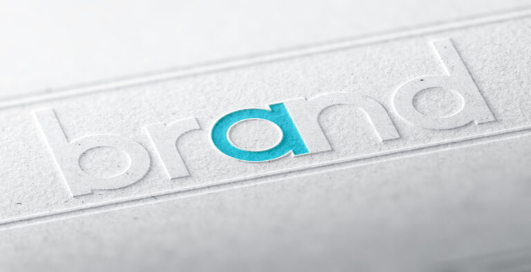
Have you noticed that more brands are opting for sleek monochrome logos? It’s not just another modern trend—businesses are deliberately choosing monochrome for its restraint and lasting appeal.
Monochrome logos are flexible, working well across all media and platforms to provide brand recognition. And beyond their visual appeal they tap into the psychological power of color reduction, making consumers more conscious of a particular brand.
- Monochrome Logos: A History
- Monochrome Logos Across Media & Platforms
- Using Color Reduction to Your Advantage
- Monochrome Logos Are Timeless
- Design Tips for a Monochrome Logo
- Challenges of Using Monochrome Logos
- Case Studies of Successful Monochrome Logos
Monochrome Logos: A History
Monochrome logos have been around since the early days of branding. Think long before digital marketing and complex color printing. In the late 19th and early 20th centuries, brands were limited by printing technology and used monochrome to guarantee consistency across print.
Brands like Coca-Cola and Ford worked within these limitations to create logos that were recognisable and reproducible in monochrome.
As branding developed, some brands started to use more colorful and elaborate designs to stand out. However, modernism in the 20th century shifted towards minimalism in art, architecture, and also design.
The Bauhaus movement, emerging from the Staatliches Bauhaus German art school in 1919, was about simplicity and functionality.The school’s approach to design had a big influence on the adoption of minimalist logos. During this time, brands like Volkswagen went for sleek monochrome designs to look professional and also eternal.
Right now, the world of branding is shifting back in time to replace colorful and complex designs with simpler, more streamlined, monochrome logos.
As minimalism is more valued in modern design, brands are going for monochrome logos that are uncomplicated and enduring. For brands that want a clean modern look, these logos are appealing because they remove unnecessary clutter to leave a design that’s both beautiful and lasting.
Monochrome logos can be sophisticated and elegant, as they offer a classic look that means a brand’s identity will remain relevant for years to come. Their lucid design has been chosen as a a statement of style and grace.
Monochrome Logos Across Media & Platforms
One of the best things about monochrome logos is that they are adaptable in all media platforms.
Monochrome logos look polished and professional, whether on a website, social media profile, mobile app, or even physical things like packaging and business cards. This ability is foremost in today’s multi-channel world, where your brand needs to look the same everywhere.
Scalability is another area where monochrome logos excel. A good monochrome logo will:
- Expand to fill a billboard
- Shrink to fit on a smartphone screen
- Adapt easily into other designs
This flexibility means your logo always looks sharp and professional, no matter the size of the image.
Using a monochrome logo across all of your platforms helps brand recognition by building a strong brand identity. Over time, this consistent presence will embed your brand in the minds of your customers. As a result, your brand becomes instantly recognizable and memorable.
Using Color Reduction to Your Advantage
The psychological impact of color reduction in branding is extremely powerful.
You can elicit specific emotions and a stronger focused brand message when you reduce a logo to one or two colors. Removing excess colors allows the heart of your brand to shine through, giving the consumer the ability to connect with—and remember—your logo.
Monochrome color schemes use psychology. For example, black can mean sophistication and authority, while white means pureness and lack of adornment.
Grayscale adds depth without overwhelming the viewer, and the lack of color can actually make your brand look more professional, confident, and enduring.
Just look at Apple; the business has proved that less is more by using monochrome logos to boost their brand name. The monochrome logos they use are iconic and instantly recognizable symbols of their brand.
Using Monochrome Elements in a Wider Branding Strategy
Choosing to include a monochrome logo into your broader branding strategy requires you to carefully consider your options.
Align Everything
Start by aligning your other brand elements with a monochrome aesthetic, such as your website design, marketing materials, and product packaging.
Not everything you create has to be black and white. Monochrome also refers to the use of single-color tones. For now, we suggest you concentrate on immaculate layouts, minimal design, and subtle visual details that will complement the naturalness and sophistication of your monochrome logo.
Be Consistent
Consistency is the best ingredient in brand identity. To look cohesive, please make your typography, imagery, and tone of voice reflect the minimalism and sophistication of your monochrome logo.
Uniformity across these areas will strengthen brand recognition and send a clear message to your audience.

Don’t Be Afraid to Add a Dash of Colour
Your logo may be monochrome, but that doesn’t mean your entire brand palette has to be. You might want to consider adding some color accents to your other branding materials.
A well-placed color can draw attention to specific areas and amplify your monochrome logo to keep the overall brand image not only cohesive but also eye-catching.
As an example, you’ll often see cybersecurity companies follow this general template for their logos: Strong use of blue to convey trust and green to be associated with modernity and cutting-edge technology.
Financial institutions go for darker shades like forest green or navy. These colors convey stability and reliability, so clients are more likely to invest trust in these institutions.
Monochrome Logos Are Timeless
Trendy colorful logos need to be updated regularly to stay current. However, monochrome logos have a classic quality that will stand the test of time. That’s why they’re a smart choice for brands looking to build a lasting identity.
Nike changed their logo in 1978 but retained its monochrome look. This logo hasn’t just helped the brand last longer, and it’s helped it stay consistent in the market.
For businesses, the long-term benefits of using a monochrome logo are huge. With a logo design that doesn’t need to be rebranded often, you can save time and resources.
Another benefit of monochrome logos is that you can place them on any landing page or blog and use high-authority backlinks to build brand awareness whenever anyone clicks on them.
Plus, a monochrome logo simplifies brand maintenance and helps to build consumer recognition and trust. Over the years, your brand stays strong and memorable in your audience’s mind.

Design Tips for a Monochrome Logo
Creating an effective monochrome logo requires a balance of practicality, creativity, and clarity. With a focus on the essentials and careful use of good design elements, you can create a logo that is striking and versatile:
- Simplicity is everything: Focus on reducing your logo to its most essential elements. A strong visual identity comes from an uncluttered design that’s easy to recognize.
- Choose the correct typography: Select a font that complements your monochrome logo. Sans-serif fonts are often preferred for their modern look and might also convey the elegance you’re after for your brand.
- Apply negative space: Try to use negative space creatively to add depth and interest while maintaining clarity.
- Testing and refinement: Test your logo across various mediums including digital and print. Also, try using different sizes, and don’t forget to ask for feedback. The process of refining and iterating your design helps make sure that it’ll look great and function effectively.
Challenges of Using Monochrome Logos
While monochrome logos offer uniformity and pliancy, they come with certain challenges that businesses must navigate to maintain a strong brand identity.
It’s also important to emphasize that a logo is only as good as the other aspects of your branding.
Risk of Appearing Too Simplistic
One of the primary concerns with monochrome logos is the risk of appearing unsophisticated. In a world where brands compete for attention, a stripped-down logo might fail to stand out. This problem is especially apparent in industries where vibrant visuals are the norm, and anything less could be perceived as a lack of creativity or effort. This impression could potentially diminish the perceived value of the brand.
Businesses can overcome this problem by focusing on distinctive typography, clever use of negative space, and dazzling creative layouts. These elements can add depth and sophistication to a monochrome logo, ensuring it feels intentional and well-designed, rather than plain.
Blending Into the Competition
With the growing popularity of monochrome logos, particularly among luxury and tech brands, there’s a risk of a new logo blending into a sea of similar designs. Monochrome logos, especially in black or white, may become indistinguishable in a competitive market where many companies adopt this approach.
To avoid blending in, businesses must try to focus on creating a unique brand story and integrate subtle signature elements into the logo, such as a distinctive font, icon, or use of negative space. These small details can help distinguish a brand, even within the monochrome aesthetic.
Limiting Creative Freedom
Monochrome logos can sometimes curb a designer’s creative freedom, as they lack the variety of colors and gradients that can bring visual interest to a design. Without these additional elements, it can be challenging to convey brand values or to evoke emotions.
Brands can use texture, pattern, and geometric shapes within the monochrome palette to maintain their creative freedom. Businesses can also consider using complementary visual elements—such as accent colors in other brand materials—that align with the monochrome logo while refining the brand’s overall impact.
Case Studies of Successful Monochrome Logos
Believe it or not, several big brands have gone monochrome and made the constraints a fun challenge. This has resulted in brand identities that last beyond the trend, and prove that plainness can be the key to recognition, trust, and market presence.
Here are three examples:
- Chanel: Enduring Chic in Fashion
Chanel’s monochrome logo, made up of two interlocked “C”s in bold, is one of the most recognizable logos in the world. Introduced in 1925, the company’s monochrome logo has remained unchanged for nearly 100 years.
By using monochrome, the company has reinforced its brand as a symbol of luxury for an audience that values heritage and sophistication. The black-and-white contrast imparts authority and brilliance. Chanel has used these traits to build trust and maintain its premium position in the fashion industry.
- Apple: Minimalism Meets Innovation
Apple’s logo has changed a lot over the years, but going monochrome in the late 1990s was the cleverest part of its rebrand strategy. As an innovative leader in technology, Apple’s shift from the colorful striped apple to the sleek monochrome logo unveiled a new era of easy-to-understand technology with a popular user-centric design.
Apple’s monochrome logo matches its minimalist product design and brand messaging. The understated logo has become synonymous with quality, reliability, and innovation, helping Apple build a loyal customer base and establishing its global dominance.
Nike: Power in Purity
The swoosh is one of the most famous logos in the world; the monochrome version is a classic icon.
Designed in 1971, the swoosh’s clean lines reflect Nike’s focus on motion, performance, and athleticism. By sticking to monochrome, Nike can keep its brand looking modern and relevant to athletes and consumers alike.
The versatility of Nike’s logo across all media and platforms—from sneakers to billboards—is phenomenal. By keeping its monochrome logo going strong, Nike has become a symbol of trust, performance, and style—dominating the sportswear space.
Conclusion
A monochrome logo is an easy way to make an impact. It’s functional, enduring and can be used across all mediums, helping businesses stay relevant.
As you work on your brand strategy, please think about how a monochrome logo could give your business a modern and pristine image that can cut deep into any market. It’s hard to believe, but pure and simple never goes out of fashion.
Author: Andrew Ginsberg.
Frequently Asked Questions
1. Why are monochrome logos so popular today?
Monochrome logos are a hit because of their clean and timeless look. They offer great flexibility and ensure your brand looks consistent everywhere. Plus, with today’s focus on sleek, minimalist designs, they’re a perfect choice for brands wanting a design that’s more current.
2. Do monochrome logos work for all types of businesses?
Absolutely! Monochrome logos are versatile and can fit any business, no matter the industry. They’re particularly favored by tech, luxury, and fashion brands because of their elegant and sophisticated vibe. The beauty of a monochrome logo is that it can be tailored to match any brand’s unique identity.
3. How do monochrome logos impact brand recognition?
Monochrome logos are fantastic for building strong brand recognition. They’re adaptable and look great on everything from business cards to billboards, helping people easily spot and remember your brand wherever they see it.
4. Can I add color to my branding if I have a monochrome logo?
Yes. You can definitely keep your logo monochrome while adding pops of color to other branding materials like your website or packaging. These colorful accents can enhance your brand’s visual appeal and complement your logo beautifully.
5. What are the psychological effects of monochrome logos?
Monochrome logos can really make an impression. Black often signals authority and elegance, while white gives a sense of purity and simplicity. Using shades of gray can add depth and convey a professional and trustworthy vibe.
6. Are there any challenges to using a monochrome logo?
One challenge could be standing out, especially if many others in your field also use monochrome designs. To overcome this, you can get creative with typography, explore unique layouts, and incorporate clever design elements that highlight your brand’s uniqueness.
7. How do I ensure my monochrome logo stands out in a competitive market?
To make sure your logo shines, focus on unique design touches like distinctive fonts and strategic use of negative space. Your logo should also clearly convey your brand’s story and core message, making it both memorable and easy to recognize.