The show is over (although for a while there, it didn’t seem like it was ever going to end). Regardless of whether you think the Academy got the winners right or the multi-talented host delivered in the entertainment department, over 1 billion people around the world tune in every year to see which moving picture makers come out on top.
For many of these institutions, their logos represent dynasties and harken back to times when a night out at the movies was the ultimate leisurely pastime. My, how things have changed. While for some of the impressive newcomers, such as Black Bear Pictures established in 2011 and the powerhouse behind the fearless film The Imitation Game, the visual identity is new and may evolve over time.
Here are the results when we took a little bit of movie magic and mixed it with some refreshing and unexpected design treatments. Naturally, we saved the studio behind the two biggest winners of the night for last.
Oscar-Winning Filmmaker Logo Redesigns
Warner Bros.
American Sniper
To counter the grave subject matter of American Sniper, but to capture the strong themes of patriotism and American pride, we gave a classic institution an iconic update. We wanted to leverage just how recognizable those two letters are. We gave the famous WB shield an Andy Warhol treatment, and the results are bright, cheery and just a little whimsical.
Black Bear Pictures
The Imitation Game
In addition to giving us all the opportunity to say Benedict Cumberbatch’s name frequently, and of course, with alacrity, The Imitation Game has put Black Bear Pictures on the map. In the spirit of cryptography and hidden messages, and playing off the bear theme, we wanted to modify this logo to incorporate elements of design made famous by the Grateful Dead. After all, The Imitation Game tells us the story of Turing’s heroism, for which we should all be grateful (yup, we went there).
Sony Pictures Classic
Whiplash
For the most subdued and demure logo of the bunch, we wanted to expand the boundaries and, well, loosen things up a bit. The Sony Pictures Classic logo looks just that — classic and plain, conjuring memories of VHS video tapes. This is a stark contrast to the genius in training featured in the film, and the dire challenges he overcomes in his journey to musical prowess. Dare we suggest an update to this logo inspired by another film that features pain in order to achieve gain, Fifty Shades of Grey. Sony Pictures, Mr. Grey will see you now.
Harpo Films, Cloud 8 Films, Celador Films
Selma
What to do for the woman who has everything, and has achieved so much across every medium imaginable? (come on, admit that you watch OWN) Give her the hipster treatment, of course. We love the idea of Oprah on her single speed fixed-gear bike, riding to the farmer’s market to restock on kale. The Harpo Films logo, with its striking kaleidoscope in homage to its chief executive, would look sharp with a stripped-down, hipstered-up version. Now if we can just convince Oprah to rock black nail polish and those Warby Parker glasses we sent her.
Working Title Films
The Theory of Everything
For the riveting film about the singular Mr. Hawking, we wanted to reimagine the Working Title logo with a design aesthetic that was equally pivotal for its time. The Pointillism movement was a mind-bending expansion from the Impressionist era that was first given this moniker out of sarcasm and derision. It’s all about perspective, trusting your eyes and your mind to yield incredible results, and taking a leap of visual faith.
IFC Productions, Detour Filmproduction
Boyhood
Boyhood is a ground-breaking film as much for its candor and humanity as for its process. The film was created over the course of 12 years with the same actors, giving it an authenticity that has never been experienced. The director truly reimagined filmmaking in an almost “Film 2.0” kind of way. We didn’t have to look any further. Here’s IFC 2.0.
Fox Searchlight
Birdman
The Grand Budapest Hotel
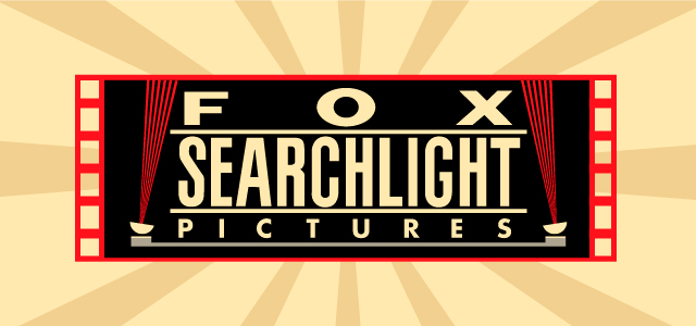
Fox Searchlight was the big winner in Sunday’s ceremonies, with Birdman taking home the two most coveted awards of the night, and Grand Budapest Hotel taking home 4 Oscars. The visual recall of the Fox Searchlight logo primarily ties to its moving spotlights, but the heavy block letters hoisted on top of a Grecian pedestal are memorable as well. Pull a Shepard Fairey and voila! Instant update that focuses on the key elements in a truly compelling way. Clearly a makeover worthy of the studio behind two quirky and heartfelt films.
