You have the perfect recipes, the best cooking stories, and a ready-to-go site as your canvas.
Then you notice something is missing. Your stories, photos, and recipes look fantastic, but there’s nothing really memorable that sets your site apart from the rest.
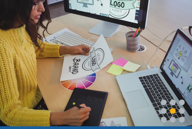
What you need is the perfect logo. A splash of personality that people will recognize as your recipe blog.
Creating the perfect logo can be a hassle. This little icon shares your style, creativity, love for food, and individuality with the world. That’s a lot to pack into one little space!
Here are some logo design basics you need to know to create the right logo style for you.
What’s Your Brand Identity?
What do you want people to know and feel about your recipe blog?
Start by identifying the core values and beliefs in your business. Think about what you do better than any other recipe blog. Your strengths are what will set you apart from the rest.
Your answers will be the focal point of your logo style. Jot them down as they will be the foundation of your logo.
Find Your Inspiration
Now is the time for brainstorming, where you write down all your ideas, no matter how crazy they sound. Even the worse of ideas may spark something better.
Study the logo styles you like the best. What about them attracts your eye? Check out what the competition has done with their logos to find more inspiration.
Try out a mood board by collecting fonts, colors, textures, and images that show your personality and style. You’ll be surprised where you can find your inspiration.
Pick a Logo Style
Are you a quirky cook who embraces happy accidents in the kitchen? Or do you create sophisticated dishes that inspire professional chefs?
However you create your recipes, your logo style should share your recipe blog personality. Here are few tried and true styles for you to explore:
- Classic Styles: A timeless style that shows your reliability and experience in recipe blogging.
- Vintage and Retro: For the homestyle and comfort food extraordinaire, kindle a sense of childhood nostalgia with a vintage-inspired logo style.
- Quirky Styles: Show off your fun side with cute illustrations and bright colors.
- Minimalistic: This trendy and modern style will show your no-nonsense side and lets your audience know you’re recipe blogs are down-to-earth.
- Handcrafted Styles: Whether you’re a farm-to-table, all organic, or into homestyle cooking, this logo style demonstrates your unique and classy style.
- Symbol, Logotype, or Both: Simplify your logo style by sticking to just a symbol or letter or make it dynamic by mixing both.
Mix and match styles, fonts, and symbols to find the style that fits your brand best.
Typography & Color
Finding the right type and color palette will bring your personality and style home.
Experiment with type by typing out your recipe blog’s name and trying different font styles. You don’t need to be a professional graphic designer to find fonts that relay your style.
Color attracts the eye, evokes a feeling, and consist of deeper meanings. Working with color palettes that are complementary (opposite), analogous (colors next to each other), or triadic (3 evenly spaced colors) on the color wheel will ensure the colors work well together.
A little research and experimentation will lead you to the right mix of colors and font for your logo.
Now you can start pairing your different elements together. With a little help from a designer, you will create the perfect logo style to symbolize your recipe blog.
Learn more about designing a great logo in our logo design blogs. We have the industry’s latest tips and trends to get your logo looking its best!


