If you stare at red, your heart will beat a little faster, so understanding the influence of red logos is quite important these days.
It can even boost your blood pressure and adrenaline.
Red is nearly the most visible color on the spectrum, second only to yellow.
There are endless eye-popping facts about the color red. It’s the most energetic, captivating hue out there. There’s a reason so many large companies have red logos. They use the color to grab your attention.
The influence of red logos is something many people overlook. But seeing the energetic hue affects you in ways you might not realize. There are tons of scientific studies to prove it.
Red logos are a perfect fit for many companies. For other companies, a custom red logo might not be the best choice.
Are you considering using a red logo to represent your brand? It may be the right choice for you. If you want to find out why, keep reading.
- Color Psychology: Why Are Red Logos So Captivating?
- Psychology of Red Logos: How Can They Affect Customers?
- What are Some Myths About Red Logos?
- Is Red A Good Color for Your Logo?
- How Should I Use Red in My Logo Design?
Color Psychology: Why Are Red Logos So Captivating?
Red affects us subconsciously. Think stoplights, stop signs, fire trucks, ambulances, and even sirens. These are specifically designed to engage viewers.
This same subconscious effect happens when we see a bright red logo. Color is the first thing people notice about a brand, so why wouldn’t you want your brand colors to captivate your customers?
Psychology of Red Logos: How Can They Affect Customers?
There are countless case studies done on the color red. Before choosing your logo color, learn how it can affect your customers. Here’s how seeing red might affect them:
Red Gets More Sales
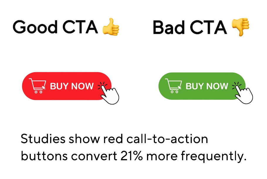
According to Marketing Insider Group, studies show red can impact consumer behavior. One finding was a red call-to-action button can increase conversion by 21%.
Compared to a green CTA button, the color red drove much more conversions. This suggests red creates a sense of urgency, pushing people to take action quickly.
If a CTA button does this to customers, imagine what a logo might do. It can create a sense of urgency, similar to the CTA button.
Red Causes Intense Physical Reactions
Some studies show that being exposed to the color red can lead to:
- Increases in heart rate
- Faster breathing
- Increases in blood pressure
- Higher metabolism
Red Impacts What Customers Think of Your Product
One study investigated the influence of red logos on consumers’ perception of quality and price.
Researchers found that the color red positively influenced people’s perceptions of the quality and presentation. However, it had negative effects on perceptions of price. This study is called “Seeing Red: Quality of an Online Product, Its Presentation, and Price.”
Think about how a red logo can affect your customers this way. Will they assume a red logo means high quality? It’s possible. You should consider these things when creating a logo design.
If a unique logo is what you’re after, FreeLogoServices is your go-to option.
Pick from thousands of logo designs that scream your brand’s identity. Whether it’s a neutral color or a red color, your brand identity is in the best hands. Hop on FreeLogoServices and pick your logo today!
Red Can Improve Ad Performance
A study by Gorn et al revealed that red can increase ad effectiveness. It can provoke emotions like excitement and urgency. Ads with red elements were found to be more memorable and impactful.
If red has this effect on advertisements, it might be with logos too. Of course, there are other key elements that can change customer perception–logo graphics, text, secondary colors, etc.
Red Gives an Edge Over Competition
A study on the Euro 2004 International Soccer Tournament showed some interesting results. Five teams, which wore primarily red, while their opponents wore different colors, showcased better performance on the field than their competitors.
All five red teams also scored more goals. This led them to believe colors may impact winning and losing.
This study might not have a direct correlation to red logos. It’s still important to know since red can have similar effects on consumers. Or even competing brands.
Red Logos Can Have Negative Effects, Too
There are more than just one or two emotions associated with the color red. Not all feelings people get from red logos are positive.
Some people say seeing red can actually provoke negative feelings, like
- Danger
- Anger
- Aggression
- Fear
What are Some Myths About Red Logos?
Myth #1: Red Logos are Only Good for Certain Industries
Reality: Red is used a lot in the food and beverage industry. An eye-catching color like red stimulates hunger. However, it’s not only good for food-related logos. Red is great for other industries, too. Like technology, automotive, fashion, and even entertainment.
The key is how you integrate red into your brand. For example, red is used by tech companies like YouTube to convey excitement. It’s also used by automotive brands like Ferrari to symbolize speed and performance.
It can be used across tons of different niches. It really depends on what your brand is about. Use your logo color to amplify your brand’s personality, not define your entire brand.
Myth #2: Red is Universally Loved
Reality: Preferences for red can vary across different cultures. In some cultures, like China, red is associated with good luck and prosperity. In other cultures, it can be linked to danger or warnings.
Understanding your target audience is crucial when choosing your logo colors. Know who your target audience is, and know how they view the color red.
The better you understand your audience, the better decision you’ll make when choosing a logo color.
Myth #3: Red Logos Always Increase Appetite
Reality: While tons of studies show that red logos increase appetite, this isn’t always the case. Red’s effect on appetite changes based on culture, personal preferences, and the shade of red used.
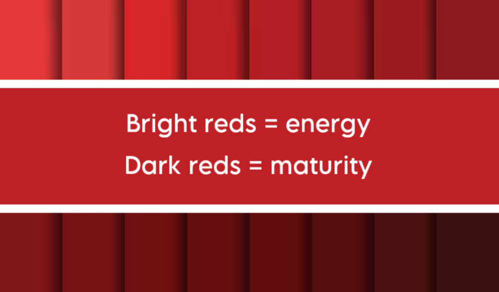
For example, deep reds might stimulate feelings of warmth. Bright reds, on the other hand, might feel more intense and grab attention. Feelings can vary based on how the hue is perceived. Famous brands know this very well.
Myth #4: Red Only Portrays Aggressiveness
Reality: Yes, red can indicate anger, aggression, or even fear. However, it can also evoke warmth and passion. This all depends on the context and usage.
Think of a red logo in a cozy restaurant. This might suggest warmth and hospitality. While red in a sports brand might suggest competition.
Myth #5: Red Logos are Overused and Unoriginal
Reality: Red is a popular logo color, but it’s far from unoriginal. Creative uses of red logos can still make a brand stand out.
The idea of red being unoriginal comes from its strategic use in industries, not a lack of originality. If the color red aligns with your brand strategy, use it.
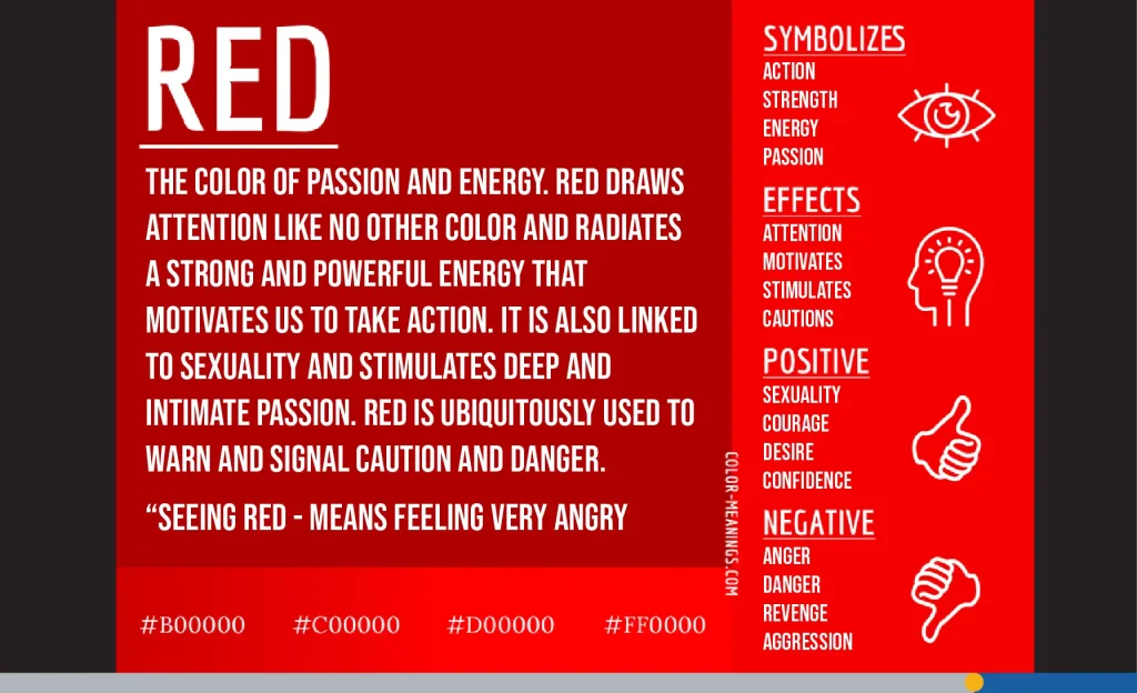
Is Red A Good Color for Your Logo?
It depends. The ideal color for your logo can vary based on lots of things.
If you’re going after a more energetic, bold, or passionate feeling, then yes. However, not every brand is trying to convey this.
If your brand represents a more mature, calm, and serious persona, then probably not. You have to consider your target audience.
There’s a reason many banks and law firms choose neutral colors: They simply aren’t trying to convey an energetic feel to customers.
On the other hand, there’s also a reason many food brands choose red. Famous red logos include Wendy’s, McDonald’s, Jack In The Box, Coca-Cola, Chick-fil-A, etc. These brands likely want to promote feelings of hunger, urgency, and excitement. And it works on many people.
If that’s what your brand is about, red is probably a good option.
To create the perfect logo for your business, use FreeLogoServices! Our online logo maker ensures you create an attractive logo with powerful and eye-catching colors tailored to your customers.
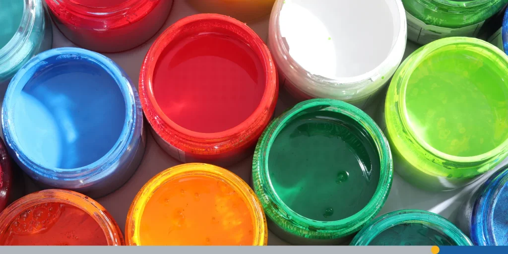
Before You Choose A Brand Color, Keep These in Mind:
1. Your Target Audience:
Really get to know your target audience. Thoroughly understand everything about them:
- Demographics
- Preferences
- Cultural backgrounds
- Age
- Gender
2. Trends in Your Market:
Know the color trends in your market. Yes, it’s important to stand out, but you also want to make sure your color choice aligns with industry norms.
If you’re a male-based brand, like construction or monster trucks, you probably shouldn’t choose pink, which is a more feminine color.
3. Your Brand Personality:
What is your brand personality? How will your logo communicate that? Is your brand persona energetic, serious, humorous, etc? Different colors provoke various feelings.
For example, picture you’re a funeral home owner. A bright, energetic color might not make sense. Bright red, yellow, baby blue (a shade of the color blue), etc would be terrible choices.
They’d probably confuse your customers, too. Imagine a bright yellow or pink logo for a funeral home – strange, right?
However, for a makeup or lemonade brand, those colors would fit like a glove. Context is everything.
4. Color Psychology:
Research the psychological effects of colors. We’ve talked about how red can stimulate hunger.
If you’re a food-based brand, you should consider red. Also, if your brand represents competition, red might be a good choice. It’s all about brand recognition.
Think about every emotion felt when seeing a certain color. If your brand represents that feeling, the color probably fits.
5. Cultural Differences:
People from different parts of the world may favor colors differently. Be aware of how other cultures may view red logos.
This is especially true if your brand is internationally based. A positive color in one culture could be seen as negative in another.
7. Competitor Analysis:
Study your competitors’ colors and make your logo unique. Avoid colors that are overly similar to your main competitors, so your logo stands out.
You can even create a list of your top 10 to 20 competitors. Study how they convey emotions through their logos. What makes them stand out?
Consider how you can use similar strategies in your logo.
8. Color Harmony and Palette:
Think of how your primary color will look with other colors in your palette. Make sure your colors blend well together.
Also, avoid pairing colors that are too similar. You need a good amount of contrast for visibility. Red combined with another shade of red might be a bad idea. At least if they’re placed directly on top of each other.
Try to avoid colors that don’t go well together. Understanding color theory is important for this. Get other people’s feedback about your color choice. Refer to the following point about testing and feedback.
12. Testing and Feedback:
Before making a final decision, test your color choices and gather emotional responses from your audience. Do this with groups of people or surveys to get feedback. Sometimes, it’s better to listen to popular demand over your opinion.

How Should I Use Red in My Logo Design?
Use Red Sparingly to Direct Attention
Red is a bright, attractive color. It makes people stop and stare, and it’s also used by many media brands. Use it to get people to focus on a certain area of your logo.

For example, the Netflix logo uses red sparingly, yet it triggers positive emotions. It uses black, a contrasting color, to make the word “Netflix” pop. This (and the arc in the wording) causes the writing to stand out.
Consider Using A Gradient in Your Design
Many people love gradients. One color fading into another can add a perfect modern touch to logos. If you’re considering using a gradient, try fading a darker color into a lighter one.
The contrast in shades tends to captivate viewers.

Color Combination: Red With Other Colors
If you don’t want to use multiple shades of red, try using other colors. \
In graphic design, the most common colors paired with red are white, black, and yellow. It’s recommended to use contrasting colors so your logo stands out. For example, you wouldn’t want a dark red logo with a crimson background. The best color combos complement each other well.
Get Creative With Different Shades of Red
Using only one shade of red isn’t a bad idea. However, multiple shades of red may grab more attention. Try using shades of darker red, lighter red, or similar warm colors.
Avoid placing red directly on another shade of red. This makes images hard to see.
The McAfee logo has multiple shades of red. This captures attention and makes it stand out from other red brands. Whatever you choose, make sure the important parts of your logo are easy to see. Never place a red logo on another red background.
Your Logo Design Should Convey Your Brand Personality
Red logos aren’t for everyone. For some companies, it’s a hue that simply doesn’t fit. Whichever color you choose, it should match your brand personality.
Knowing the facts we’ve covered, you can make a better decision when picking a color. Your logo design should be a symbol of your company. It represents you.
When people think of your company, your logo will be the first thing that comes to mind. Create it the right way.
Ready to create your first business logo? Then FreeLogoServices is your first choice. Pick from thousands of combinations and business card variations and boost your online presence with captivating visuals for your brand.
About the author:
Matthew Pierce, SEO Specialist over at MattsWorld101.com.


