Imagine trying a burger at 10 different restaurants. None of the establishments have any names, signs, or identifying symbols on their food. Could you still tell the burgers apart? Would you be able to remember what you liked or disliked about each restaurant?
Making great food is only one part of having a successful restaurant. If you’re competing with a lot of businesses selling similar food, you have to make your restaurant the easy choice. Creating a brand can help you build customer loyalty and attract new business. And designing an attractive restaurant logo is a good place to start.
Logos are simple and visual. They play on impulses and instantly remind diners of your delicious menu. To attract diners, include these 10 elements when creating a logo for your restaurant.
1. Differentiation
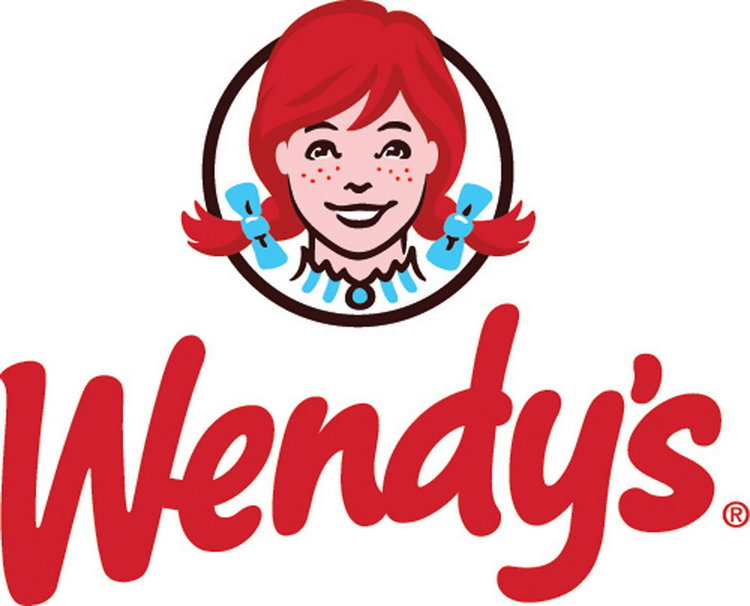
Know why you’re different from competitors. Great restaurant logos have a distinct personality that’s reflected in their service and product packaging. Think about all the thriving burger restaurants in the world. The Wendy’s logo uses the cartoon likeness of the founder’s daughter. It represents family, quality and old-fashioned values with a clear message. Wendy’s wouldn’t serve you food that isn’t good enough for the founder’s own family.
On the other hand, In-N-Out burger is known for fresh ingredients, history, and fast food convenience. The retro arrow logo is simple and tells customers they don’t have to wait long for tasty food. Research competitors, and make a list of selling points that make your business stand out.
2. Expressive typeface
A strong restaurant logo doesn’t have to have symbols. Ihop, Denny’s, and Subway all use letters with no logomark. With that in mind, try to create unique lettering that makes your business name pop. The font should reflect the tone of your business. After all, a fancy script doesn’t quite fit a casual breakfast diner.

Creativity doesn’t mean being over the top. Even if you use a logo designer to create a mock-up, add simple touches tailored to your brand story. Picture the arrows at the ends of the “S” and “Y” in Subway. They add the perfect finish to a simple design.
3. Customization
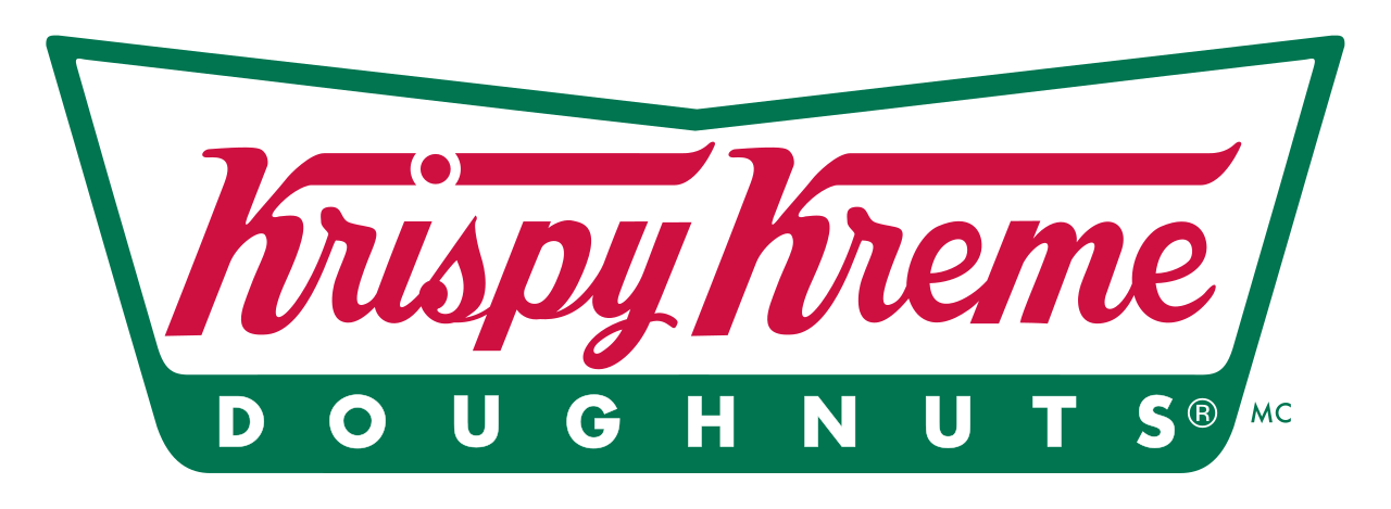
For the most impact, consider using a completely unique typeface. Brands like Moe’s Grill and Krispy Kreme have custom lettering, so other restaurants can’t easily copy their branding.
4. Storytelling
Make it easy for diners to match your logo to your products. Think about who your core customers are and why they come to you. Are you family-friendly? Authentic? High-end? Innovative? Is your food customizable? Fusion? Healthy? Traditional? Artistic?
Cracker Barrel was originally a country store in Tennessee. The logo captures the quaint history, depicting a man and a barrel at the old storefront. Everything about the restaurant’s imagery tells a story of Southern comfort and hospitality.
5. Balanced shapes
Try not to go crazy throwing strange elements together. You don’t want round elements fighting against sharp ones. And large logos look odd when the interior shapes are too small, leaving a lot of excess space. A cluttered logo confuses customers and doesn’t do anything to further your brand. Even if they don’t know why, customers are immediately turned off when shapes are out of balance.
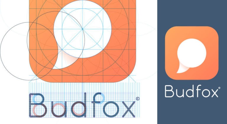
That’s why it’s smart to use familiar shapes and proportions as logo inspiration. Picture any well-known logos in your mind. Focus on the biggest shapes in each logo and how smaller ones complement it. Most logos can be broken down to circles, rectangles, triangles, and squares.
6. Symmetry
While there’s nothing wrong with mixing round and sharp shapes, you need strong symmetry for a clean design. Keep in mind, symmetry doesn’t mean both sides of the logo have to look the same. The important thing is to control the amount of space used throughout the design.
Consider the proportions of the Sonic restaurant logo. The main design contains two overlapping triangles pointing in opposite directions. But look more closely. You can fit the entire design inside a large rectangle. The upper points of each triangle would hit the corners of the rectangle.
7. Color symmetry
Beyond shape symmetry, you also need logo colors to work together. The majority of restaurant logos have no more than two colors. You can certainly add more, but it gets harder and harder to keep the design balanced.
Researching color theory can help you pick the right hues for your logo. Colors have a wide range of associations, and using the wrong ones can make it hard to nail down your branding. Brainstorm a list of traits that represent your business, and choose relevant colors. Is your restaurant fun and casual? Upscale and expensive? Associated with specific cultures?
Take Italian restaurants, for example. Many use green or red in logos because they’re the main colors in the Italian flag. Bright red and orange are common for fast food restaurants. These intense colors channel feelings of joy, desire, speed, and celebration.
8. Negative space
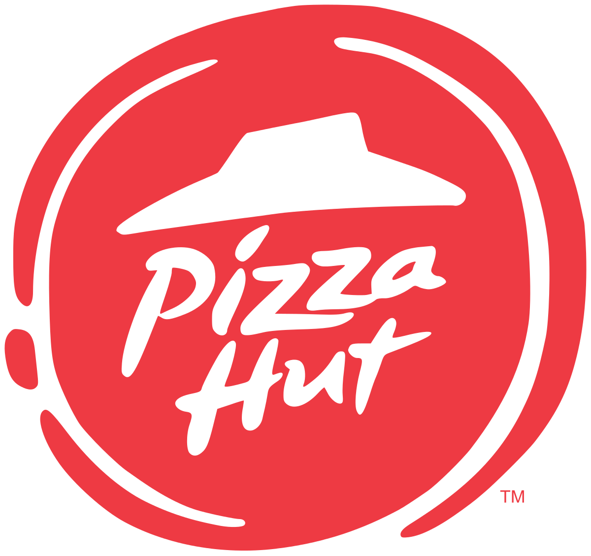
Don’t assume that you have to fill in every inch of the design. White space gives your eyes a break while calling attention to secondary shapes. Being strategic with white space makes for a more crisp, refined look. TGI Friday’s log breaks up the bright red stripes with a white background. And the Pizza Hut lettering appears to float in the white space.
9. Positive associations
No business owner wants to send negative vibes, but an upbeat design is even more important for restaurants. Diners are particular about food, and they don’t want to eat in places with bad associations. The phallic logo for Dirty Bird has sparked controversy since its introduction. The logo certainly fits the company branding, but it immediately alienates many diners. Being risque isn’t always a bad thing, but make sure you’re catering to a distinct and loyal audience.
10. Simplicity
Be prepared to deal with some stinkers along the way. A good restaurant logo takes time to make, but the final design should be simple. Keep editing until all unnecessary elements are removed. If you can take away flourishes here and there without watering down the design, that’s a good thing.
Get feedback and logo inspiration from your most loyal customers along the way. They’re the type of people you want to attract in the future, and their opinions could be right on the money.
Need more ideas? Take a look at some of our restaurant logo designs for inspiration.


