Sports are international; they’re borderless. Therefore, many sports logos have international recognition. Imagine you’re a designer tasked with the job of branding a sports franchise for a soccer, rugby, football or baseball team. Sound like a tall task? Designing a logo that can potentially be seen by millions of people is both exciting and daunting.
Essential Design Elements of a Sports Logo
There are a lot of design elements that need to be taken into account when designing a sports logo. A well-designed sports logo will include some shapes that create movement, as most sports require a lot of movement from the athletes. A bold and assertive font style should also be a top priority. Whimsical cursive fonts have no place on sports logos. Instead, bold, modern, and uppercase lettering are usually a designer’s top choice. Finally, colors play a significant role in sports logos. Fans and athletes alike need to be able to easily recognize their team through the use of color.
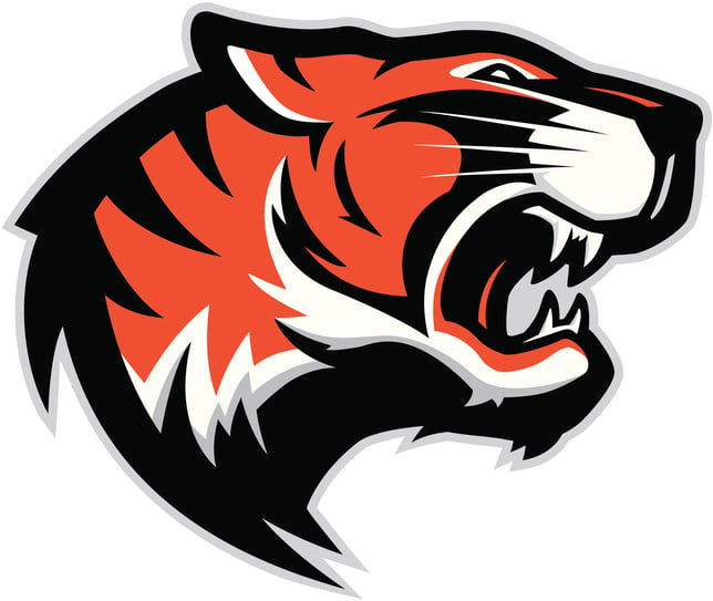
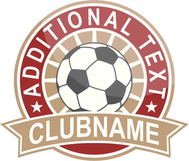
A sports logo should also always leave room for a mascot or emblem. Mascots are often used by American sports teams, whereas emblems are frequently used elsewhere across the world. Think about some of the NFL teams: The Buffalo Bills, Baltimore Ravens, and Miami Dolphins; each has a mascot that’s recognizable and incorporated into their sports logo. Emblem logos are often used by rugby teams and soccer teams (think Manchester United, Liverpool Football Club, or Chelsea Football Club).
Tips To Consider When Designing a Sports Logo
Your logo may need a few different versions.
When you look at successful sports teams, mot have more than one logo. One logo usually holds the initials of the team, school, city, or street in an emblem or wordmark format. A different logo shows an image of the mascot, usually just a face, and normally no other words. Keep team consistency throughout these logos by using the same fonts and colors throughout. For example, the Philadelphia Eagles have one logo featuring the mascot eagle’s head, and another with the words “Philadelphia Eagles” over the image of the eagles head again. They even have a smaller logo with just the word “Eagles” in the same font and color scheme as the others.
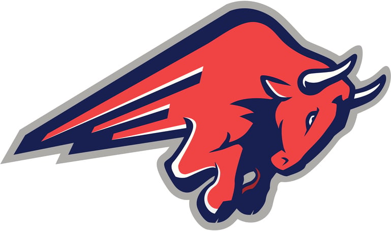
Your logo should represent your area.
Many professional-level sports use their city’s history to form a brand around their team. That is always a great strategy to use. If your area doesn’t have a great history, use a funny story, like Virginia Tech. Their team brand is modeled after the “Hokie,” which is simply something that a man used to yell at games and it became the name of the team and somehow got materialized as an image of a turkey. Further, the University of Nebraska uses a “cornhusker” as their team brand because husking corn was just something that people did in Nebraska. Whatever the reason for branding your team, make sure it has some local meaning.
Be confident about the brand you’re building.
Not to scare you, but an entire franchise can be built around the logo that you design. Be confident that the colors you use will look good on uniforms, and that the font you choose will stay cool on hats and signs. Be confident that your design represents the team well and won’t offend anyone. Have discussions with others to make sure the logo is right for the team. Once you’re confident, you’re ready.


