When building a website for your business, there are a few crucial areas you will need to focus your attention on when you’re doing the design work: the header, the body, and the footer.
The header of your website is included above the fold (everything that loads before a user has to scroll down the page) and usually includes contact information, calls to action, social media buttons, and — most importantly — a business logo. The body of each page on your website should be filled with unique and original content, images, videos, and other media, as well as internal links and calls to action. This is the space where you will want to inform your users about your product or service; it is also where shoppable products are displayed on e-commerce sites. A footer is similar to a site’s header regarding the type of information displayed to users but much more in-depth.
What is a website footer?
Located at the bottom of each page on a website, the footer is meant to offer additional navigational assistance and is highly visible to users. One study by Chartbeat revealed that users spend a shockingly long amount of time scrolling through websites to get to the footer. Why is this?
The simple answer is: a footer is where users go to quickly get the information they need without having to sift through an entire pages’ worth of content, which could take minutes. With our attention spans now on par with that of a goldfish, it’s no wonder we’re looking for answers fast — and those can be found at the bottom of the page. But with a limited amount of space, the decision regarding what to include in your footer can be quite challenging. Below are a few suggestions most professional web developers would agree are essential to include in a website footer.
Information to add to a website footer
- Contact Information. This is the most critical piece of information in your website’s footer. Most users who scroll down to the bottom of a website are looking for a phone number, email address, or physical address so they can get in touch with or visit your business. Make sure this information is displayed clearly in easy-to-read font and colors that don’t conflict with each other. With some simple code work and a Google Analytics account, you can also track how many people click on the phone number or email address in the site’s footer.
- Social Media Icons. If your business has a social media presence and you want others to know about it, then adding social media icons to your footer is a great way to improve your brand’s online visibility. Create a Facebook Business page, Twitter page, or Instagram page (if applicable) and link the icons so that users can follow your business online. Pro tip: ensure that when users click the icons a new window opens so as not to divert traffic off of your website. Depending on what type of content management system you are using, you can also add a real-time social media posting feed.
- Reviews. According to a report conducted by The ROBO Economy, 45% of consumers read product and service reviews before making a purchase. So, aside from ensuring your business is on third-party reviews sites such as Yelp or YellowPages, don’t forget to include a positive review in the footer of your website. The idea is to build trust in users who are researching by including a real review a past customer left for your business. Feel free to link the review in your website’s footer to an internal Reviews or Testimonials page.

- Interactive Map. A map is always a useful piece of information to have available for your mobile users. To add a directions map to your website, type in your business address in Google, click the “directions” icon and Google will bring up Google Maps. Once on this screen, click the sandwich icon and click the “Share or embed map” option. Select “Embed a map” once the pop-up screen appears. Copy the iframe code and paste it into the plain text/HTML side of your text editor. On the front end of your website, users will be able to add their current location or home address as the starting point, ultimately saving them the time of having to type in your business address themselves.
- Login Prompt. Are you building an e-commerce site or a website that involves users needing to set up an account to use your products or services? If so, adding a login prompt to the footer is a great way to allow your returning visitors to quickly log in to access saved products, services, or information. We also recommend adding a similar login link or prompt to the header of your website. Having the same login feature on both the top and the bottom of your website ensures that no user will miss this crucial online user experience. Users can get frustrated quickly and leave a site if they can’t find what they are looking for, so repeating the same information is sometimes necessary.
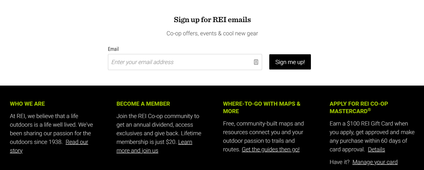
- Newsletter Signup. Email and newsletter sign-ups are commonplace in website footers — and for good reason. Anyone looking to build their email list for a successful email marketing campaign should look to include newsletter signup boxes at the bottom of their website. The idea behind this footer option is that if your website’s body content is good (think blogs, landing pages, homepage, etc.), your users are more likely to want to read more of what your business has to say. Don’t forget to use a catchy call-to-action, such as “Give me more news!” or “Be the first one to get updates” so that the experience feels more personalized.

- Site Search Bar. If you have upwards of 100 or more pages on your website (we’re looking at you, e-commerce or online news publication business owners), then a site search bar is a must-have footer feature. Many sites that are built using robust content management systems will have apps or plugins you can download that set all of the search bar functionality for you. Not only will a site search bar decrease user frustration, but also decrease the chance of your users leaving your website. Let customers quickly find what they are looking for so that they can quickly make a purchase (a win-win situation for everyone).
- Company Logo. Are a lot of the above ideas not applicable to your website’s design or business? No worries! One feature you can add to your site’s footer is your own company logo. As long as you have designed a business logo that is legible and looks great against your site’s chosen background colors, then adding a company logo should be no problem. If you design a logo using an online logo maker, you should have a variety of different image files on hand. Our logo design specialists recommend adding the PNG version of your business logo to your website, as PNG’s have a transparent background that works best on websites.
- Copyright, Privacy Policy & Terms of Use. In this day and age, it’s essential to protect your intellectual property. If your unique products, services, advice, and company information are displayed on your site for everyone to see, then it’s important to protect every aspect of it. Be sure to consult with your company lawyer to draft up a privacy policy and terms of use section. A copyright sign with the current year can easily be added to the footer of your site as well.

- Awards & Certifications. Whether you’re a contractor, a small local business, a national retailer, or a corporation — there is always an industry award to display. You’ve worked hard to provide your customers with the best experience and the best products on the market, so if you have the awards to show this hard work and dedication, then show them off in your website’s footer. Awards and certifications such as Angie’s List Super Service Award, BBB Accredited, Google Trusted Stores, or an OSHA Certification not only builds user trust in your company but also sets you apart from your industry competitors.
- Mission Statement. What makes your business different? What did you set out to do? Is your goal to provide more eco-friendly products? Perhaps your goal is to raise awareness for a cause? Whatever your reasoning for opening your business is, make sure users are aware. The best place to put a mission statement is in the footer. Just keep in mind that you should keep your mission statement brief (a short paragraph) so that your footer isn’t stretched further down the page. If your mission statement is more than a couple of sentences, then we recommend putting the full version in your “About Us” page and including an abbreviated version at the bottom of your site.
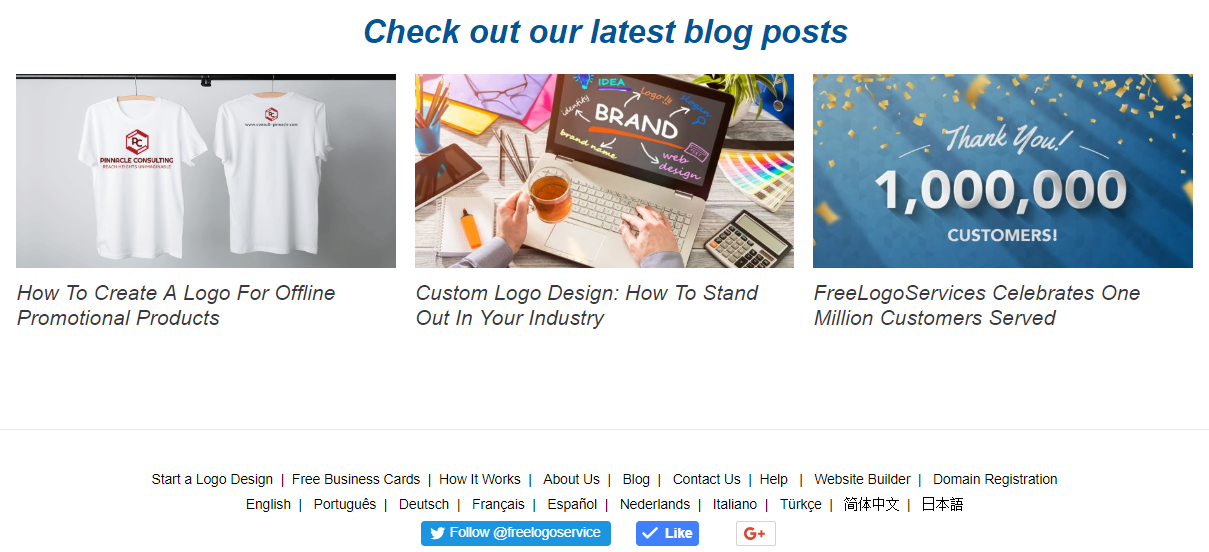
- Recent Blog Posts. You’ve put a lot of time and effort into writing up industry-related blog posts for your business, so why not make sure they get some visibility on your website? Many users may skip clicking on the “Blog” link on a site’s main navigation menu in the header, so it is a great idea to display the latest 3-5 blog posts in the footer to catch the user’s attention. Writing blogs with catchy, click-able headlines is another excellent way to draw users further into your site and learn more about your product or industry. Pro Tip: add a newsletter signup section just below or right next to your recent blog posts section in the footer so users can quickly sign up for new articles.

- Call to Action. Your homepage or header may have plenty of calls to action, but do you have anything that will capture leads towards the bottom of the page? Having a brightly colored and prominent call to action in your footer is bound to give you those extra monthly conversion numbers you’re looking for. For charities or non-profits, try adding a “Donate Now” button that directs users to your donation page. If you’re a contractor, add a “Request Service” button that leads to your Contact Us page. Get creative with your call to action slogans and your button color choices to see which drives the most revenue. Pro tip: Forgo the button and just add a short contact form instead that includes Name, Email, and Message as input fields for the user.
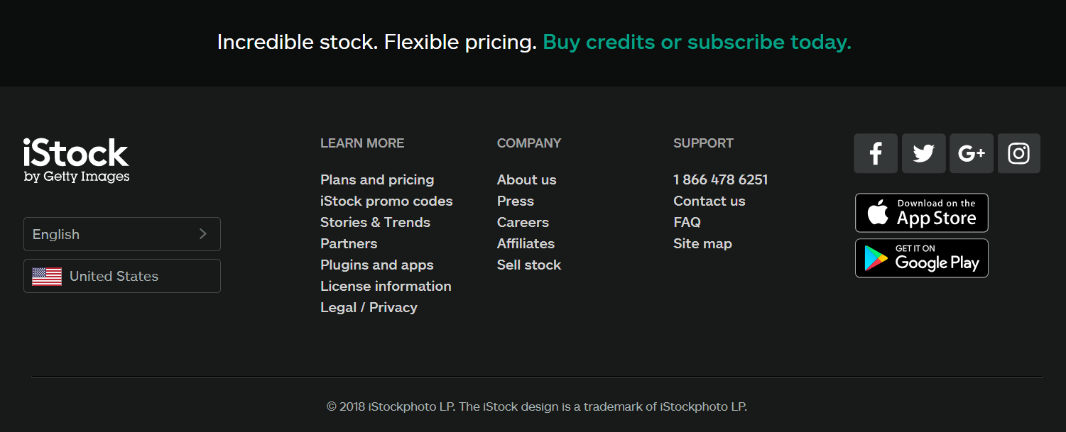
- Navigation Menu. For larger websites, it can be quite easy to have a complicated top navigation menu. Many e-commerce sites will have main menus, sub-menus, and sub-menus in sub-menus, and so on. Adding a footer navigation menu that is meticulously curated to include only the most important landing pages on your site can help users better navigate to the content or products they want to see. This footer menu is especially helpful if you don’t have a site search bar. Your footer menu can also include pages that are still important, but less relevant to your product or service, such as FAQ, Blog, Privacy Policy, About Us, Press, or language selection links.
- HTML Sitemap. Do you still have a bit of space to include in your footer? Adding a plain and simple HTML sitemap is a great way to improve user experience. If visitors to your website are unable to find what they’re looking for using your site search bar or footer navigation menu, then they will certainly find it in your HTML sitemap. Unlike an XML sitemap (which is generated for search engines to determine what pages to crawl on a website), and HTML sitemap is strictly for users to see all of the published and public pages on your site. Building an HTML sitemap doesn’t take too much effort as long as you find a great online tool, such as XML-Sitemaps.com.
Before you delve into designing a website, there are a few additional takeaways. First, think about how many of these features you want to include in your site’s footer. The general rule of thumb is to include anywhere from 3-5 of these features, depending on available space and what your content management system is capable of. Don’t forget to design the footer with mobile users in mind, not just desktop. Ensure that all of the information is responsive to all portable devices. Lastly, don’t forget that nothing is set in stone — you can swap out these features whenever you want!
If you’re having trouble designing your website or would rather have someone else design your company website for you, contact our specialists so we can set up a custom website for your business.


