We’re partway through Women’s History Week (first full week of March) and International Women’s Day (March 8th) is coming up in a few days. So, in honor of all the entrepreneurial women out there, we want to showcase some of the best logo designs from women-owned businesses. But first, let’s quickly discuss what all the buzz is about surrounding National Women’s History Month.
What Is National Women’s History Month?
When one small California town decided to host an event in honor of women and their role in shaping our nation’s history, the rest of the country caught on to their great idea. The school district of Sonoma became a weeklong celebration of women in the late 1970’s. During these events, individuals gave presentations, speeches, wrote essays, attended parades, and gathered to support one another. By 1980, President Jimmy Carter issued the first presidential proclamation, which declared the week of March 8th as National Women’s History Week:
From the first settlers who came to our shores, from the first American Indian families who befriended them, men and women have worked together to build this nation. Too often the women were unsung and sometimes their contributions went unnoticed. But the achievements, leadership, courage, strength and love of the women who built America was as vital as that of the men whose names we know so well.
As Dr. Gerda Lerner has noted, “Women’s History is Women’s Right.” – It is an essential and indispensable heritage from which we can draw pride, comfort, courage, and long-range vision.”
I ask my fellow Americans to recognize this heritage with appropriate activities during National Women’s History Week, March 2-8, 1980.
I urge libraries, schools, and community organizations to focus their observances on the leaders who struggled for equality – – Susan B. Anthony, Sojourner Truth, Lucy Stone, Lucretia Mott, Elizabeth Cady Stanton, Harriet Tubman, and Alice Paul.
Understanding the true history of our country will help us to comprehend the need for full equality under the law for all our people.
This goal can be achieved by ratifying the 27th Amendment to the United States Constitution, which states that “Equality of Rights under the Law shall not be denied or abridged by the United States or by any state on account of sex.
source: National Women’s History Alliance.
These female historical figures paved the way for women to rise up and pursue interests in the same fields as men – one such interest being entrepreneurship. As of 2018, there are nearly 12.3 million women-owned businesses in the US alone with statistics pointing to women being slightly more likely to start a business these days than their male counterparts. One of the biggest aspects of starting a business is creating a logo and marketing the new brand.
Below is our roundup of ten logo designs from women-owned businesses to help give you some inspiration for your own startup.
The 10 Best Women-Owned Business Logos
-
Orangetheory Fitness (Ellen Latham).
About the CEO: After being laid off from her job, what started as a desperate attempt to make ends meet for her and her 9 year old son ended up becoming a multi-million dollar elite fitness club. Ellen Latham founded Orangetheory Fitness in her spare bedroom out of her Pembroke Pines, Florida home. Armed with a master’s degree in exercise physiology and experience in spa and fitness, Latham’s goal for Orangetheory Fitness was to provide members with a full-body, interval training workout.

Logo Design Review: It’s hard to miss the iconic Orangetheory Fitness logo, a wordmark logo with a mix of different font styles and font weights. The word “Orange” features a nebulous “O” which takes on a persona of reaching out in many directions, signifying a connection to the members of the fitness club. The bright orange color signifies energy, motivation, and happiness – the three feelings Latham wants her members to feel during their workouts. The horizontal layout of the text-only logo is simple, modern, and well-balanced with a white background – making it versatile on various marketing materials. -
Pinnacle Group (Nina Vaca).
About the CEO: Nina Vaca is the voice and reasoning behind the 22-year-old IT services company which had its humble beginnings on the floor of her apartment. Pinnacle Group offers comprehensive IT services and workplace solutions to some of the largest global brands. Vaca believes in empowering women to overcome workplace boundaries and encourages her any female entrepreneur to pursue their goals and talents for business ownership. One of the key aspects Vaca associates with her success is having mentors, whether they be friends, family members, or otherwise both male and female.
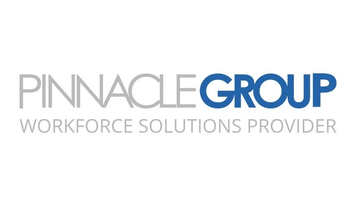
Logo Design Review: Pinnacle Group’s wordmark logo is as timeless as it is modern. The text-only logo features a custom Sans Serif-based font (no extra “legs” on the letters) that features letters in all caps. “Pinnacle” is sleek and slender, while “Group” is bolded. While most companies shy away from taglines these days, the IT giant decided it a tagline (“Workforce Solutions Provider”) was needed to help customers understand their services and what industry they represent. Overall, the wordmark logo features a more compressed font style (similar to Zara’s new logo design) and is made symmetrical thanks to the spacing of their company slogan beneath. -
Technology Concepts Group International (Avis Yates Rivers).
About the CEO: Starting a career at Exxon Corporation allowed Avis Yates Rivers to acquire the courage and knowledge she needed to eventually branch out on her own once Exxon decided to sell her Office Systems Division. Technology Concepts Group International (TCGI) is now a global asset, procurement, and expense management firm assisting companies all over the world. Rivers is a firm believer in the need for increased participation of women and minorities in the technology industries. She is constantly mentoring others and participating in non-profit organizations.
Logo Design Review: TCGI’s logo design is a classic combination mark logo design. This type of logo style includes both an icon and text. TCGI’s geometric box logo icon is the perfect image for an IT-based company. The light gray and muted yellow logo color scheme is professional, memorable, and unique. The company’s choice of font – which is a dark gray Sans Serif – ties well with the clean look of their geometric logo icon. They also chose to emphasize the abbreviation of their company’s name, a bold move that many businesses are not able to properly implement. Where one might place a tagline, TCGI opted to write out their full company name beneath the abbreviation. -
Morning Sun Financial Services (Dr. Rebecca Thomley).
About the CEO: To say Dr. Rebecca Thomley does it all would be an understatement. Thomley received her Ph.D. in Clinical Psychology, and an MS in Psychology, a Masters in Psychopharmacology, and an MA in Organizational Management – and applies each of these degrees to her work. A constant advocate for helping others and communities both near and far, Thomley founded Morning Sun Financial Services to meet the growing demand for how participants can manage their care. During an interview with the Huffington Post regarding advice she could offer to women, Thomley advised that “If you are passionate and focused on your goals, you can break down barriers one step at a time.”

Logo Design Review: Morning Sun Financial Services decided to keep their combination logo design timeless and classic. The serif-style font features a beautiful, muted navy blue color which carries over to their logo icon. A small detail they added to their business name was to connect the “R” and the “N”, which makes the logo more distinguishable. The company opted for their business name to be featured in all capital letters, which aids in the professional demeanor of the business. The logo icon itself is made up of small, various-shaped dots that come together to create a square. The dots are positioned in such a way that they create a circle, signifying a morning sun. -
CATMEDIA (Catherine Downey).
About the CEO: “Follow your own path, make your own rules, take risks, continue chasing your dreams – these are the things that make a woman who means business,” CEO Catherine Downey explained in a recent interview with BizJournals. Downey founded CATMEDIA in 1997 as a single mom looking to help clients in media and production. Since the launch, CATMEDIA has become a go-to leader among government services contractors by helping clients seeking program and project management, creative services and training, and marketing and advertising.
Logo Design Review: This one-of-a-kind combination logo design more closely resembles that of a badge logo. While most businesses opt for a horizontal logo, CATMEDIA chose a vertical/stacked logo in the shape of a square. The top portion of the design features a prominent purple background with a white abstract mark that is shaped into a cat’s eye. Below the icon is CATMEDIA’s company name in a fun, all-caps bolded font type. The unique Sans Serif font almost resembles that of bubble letters – a great combination with the fun icon above. A red typeface is eye-catching and authoritative, which gives potential customers a better idea of CATMEDIA’s company ideals, goals, and personality. -
Contract Direct (Elizabeth Hammond).
About the CEO: Growing Contract Direct’s revenue from $100,000 to $23 million in 13 years was no easy feat for founder Elizabeth Hammond. However, her expertise in being able to manage operations and client relations at previous careers gave her the courage she needed to be the head of a multi-million dollar facility maintenance service company. From the business’ fledgling days of cleaning aircrafts herself and raising three kids, to procuring contracts with some of the world’s largest companies, Hammond has made a niche for Contract Direct that meets a growing demand.

Logo Design Review: Contract Direct’s logo is straight and to the point. The wordmark logo design features a bold Sans Serif font that’s encased in a thick border. The logo dons two colors – white and blue – and is separated into two sections, each with flip-flopped colors to make the design unique. While there is no initial sign of what the company does based on their logo design, Contract Direct’s reputation for superior janitorial services makes up for the more reserved design. -
Xtreme Solutions Inc (Phyllis Winchester Newhouse).
About the CEO: Phyllis Winchester Newhouse is all too familiar with tackling difficult situations head-on (such as founding a company). The retired military veteran was able to apply her hard work, ethics, and love for technology she acquired from her work serving our country to the cybersecurity industry. Newhouse is one of the most driven women in the industry to-date due to her drive to continue to protect the nation. “My reason for starting a business and becoming an entrepreneur was so compelling that failure was simply not an option,” she recently mentioned on the company’s blog.

Logo Design Review: Xtreme Solutions Inc’s logo is a combination style logo that features a prominent logo icon above the business name. The business chose colors that are often identified with safety and security: red and silver – and created an appealing balance between both colors. The icon features a prominent, red-colored globe with their “XSI” business abbreviation as a centered overlay. The icon itself is the main attraction in this logo design, and the business name displayed below is more of an afterthought. The font style is a simple Sans Serif with black text. -
Akorbi (Claudia Mirza).
About the CEO: Claudia Mirza’s success and business prowess took a long time to develop. Growing up in the violent Colombian city of Medellin, Mirza moved to the United States in 1997 where she eventually founded Akorbi out of her own home in Texas in 2003. Now based in Plano, the staffing and language services company has grown to over 600 employees with locations across the country and the world. Mirza and her business has been recognized by multiple sources as a leading woman and woman-owned business. Now a public speaker and women’s advocate, she strives to help women and minorities achieve their entrepreneurial dreams.

Logo Design Review: Akorbi’s logo design is a wordmark (text-only) logo that features a muted gray tone and lime green accents. While most businesses with lettermark logos opt to have all of the letters of their business name capitalized, Akorbi opted to just capitalize the first letter of the name, making the business appear more modern and approachable. The Sans Serif font is legible, and the small lime green accent on top of the letter “i” ties in nicely with the spacing blocks in their company tagline. Overall, the logo design is modern, well-balanced, and minimalist with just enough flair. -
Maximum Games (Christina Seelye).
About the CEO: Christina Seelye has a love for games – and her belief that owning a company and growing it into a successful venture is often compared to that of playing a game. While things started off slow in the beginning for Seelye, her and her partner Len Ciciretto never stopped striving to improve their business opportunities. What first started off as a few deals for video game content quickly became a full-fledged gaming production business that has contracts with Nintendo, Sony, and Microsoft. Seelye will always tell other female entrepreneurs in the video game industry that it’s essential to get back on the horse, no matter how far or hard you fall.
Logo Design Review: You won’t see rainbows, butterflies, or a sign of anything pink on Maximum Games’ logo design. Seeyle made it perfectly clear that her company could blend in with the rest of the video game industry crowd. The shield logo features a black background which helps the lighter elements within the badge logo pop. Within the logo is a hexagonal icon that looks similar to Gamecube’s own 3D square icon (we love the uncanny and most-likely intentional resemblance). The outer portion of the shape is a gradient silver color, with a gradient, 3D shape housed within that resembles the letter “M”. Silver and black are common colors in the video game industry, whereas the orange colored M was a great choice to brighten up the otherwise dark logo design. Centered beneath the icon is the business name in all capital white letters of varyious thickness. -
Contingent Resources Solutions (Debra Gentry).
About the CEO: Debra Gentry never thought she would be the CEO of one of the nation’s fastest women-owned businesses. Her early career started off when she worked in public accounting. Public accounting eventually lead to staffing positions at companies such as Wacker Chemie AG. After realizing there was a specific need for a better method of connecting the right employees with the right employers, Gentry founded CRS. The business has since been recognized and certified as a Women’s Business Enterprise by the Greater Women’s Business Council.

Logo Design Review: Contingent Resources Solutions’ logo design is a lettermark logo with some additional flair. The logo is split down the middle by a vertical black bar, to the left of which is a beautiful, color gradient display of the abbreviation of the company’s name (“CRS”). The custom made font create combined with it’s color gradient allows the user’s eyes to quickly and easily travel across the logo. Each of the letters is connected at the bottom, which ties in nicely with how each of the colors used blend in with each other. To the right of the horizontal bar is the business name spelled out and stacked neatly in lowercase black font.
Join us this month to help us recognize and support women-owned businesses. If you are looking to start your own business, we’re here to help you create your first logo design. You can either use our DIY logo maker or opt to speak with a logo designer about your logo idea.
